Beige, a neutral and versatile colour, has long been a favourite in the worlds of interior design, fashion, and art. It’s a classic tone that works well with virtually any other colour, making it a key player in crafting sophisticated spaces, stylish outfits, and engaging artwork. But despite its popularity, creating the perfect shade of beige involves more than just mixing brown and white. It requires understanding the nuances of various undertones and how they interact with other colours. In this ultimate guide, we will explore how to mix beige, the science behind its creation, its use across different fields, and how to use beige effectively in various art projects.
Understanding the Basics of Beige
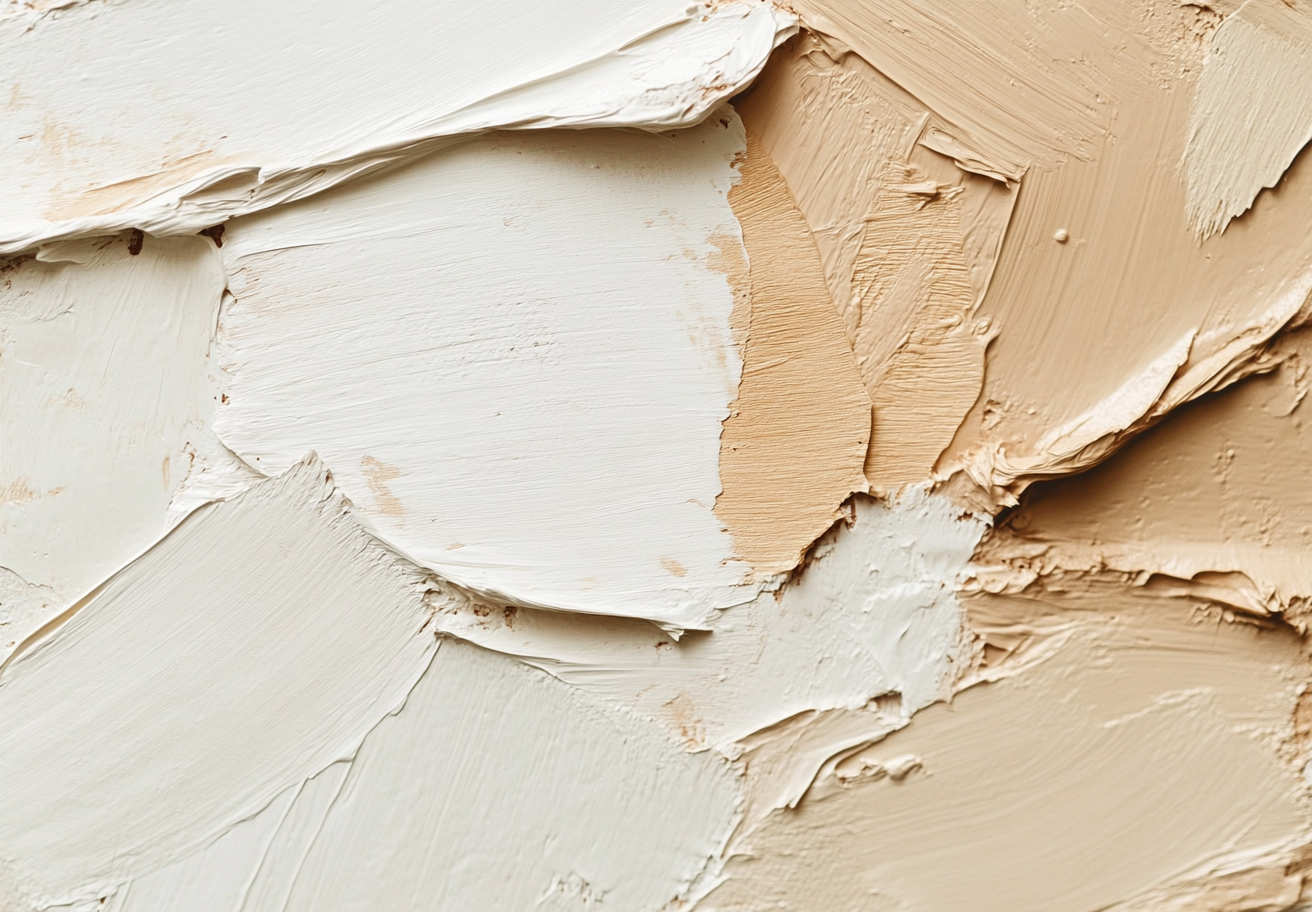
Before diving into the specifics of how to create the perfect beige, it’s essential to understand what beige actually is and why it’s so widely appreciated. Beige is often described as a light brown colour, but it has much more depth. It’s a subtle mix of brown, yellow, and sometimes gray, with different amounts of red or orange influencing the tone. This complexity gives beige its character and makes it highly adaptable across various applications.
Beige exists on a spectrum, from light, pale shades to deeper, more earthy tones. The tone and temperature of beige depend on how it is mixed, particularly in terms of the warm or cool undertones. These variations in beige are what make it such a dynamic and versatile colour that is highly desirable in art, fashion, and interior design.
The Role of Warm and Cool Undertones in Beige
The key to creating the perfect beige is balancing its warm and cool undertones. As a generally warm colour, beige can lean toward either side of the temperature spectrum depending on what you mix into it.
- Warm Beige: Beige can take on a sunny, cosy feel by incorporating more yellow and red tones. These hues evoke a sense of warmth and comfort, making this type of beige ideal for creating inviting spaces or cheerful outfits.
- Cool Beige: On the other hand, beige can be made cooler by adding shades of gray, blue, or green. This results in a more refined and sophisticated tone, perfect for modern design, minimalist art, or creating subtle contrasts.
Understanding these undertones is crucial when mixing beige for your specific purpose, as it can completely change the final aesthetic of your work.
Colour Theory: What Colours Make Beige?
At its core, beige is a blend of three primary colours: yellow, brown, and white. Let’s take a deeper look at how these colours mix to form the perfect beige, as well as the optional ingredients that can adjust the tone to your liking.
1. Mixing Yellow and Brown
Yellow is the base of many beige shades. The addition of brown, which itself is a mixture of red, yellow, and black, gives beige its depth. By adjusting the ratio of yellow to brown, you can create a variety of beige tones:
- Light Beige: Use more yellow and a small amount of brown to create a pale, soft beige.
- Dark Beige: Increase the proportion of brown to create a deeper, richer beige with more earthiness.
If you’re curious about how to make brown and create even more complex tones, check out Prime Pass’s Brown Colour Collection for inspiration on incorporating different brown hues into your work.
2. Adding White to the Mix
White is used to lighten the brown-yellow mix, creating a soft, neutral beige. The amount of white you add will dictate how light or dark your beige turns out.
- Pale Beige: A large amount of white with a little yellow and brown will result in a creamy, light beige.
- Warm Beige: A smaller amount of white mixed with yellow and brown creates a warm, inviting beige tone.
For more on how white is made and how it affects your colour mixing, check out Prime Pass’s guide on What Colours Make White to explore the nuances of incorporating white into your palette.
3. Incorporating Red or Orange
In some cases, a hint of red or orange can be mixed into beige to warm it further, creating peachy or rustic tones. This technique adds vibrancy to beige, making it more inviting and lively.
- Peachy Beige: A subtle touch of red or orange can give beige a peachy hue, perfect for creating a soft, welcoming feel.
- Rustic Beige: A deeper, richer tone of beige can be achieved by adding more red or orange, lending a more earthy, natural look.
4. Mixing Gray for Cool Beige
For a cooler tone, gray is often introduced to the mix. Gray mutes the yellow and brown undertones of beige, resulting in a more understated and modern hue.
- Cool Beige: A slight amount of gray mixed with yellow and brown results in a cooler beige with a refined, contemporary aesthetic.
- Stone Beige: Adding more gray or even a touch of black creates a neutral, earthy beige that’s ideal for modern, minimalist settings.
5. Blue or Green in Beige
Though rare, blue and green can be added to beige for unique effects, particularly in modern or experimental designs. These cool tones create distinct variations of beige.
- Greige: A popular trend in modern design, greige is a mixture of beige and gray with hints of green or blue, resulting in a sophisticated, neutral tone.
- Blue-Tinged Beige: A small amount of blue mixed with beige results in a calming, serene tone, perfect for bedrooms or peaceful spaces.
The Perfect Beige for Your Project
Now that we’ve explored the colour combinations used to create beige, it’s time to discuss how to use this knowledge to mix the perfect beige for your specific project. Whether you’re working on interior design, fashion, or painting, understanding how to create the right shade of beige will elevate your work.
1. Beige in Interior Design
Beige is a top choice in interior design because of its versatility and ability to work with almost any colour. It serves as a neutral backdrop, allowing other colours to pop, while also creating a warm, welcoming environment. The right shade of beige can set the mood of a room, making it cosy, sophisticated, or modern.
- Living Room: For a cosy, inviting living room, choose a warm beige with yellow and brown undertones. This will create a comfortable, welcoming space. Pair with darker accents like charcoal grey or navy to add contrast and depth.
- Bedroom: Cool beige with gray undertones creates a restful, calming atmosphere perfect for a bedroom. Add soft, pastel-coloured bedding and accessories to provide contrast and warmth without overpowering the space.
- Kitchen: Beige with a touch of red or orange can give the kitchen a rustic, farmhouse feel. Alternatively, a cool greige will create a modern, clean atmosphere in contemporary kitchens.
2. Beige in Fashion
Beige is widely used in fashion due to its neutrality and timeless appeal. It’s a versatile colour that can be styled for both casual and formal occasions. Its subtlety allows it to pair well with other colours, and it works well in all seasons.
- Summer Wear: Light beige with yellow undertones works well in summer fashion. Pair it with white, light blues, or pastel colours for a fresh, airy look.
- Winter Wear: Darker beige with red or brown undertones offers warmth and sophistication during the colder months. Combine it with earth-toned accessories for a rich, cosy feel.
- Accessories: Beige accessories, such as scarves, shoes, or bags, are essential in any wardrobe. They work with virtually any outfit, providing a neutral and stylish addition to your ensemble.
3. Beige in Art and Painting
Artists often use beige as a background colour or as part of a larger gradient. Knowing how to mix the right shade of beige can help set the tone and mood of the artwork.
- Portraits: Mixing yellow, red, and brown with white can create a realistic skin tone for portraits. The amount of red or brown used will depend on the subject’s skin tone.
- Landscapes: Beige is a common choice for painting landscapes, especially when depicting sand, stone, or dried grass. By mixing beige with green or blue, you can accurately capture the colours of nature.
- Abstract Art: Beige is often used as a neutral background or to create subtle transitions between more vibrant colours in abstract art.
4. Beige in Branding and Design
Beige is a popular choice in branding due to its ability to convey warmth, sophistication, and luxury. It is often paired with gold, pastels, or other muted tones to create an elegant, timeless aesthetic.
- Luxury Products: Beige with golden undertones is often used in branding high-end products, such as jewelry, perfumes, and cosmetics, to convey refinement and luxury.
- Minimalist Brands: Cool beige shades are common in minimalist and sustainable branding, where the goal is to evoke calmness, simplicity, and a sense of timelessness.
Tips for Achieving the Perfect Beige
Now that you understand how beige is created and its various applications, here are some additional tips for achieving the perfect beige in your projects.
1. Start with a Base Colour
When mixing beige, always begin with a base colour, typically yellow or brown. These form the foundation of your beige, and knowing how each will affect the final shade is essential.
2. Experiment with Ratios
Mixing beige is more of an art than a science. The perfect beige will often require trial and error, so don’t be afraid to adjust the proportions of each colour. Start with small amounts and gradually experiment to find the perfect balance.
3. Add White Gradually
When lightening beige, always add white gradually. Too much white can make the beige too pale and washed out. Mix thoroughly before deciding whether more white is necessary.
4. Test in Different Lighting Conditions
Colours can look different depending on the lighting, so always test your mixed beige under various lighting conditions. Natural daylight and artificial lighting can alter the appearance of the colour, so it’s essential to see how it looks in both environments before finalising your project.
5. Use Beige as a Base
In design, using beige as a base allows you to experiment with accent colours. Because beige pairs well with so many other colours, it’s an excellent choice when you want the flexibility to add bold pops of colour without overwhelming the space or artwork.
Practical Uses of Beige
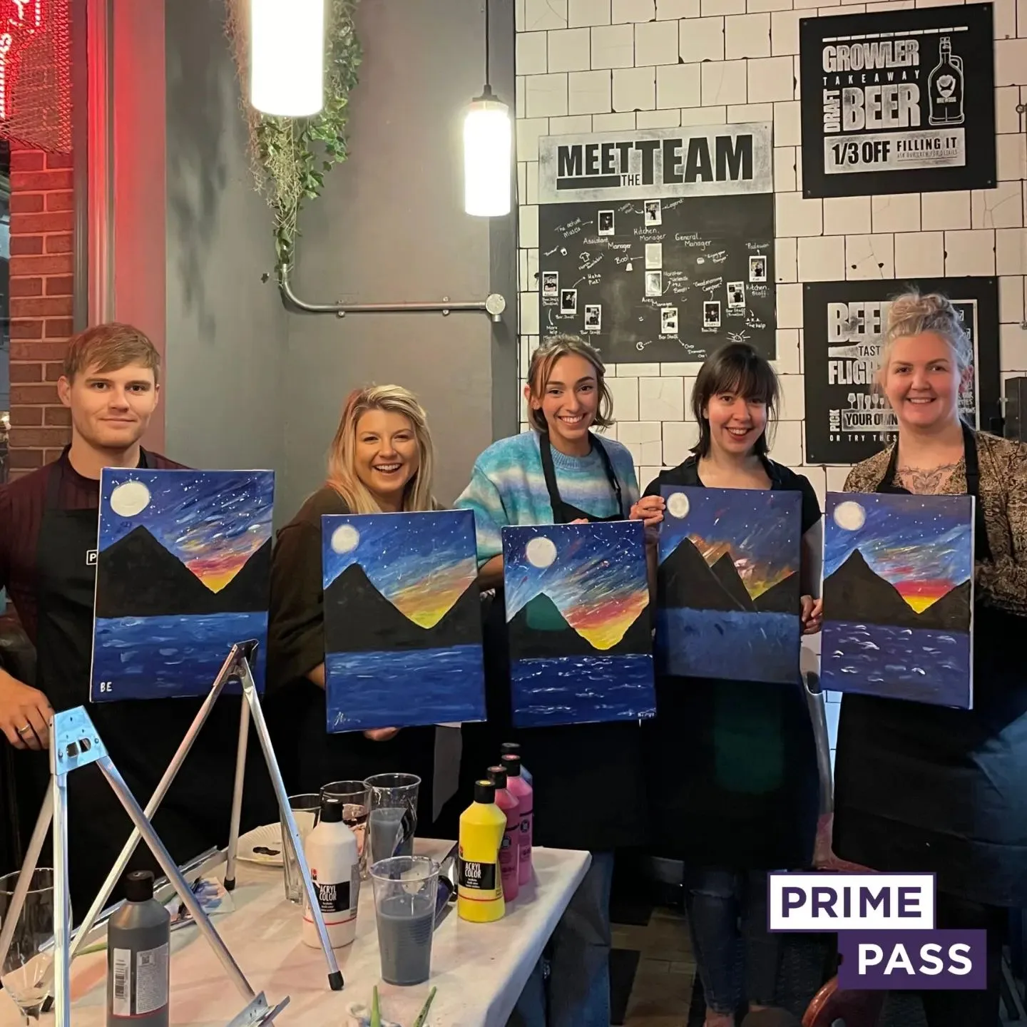
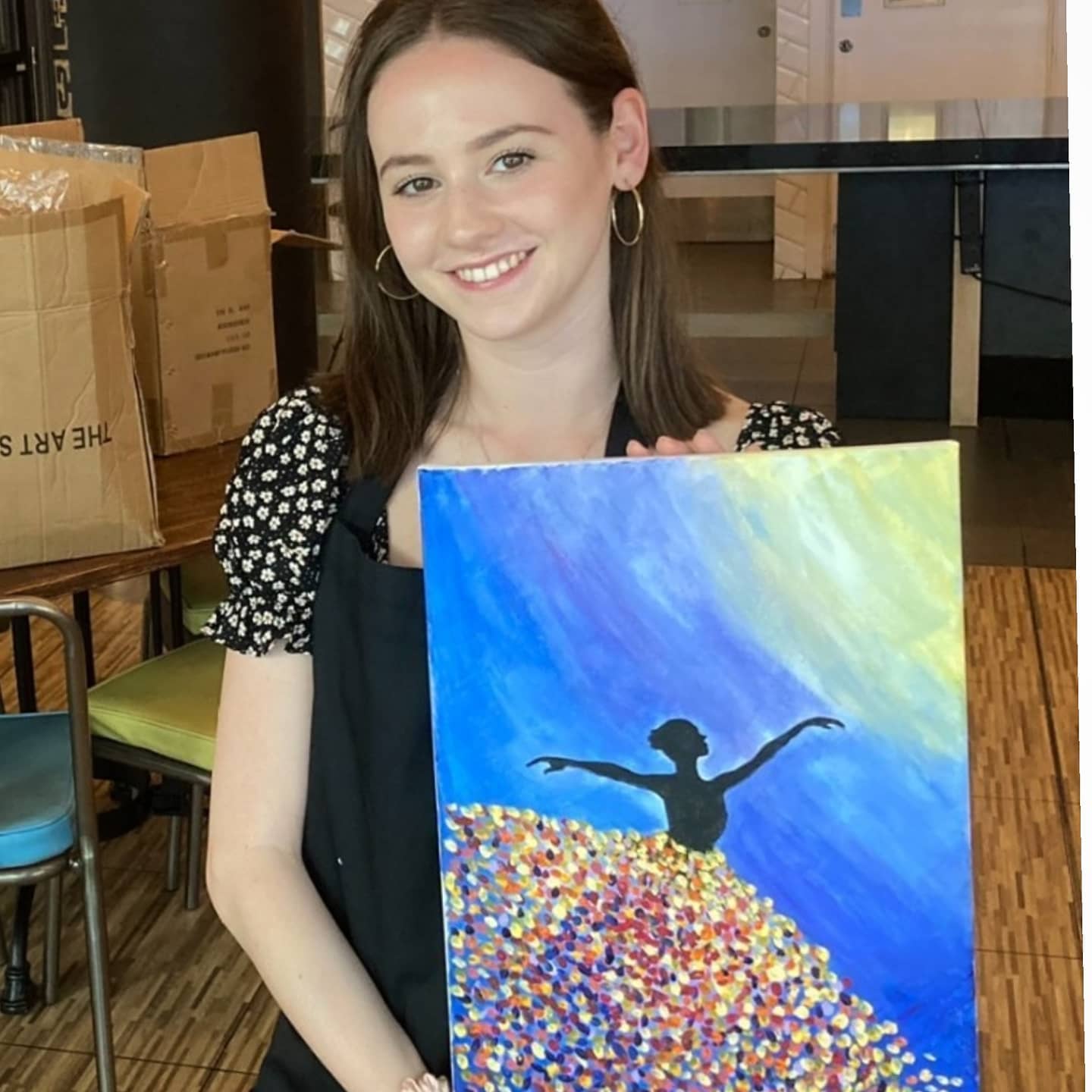
Painting sessions offer a fantastic way to unwind and get creative, perfect for a night out or a special event. At Prime Pass, we provide unique paint and sip experiences ideal for friends, family gatherings, or team-building activities. Our welcoming environment ensures that anyone, from beginners to seasoned artists, feels comfortable expressing their creativity with guided instruction and a glass of wine or their favourite drink.
Creating art together fosters connection, as participants share laughs and ideas while working with versatile colours like beige. The joy of collaborative painting enhances social interactions, and each participant leaves with a personal masterpiece. Prime Pass’s painting sessions offer more than just an evening activity—they provide an experience of self-expression, connection, and fun.
Book a Paint and Sip Class with Prime Pass and Explore the Beauty of Beige Colour
Looking for a fun and relaxing way to explore the world of neutral tones, including creating the perfect shade of beige? Book a Paint and Sip Classes with Prime Pass! Our friendly, guided sessions are perfect for artists of all experience levels, from first-timers to seasoned painters. During the event, our expert instructors will walk you through the painting process, guiding you in colour mixing and helping you create the ideal beige shades—whether you prefer warm, earthy tones or cool, sophisticated hues.
With all materials provided, you can simply show up, sip your favourite beverage, and let your creativity flow. Prime Pass’s Paint and Sip events are an enjoyable way to unwind, learn new techniques, and meet others in a fun, supportive setting. It’s a fantastic opportunity to experiment with mixing colours, creating custom beige shades, and leaving with a piece of personalised artwork. Gather your friends, family, or colleagues for a memorable experience and also Book Team Building Painting Session as well.
Ready to bring your artistic vision to life? Visit our website to book your spot and dive into the world of beige with Prime Pass!

