In the world of painting, lavender is known for its soft, calming, and elegant appearance. It’s a colour that can bring sophistication and serenity to any artwork. Whether you’re working on a delicate floral painting, a soothing landscape, or simply experimenting with different hues, lavender offers a peaceful yet beautiful tone.
In paints, the colour lavender is primarily created by mixing purple and white paint. The result is a lovely, pastel-like shade that is both versatile and timeless. In this guide, we’ll explore the process of creating lavender, dive into the different shades you can achieve, and provide tips on how to use lavender in your artwork effectively.
Understanding Lavender: The Origins of the Colour

Lavender is a light shade of purple that balances both cool and warm undertones. Its elegance comes from its unique composition, which combines the bold richness of purple with the soft, lightning effect of white. Lavender is known for its calming, sophisticated presence and has become a staple in a variety of artistic fields.
Key Features of Lavender
- Purple Base: Lavender is essentially a lighter, softer version of purple. Purple itself is a secondary colour that results from mixing blue and red, two primary colours.
- White Addition: The addition of white to purple softens the intensity, creating a more subtle and approachable hue. This transformation produces a pastel-like colour, ideal for delicate works or subtle backgrounds.
- Cool and Warm Undertones: Lavender has both cool (from blue) and warm (from red) undertones. The exact balance of these undertones will influence whether the lavender feels cooler (leaning toward blue) or warmer (leaning toward pink).
Basics of Colour Mixing: A Quick Recap
Before we delve into the process of mixing lavender, it’s essential to understand the fundamentals of colour mixing. Whether you’re new to painting or an experienced artist, understanding how colours interact with each other will help you create more vibrant, harmonious works of art. Let’s review the basic principles of colour theory:
1. Primary Colours: The Foundation of All Colours

The three primary colours—red, blue, and yellow—are the building blocks for all other colours. These colours are unique in that they cannot be created by mixing other colours together.
- Red: A bold, warm colour often associated with energy, passion, and excitement.
- Blue: A cool, calming colour linked to peace, serenity, and trust.
- Yellow: A bright, cheerful colour that conveys warmth, happiness, and optimism.
These primary colours can be mixed in different combinations to create secondary and tertiary colours. To learn more about how red specifically plays a crucial role in colour mixing, check out our in-depth article on What Makes Red Colour: Understanding Colour Mixing.
How to Make Lavender Colour: Step-by-Step Guide
Lavender is a beautiful, soft, and serene colour, often associated with calmness, elegance, and femininity. Creating lavender in painting is a simple process that requires just a few basic ingredients: purple paint and white paint. By adjusting the ratio of purple to white, you can create a wide variety of lavender shades, from light pastel tones to deeper, richer hues. Here’s a step-by-step guide to help you achieve the perfect lavender for your artwork:
Step 1: Gather Your Materials
Before you begin mixing, make sure you have the following materials at hand:
- Purple Paint: You can either purchase pre-mixed purple paint or mix your own by combining red and blue in equal proportions. The purple you create from this mixture can be adjusted for warmth or coolness by adding more red or blue. Some artists prefer to use a ready-made purple, like Dioxazine Purple or Ultramarine Purple, depending on the tone they want to achieve.
- White Paint: For creating lavender, you’ll need a high-quality white paint, such as Titanium White or Zinc White. Titanium White is a popular choice due to its bright opacity, which allows for more intense lavender shades, while Zinc White is slightly more transparent and softens the colour more.
Step 2: Mix Purple and White
Begin by setting a base of purple paint on your palette. This can be the purple you’ve already mixed from red and blue or a pre-mixed purple if you prefer.
- Tip: If you’re using a pre-mixed purple, like Dioxazine Purple, you will get a deep, intense purple to work with.
Next, gradually add small amounts of white paint to the purple. Start with just a little to see how the colour reacts. The more white you incorporate, the lighter and softer the lavender will become, and it will gradually lose some of its opacity, taking on a more translucent feel.
- Tip: Don’t rush this step. It’s important to slowly add white so you can control the final shade of lavender. Adding too much white too quickly could cause you to lose the depth of the colour. For more white colour mixing check out :- what colour make white
Step 3: Experiment with the Ratio
The ratio of purple to white will determine how light or dark your lavender will be. Here’s how to adjust it based on the desired effect:
- For a Light Lavender (Pastel Lavender): Add more white for a delicate, soft pastel look. This is perfect for backgrounds, light florals, or airy elements in your artwork. A ratio of approximately 1 part purple to 2-3 parts white will give you a pastel lavender.
- For a Deeper Lavender (Rich Lavender): If you prefer a deeper, more intense lavender tone, use less white. Keep the purple more prominent, and you’ll achieve a stronger, more vibrant shade. Try a ratio of 2 parts purple to 1 part white for a richer lavender hue.
- For Cool or Warm Lavender Tones: You can adjust the temperature of your lavender by altering the tone of the purple you’re using. If you want a cool lavender, start with more blue in your purple mix. For a warmer lavender, add a little more red to your purple mixture before adding the white.
- Tip: When experimenting with ratios, always keep track of the amount of paint you’ve used. That way, you can replicate the same shade later or adjust it easily if needed.
Step 4: Test and Adjust
Once you’ve mixed your lavender, apply a small amount of the colour on a scrap piece of paper or canvas to test it out. This is an important step because the colour on your palette may appear different when applied to a surface.
- If the lavender shade is too dark or intense, add more white paint to lighten it.
- If the lavender looks too pale or washed out, you can mix in a bit more purple to deepen the hue.
Take your time to test the mixture and make any necessary adjustments. Don’t hesitate to experiment further by adding a tiny bit of other colours if you want to refine your lavender shade. For example:
- A Hint of Blue: To create a cooler lavender, you can mix a tiny amount of blue into your purple mixture before adding white.
- A Touch of Red: For a warmer lavender, you can add a bit of red to your purple to enhance the warmth before lightening it with white.
Step 5: Final Application
Once you’re happy with your lavender shade, use it in your artwork. Lavender is a versatile colour that can be used in various art styles, such as:
- Landscapes: Lavender can be used to represent the soft hues of twilight or create dreamy sky effects.
- Floral Art: Lavender is perfect for painting flowers like lavender, lilacs, and other soft blossoms.
- Abstract Art: Use lavender as a base for blending and layering colours in abstract works.
- Portraits: Lavender can be a subtle addition to skin tones for a cool undertone or used to create soft backgrounds.
Different Shades of Lavender: Exploring the Spectrum
Lavender is a unique and versatile colour that can be adapted into many different shades, each offering its own distinct characteristics and emotional impact. The beauty of lavender lies in its ability to work in various artistic contexts, from delicate pastels to rich, intense tones. The range of lavender shades can be achieved by varying the amount of purple and white mixed together, and sometimes, by introducing small amounts of other colours like blue, red, or pink to create subtle variations.
Let’s dive deeper into the different shades of lavender, and how to mix them to suit your art projects. This will give you a broader understanding of how you can work with lavender in your paintings, whether you are a beginner or an experienced artist.
1. Pastel Lavender
Pastel Lavender is the lightest, softest shade of lavender. It is created by adding a significant amount of white to the purple mixture. This soft, calming shade evokes feelings of peace and tranquility and is commonly used in delicate art projects, such as baby-themed artwork, wedding designs, or soft floral paintings.
- How to Mix: Start with a base of purple paint (preferably a cool-toned purple) and gradually add white until you achieve a soft, pastel shade.
- Uses: Ideal for backgrounds, light florals, wedding décor, and nursery art.
Key Features:
- Light and airy
- Subtle and soft
- Great for creating a dreamy atmosphere
- Works well with other pastel colours like baby pink or soft yellow
2. Cool Lavender
Cool Lavender is a more muted, slightly bluish shade of lavender. It’s a calm, cool-toned colour that leans more towards blue and has a soothing, almost refreshing appearance. Cool lavender is often used for winter-themed art, frosted landscapes, or to convey serenity and calm.
- How to Mix: Add a small amount of blue to your purple mixture, then lighten it with white. The more blue you add, the cooler the lavender will become.
- Uses: Perfect for landscapes, abstract art, or soft, frosty effects in painting.
Key Features:
- Slightly bluish tint
- Calming and peaceful
- Suitable for winter themes, icy effects, and contemporary artwork
- Pairs well with cool colours like blue, aqua, or green
3. Warm Lavender
Warm Lavender has a more inviting, richer tone compared to its cooler counterpart. It is achieved by introducing a small amount of red or pink into the purple base. This shade of lavender has a hint of rose and creates a warm, comforting effect in artwork. Warm lavender is often used for floral art, vintage-themed designs, and romantic or autumn-inspired projects.
- How to Mix: Mix red or pink with your purple base, and then add white. The more red or pink you add, the warmer the lavender will appear.
- Uses: Great for roses, vintage art, romantic themes, and autumn leaves in paintings.
Key Features:
- Subtle red or pink undertones
- Warm and inviting
- Works well with earth tones like yellow, orange, and brown
- Perfect for romantic and vintage styles
4. Deep Lavender
Deep Lavender is a richer, more intense version of lavender. It is a darker shade that maintains the vibrancy of purple while incorporating white to soften the tone. Deep lavender is often used in art to create dramatic lighting effects, intense backgrounds, or night-time scenes.
- How to Mix: Use a small amount of white and mix it with purple in a way that keeps the richness of the original hue. Adding too much white will result in a pastel or light lavender.
- Uses: Ideal for creating nighttime skies, rich floral tones, and deep accents in paintings.
Key Features:
- Rich and intense
- Provides depth to a composition
- Works well in contrast with lighter colours and for dramatic highlights
5. Pink Lavender
Pink Lavender is a playful, cheerful shade that combines the elegance of lavender with the warmth of pink. It can be created by mixing purple with pink and then lightening it with white. This shade is often used in modern art, floral paintings, and whimsical designs where you want to evoke both calmness and joy.
- How to Mix: Add a small amount of pink to your purple and mix well. Then, lighten the colour with white until you reach the desired shade of pink lavender.
- Uses: Perfect for feminine artwork, baby shower themes, and floral compositions.
Key Features:
- Sweet, soft, and youthful
- Cheerful and light-hearted
The Versatility of Lavender in Art, Design, and More
Lavender’s versatility is one of the key reasons why it is such a beloved colour in a wide range of creative fields. From its soft, calming presence to its ability to evoke sophistication and elegance, lavender can adapt to numerous artistic styles and design concepts. Whether in traditional or contemporary settings, this colour’s ability to balance warmth and coolness makes it a versatile choice for artists and designers alike. Let’s explore how lavender finds its place across different applications and the impact it has on both art and design.
Uses in Art and Design
1. Fine Art
Lavender is frequently employed in fine art to create a sense of delicacy and subtlety. Artists often use it to develop soft backgrounds, gentle transitions, or to represent the ephemeral beauty of lavender flowers in botanical art. Lavender blends beautifully with other soft hues, like pastels, creating depth and dimension without competing for attention.
- Incorporation: Lavender is excellent for creating layered backgrounds or incorporating soft gradients that allow the main subject of a painting to stand out.
- Common Applications: Still life, floral paintings, and portraiture.
2. Interior Design
In interior design, lavender’s calming properties make it an ideal choice for creating serene and peaceful environments. This versatile colour is frequently used in bedrooms, living rooms, and bathrooms, where relaxation and comfort are key priorities. Lavender’s ability to enhance a space without overwhelming it allows it to work in both modern minimalist homes and more traditional spaces.
- Ideal Spaces: Bedrooms for restful sleep, bathrooms for a spa-like atmosphere, and living rooms where a sense of calm is desired.
- Complementary Styles: Lavender works beautifully with neutral tones like white, grey, and cream to create soft, elegant spaces.
3. Fashion
Lavender has a strong presence in fashion, especially during the spring and summer seasons when its light, airy quality complements the soft fabrics typically seen in these collections. Lavender is a versatile colour in clothing, from flowy dresses to casual tops, and is often used in floral patterns to enhance the spring vibe.
- Popular Applications: Lavender is seen in feminine fashion (dresses, blouses) and seasonal collections, as well as in accessories like scarves and handbags.
- Styling Tip: Pairing lavender with shades of white, soft pinks, or mint green can create a refreshing and stylish look.
4. Graphic Design
The soothing and sophisticated qualities of lavender have made it a staple in graphic design. Lavender is commonly used in logos, branding, and web design to evoke a sense of luxury, creativity, and calm. Whether it’s part of a minimalist logo design or used in a website theme to create a professional and peaceful user experience, lavender communicates elegance and serenity.
- Design Impact: Lavender can evoke a sense of trust and calm, making it perfect for wellness brands, beauty products, or luxury goods.
- Common Applications: Brand logos, business websites, and product packaging.
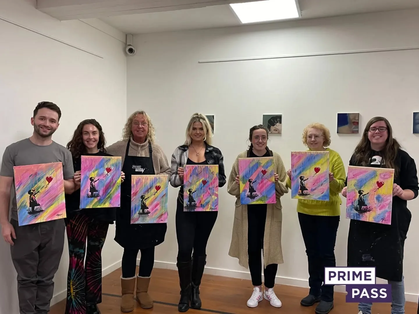
Book Your Sip and Paint Session Today with Prime Pass!

Are you ready to embrace your inner artist while enjoying a relaxing drink? With Prime Pass, our Sip and Paint sessions offer a unique blend of creativity and fun. Whether you’re a seasoned artist or someone who’s just starting their creative journey, Prime Pass sessions are designed to provide a relaxed and enjoyable atmosphere where everyone can express their artistic side.
Why Book a Sip and Paint Session at Prime Pass?
- Creative Experience for All Skill Levels
Whether you’re a complete beginner or a more experienced artist, our Sip and Paint sessions cater to all skill levels. Our friendly and professional instructors guide you step-by-step to create a beautiful painting that you’ll be proud of. There’s no pressure—just fun and creativity! - Perfect for Groups and Special Occasions
Looking for a fun group activity or something special to do with friends, family, or colleagues? Sip and Paint sessions are perfect for celebrations like birthdays, hen parties, or even team-building events. It’s a fantastic way to bond, laugh, and create lasting memories together. - Sip on Your Favourite Drinks
What makes our sessions even more enjoyable is the freedom to sip on your favourite beverages while you paint. Whether it’s wine, cocktails, or non-alcoholic drinks, we’ve got you covered. Our relaxed environment allows you to unwind, enjoy a drink, and let your creativity take center stage. - All Materials Provided
You don’t need to worry about bringing any art supplies—we’ve got everything you need! We provide high-quality paints, brushes, canvases, and aprons, so you can focus on having fun and expressing your creativity. All you need to bring is yourself and your enthusiasm! - Stress-Free and Fun Atmosphere
Our Sip and Paint sessions are all about having fun and letting go of stress. You don’t have to worry about creating a perfect masterpiece—just focus on enjoying the experience and the company of others. The relaxed and enjoyable atmosphere makes it an ideal way to spend a few hours unwinding.

