Colour is one of the most important elements in visual art. It has the power to evoke emotions, create depth, establish focal points, and influence the overall mood of a piece. Whether through vibrant landscapes, somber portraits, or abstract compositions, the right use of colour can transform a simple painting into a compelling work of art. But what exactly makes a colour ‘right’ for a particular piece? The answer lies in understanding the temperature of colour, specifically, the distinction between warm and cool colours.
In this article, we’ll dive into the fascinating world of warm and cool colours, exploring their characteristics, emotional impacts, and how they can be used effectively in your artwork. Whether you’re a beginner looking to enhance your palette or an experienced artist seeking to refine your skills, understanding the temperature of your colours is essential for taking your art to the next level.
What Are Warm Colours?

Warm colours are typically those that evoke feelings of heat, sunlight, and fire. They dominate the spectrum of reds, oranges, yellows, and certain shades of pink. These colours have a powerful presence in both nature and the arts. Often associated with elements like fire and the sun, they carry connotations of energy, passion, and vitality.
Psychological Impact of Warm Colours
- Red: Often associated with love, power, danger, and urgency. It is known to increase energy and stimulate the senses.
- Orange: This colour is seen as a symbol of enthusiasm, creativity, and warmth. It invites interaction and can be energising.
- Yellow: The colour of happiness, optimism, and brightness. Yellow often symbolises cheerfulness and is commonly linked to sunlight and joy.
- Pink: Although some shades of pink are softer, it’s often categorised as a warm colour. Pink is associated with compassion, calmness, and affection.
When used in artwork, warm colours can instantly grab attention and evoke strong emotions in the viewer. They have the ability to make spaces feel cosy and intimate, or in contrast, they can make a space feel overwhelming or intense if not balanced correctly. Explore the Role of Red in Colour Mixing: What Makes Red Colour Special? Understanding Colour Mixing
How Artists Use Warm Colours
- Focal Points: Warm colours are great for drawing attention to the center of a piece, making them ideal for emphasising the focal point of a composition.
- Movement and Energy: These colours can create a sense of movement, making them effective in compositions that convey action or excitement.
- Warmth and Light: To depict a scene with warmth, such as a sunset or a campfire, warm colours are used to bring the scene to life. They add vibrancy and richness to compositions that are meant to evoke a warm, inviting feeling.
While warm colours are dynamic and attention-grabbing, it’s important for artists to use them thoughtfully. Too much of these colours can overwhelm the viewer, so moderation and balance are crucial. Pairing warm colours with cool ones, for example, can help achieve visual harmony.
Bullet Points on Warm Colours
- Warm colours include red, orange, yellow, and some pinks.
- These colours are associated with heat, energy, passion, and intensity.
- Warm colours can create a cosy, inviting, or even aggressive atmosphere depending on their use.
- Psychological associations: Red symbolises love and power, orange represents enthusiasm and creativity, and yellow stands for happiness and optimism.
- Artists use warm colours to emphasise focal points and create a sense of movement in their artwork.
- Excessive use of warm colours can overwhelm the viewer, so balance is key.
What Are Cool Colours?

Cool colours are those that create a sense of calm, serenity, and coolness. They consist of hues such as blue, green, purple, and some shades of teal. These colours are typically linked with elements of nature like water, the sky, and foliage. Cool colours tend to recede in a composition, creating an impression of distance and depth, which is why they are often used to evoke a tranquil or relaxed feeling.
Psychological Impact of Cool Colours
- Blue: Often associated with peace, stability, and calmness. It is a colour that induces a sense of relaxation and is frequently used to create soothing environments.
- Green: Representing growth, renewal, and harmony, green is often tied to nature, making it an ideal colour for representing calm and tranquility. It also symbolises fertility and balance.
- Purple: While it has cool undertones, purple can also have a mysterious and spiritual aspect. It’s often associated with creativity and luxury, adding depth and intrigue to any composition.
Explore the Role of Blue in Colour Mixing: What Makes Blue Colour Special? Mastering Colour Mixing
In terms of artistic impact, cool colours are often used to create a sense of space, airiness, and peace. They are great for backgrounds or secondary elements, providing a calm foundation that allows warmer colours to stand out. Cool colours also have the unique ability to enhance atmospheric effects in art, helping to portray the coolness of evening light or the lush greenness of a forest.
How Artists Use Cool Colours
- Atmospheric Effects: Cool colours are perfect for creating atmospheric conditions, such as the cool blues of dusk or the green tones of a forest. They can make a scene feel more expansive, open, and serene.
- Background and Secondary Elements: Artists often use cool colours in the background to create space or depth. This allows warmer colours to pop and become the focal point.
- Calming and Reflective Mood: Because of their calming effect, cool colours are ideal for compositions that aim to evoke relaxation, meditation, or introspection.
Bullet Points on Cool Colours
- Cool colours include blue, green, purple, and some teals.
- These colours evoke calm, serenity, and distance in a composition.
- Psychological associations: Blue is linked with peace and stability, green represents growth and renewal, and purple often signifies mystery and spirituality.
- Cool colours are used to create atmospheric effects, such as evening skies or lush forests.
- Artists often use cool colours for background elements and to create a sense of space and depth in a painting.
- Cool colours can induce a calming or reflective mood in the viewer.
How to Balance Warm and Cool Colours in Your Palette
Balancing warm and cool colours is crucial for creating visually compelling artwork. By understanding how to use warm and cool colours effectively, artists can create dynamic compositions that guide the viewer’s eye, set the mood, and establish a sense of depth. Here are some strategies for mastering this balance:
1. Warm Colours in the Foreground, Cool Colours in the Background
- Warm colours (reds, oranges, yellows) naturally draw attention, so placing them in the foreground helps focus the viewer’s gaze on the main subject.
- Cool colours (blues, greens, purples) recede into the background, creating depth and allowing the warm colours to stand out.
- This technique is particularly effective in creating depth and dimensionality in a composition.
- Example: A sunset scene where the foreground is filled with warm reds and oranges, while the distant mountains are painted in cooler blues and greens.
Highlights:-
- Warm colours in the foreground for focus and emphasis.
- Cool colours in the background to add depth and perspective.
- Creates a clear focal point and adds dimensionality to the piece.
2. Blending Warm and Cool Colours for Contrast
- Using warm and cool colours together within the same space creates visual tension and contrast, which can energise a composition.
- This technique is ideal for adding drama and excitement to a piece.
- For a strong contrast, combine warm reds or yellows with cool blues or greens to create dynamic interactions.
- Often used in abstract and contemporary art to evoke powerful emotions through the interplay of colours.
Highlights:-
- Warm and cool colours placed together create contrast and visual tension.
- Ideal for dynamic compositions and to energise the viewer’s eye.
- Strong contrast between reds/yellows and blues/greens adds drama and excitement.
- Common in modern art to create movement and emotional responses.
3. Harmonising Warm and Cool Colours
- Neutral tones (grays, whites, browns) can help bridge the gap between warm and cool colours, creating a smooth transition and cohesive composition.
- Another method is using analogous colours—colours next to each other on the colour wheel (e.g., red and orange, blue and green)—to create a seamless blend between warm and cool hues.
- This approach is effective when the goal is to achieve balance and harmony in the artwork.
Highlights:-
- Neutral tones (grays, browns) can harmonise warm and cool colours and prevent clashing.
- Analogous colours can create smooth transitions and cohesion.
- A more balanced and harmonious composition can result from this technique.
4. Focusing on the Mood and Message of the Artwork
- The choice of warm and cool colours should align with the mood and message the artist wants to convey.
- For a work focused on energy, passion, or excitement, warm colours can dominate, with cool accents to create depth.
- For a composition that communicates calmness, tranquility, or melancholy, cool colours can take the lead, with warm accents to create focus or intrigue.
- This approach ensures that the emotional tone of the artwork aligns with the artist’s intentions.
Highlights
- The balance of warm and cool colours should reflect the mood or emotion the artist intends.
- Warm colours are used for energy, excitement, or passion; cool colours for calmness or introspection.
- Accents of the opposite colour temperature can be used to enhance focal points and add visual interest.
Practical Tips for Applying Warm and Cool Colours in Your Art
Now that we’ve explored how to balance warm and cool colours, it’s important to dive into practical strategies that artists can use when implementing these concepts in their own work. Whether you’re a beginner or an experienced artist, applying colour theory effectively can dramatically elevate your art. Here are a few actionable tips:
1. Start with a Limited Colour Palette
- Using a limited number of colours allows you to focus on the interaction between warm and cool tones without overwhelming your composition.
- Tip: Start with a warm base colour and add cool tones as accents, or vice versa, to ensure that one temperature doesn’t overpower the other.
2. Use Colour Temperature to Create Depth in Portraits
- Portraits are a great example of how colour temperature can influence the viewer’s perception of depth and emotion.
- Tip: For portraits, use cooler tones for shadowed areas (like the sides of the face or background), and warm tones for highlights (like the cheekbones or nose) to create a natural, three-dimensional effect.
3. Experiment with Colour Blocking
- Colour blocking involves using large swaths of solid colour. By placing warm colours next to cool colours, you can create striking visual contrasts.
- Tip: Don’t be afraid to experiment with abstract or contemporary compositions where bold temperature contrasts take center stage.
Creating Atmosphere Using Warm and Cool Colours

Beyond just creating depth, the use of warm and cool colours can deeply affect the atmosphere of your work. Whether you’re creating a serene landscape, a bustling city scene, or an emotional portrait, understanding how colour temperature affects mood is key. Here’s how to harness these colours for maximum emotional impact:
1. Creating Warm, Inviting Environments
- Warm colours are perfect for creating cosy, inviting environments. If you want your artwork to evoke feelings of warmth, comfort, or passion, incorporating more warm tones can help achieve that.
- Tip: Use warm colours in interior scenes, still lifes, or romantic portraits to set an intimate and emotionally engaging atmosphere.
2. Crafting Calming or Mysterious Vibes
- Cool colours excel at creating a calming or mysterious effect. They’re ideal for depicting nighttime, quiet landscapes, or solitary figures.
- Tip: Experiment with subtle cool tones in nightscapes, rainy days, or serene waterscapes to evoke tranquility or melancholy.
How to Adjust Colour Temperature for Different Media
The way you use warm and cool colours will depend on your chosen medium, as different mediums interact with colours in unique ways. Whether you work with watercolour, oil paints, acrylics, or digital art, each medium offers its own challenges and advantages when manipulating warm and cool tones.
1. Watercolour
- Watercolour tends to have a soft, translucent effect, which can be used to create atmospheric transitions between warm and cool tones.
- Tip: Use cool colours for soft backgrounds or to fade distant objects, and warm tones for more prominent or focused areas to create a glowing effect.
2. Oil Paint
- Oil paints have a rich, dense texture that allows for smooth blending of warm and cool colours. Their slow drying time is perfect for creating subtle gradients and transitions.
- Tip: Use cool colours in the shadows and warm colours in the highlights to bring figures and objects to life with depth.
3. Acrylic Paint
- Acrylics dry faster than oils, so working with cool and warm colours requires quicker decisions.
- Tip: Layer warm and cool colours in acrylics for sharp, defined contrasts. Be mindful of blending on the canvas, as acrylics can dry before you have a chance to soften the transition
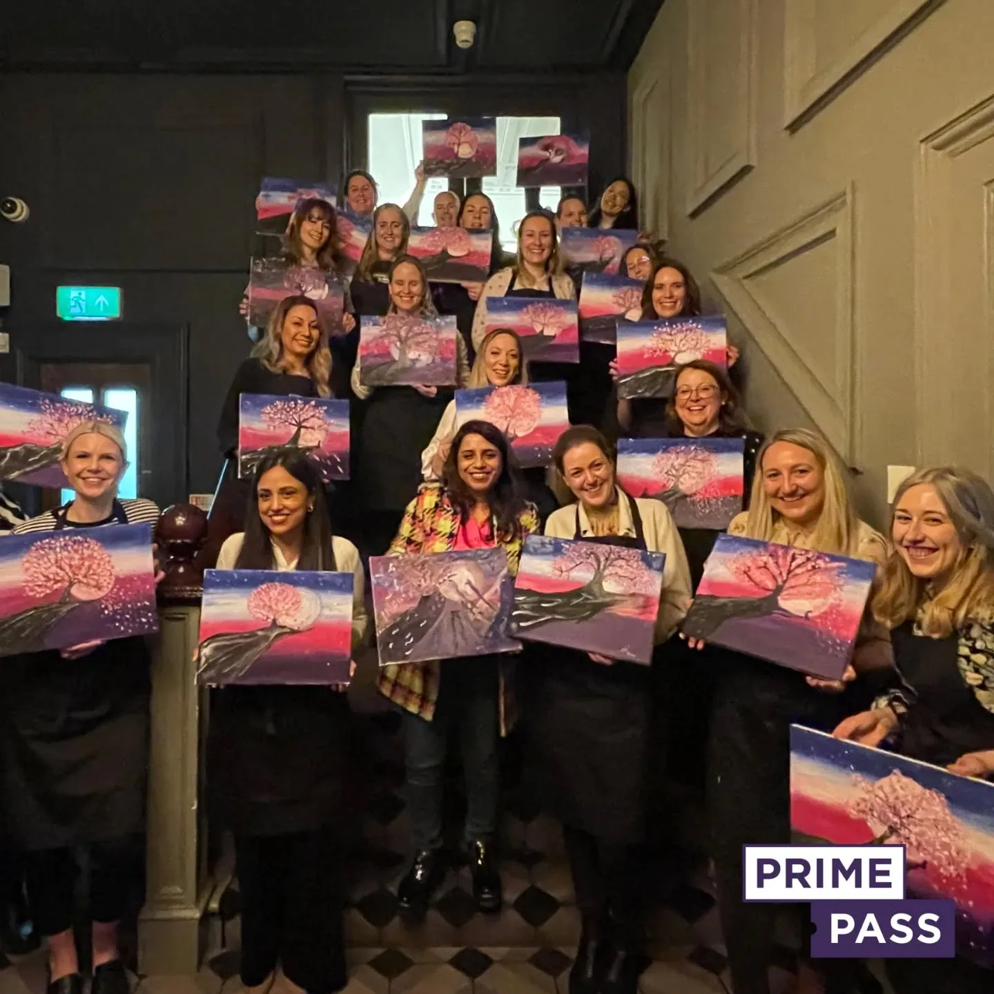
Book Your Paint and Sip Session with Prime Pass

Looking for a fun and creative way to spend time with friends or family? Book a Paint and Sip session with Prime Pass today! Whether you’re a beginner or an experienced artist, these guided sessions are perfect for all skill levels. Enjoy sipping your favourite drink while creating your masterpiece in a relaxed and friendly atmosphere.
Why Book?
- Fun for All Skill Levels: No experience needed, just bring your creativity!
- Great for Groups: Perfect for friends, family, or team-building activities.
- Relaxing Environment: Enjoy drinks, music, and laughter while painting.
- Take Home Your Art: Leave with your unique painting.
How to Book:
- Visit the Prime Pass website.
- Select your city, date, and time.
- Reserve your spot and get ready for a creative experience!
Don’t wait — Book your session now and enjoy a fun, artistic night out!

