Magenta is a bold, eye-catching colour that sits between red and blue on the colour wheel. Unlike most hues, it does not correspond to a single wavelength on the visible light spectrum. Instead, magenta is a perceptual colour—our brains create it when red and blue light mix. This unique characteristic makes magenta a fascinating subject in colour theory, art, and design.
Due to its striking and unconventional nature, magenta is widely used in various industries, including printing, fashion, branding, and digital media. Beyond its aesthetic appeal, magenta carries deep symbolic meanings, from creativity and passion to spiritual awareness and transformation.
What is Magenta?

Magenta is a secondary colour that does not naturally appear in the visible spectrum of light. Unlike primary colours, which exist independently, magenta is formed when specific colours mix. Its creation depends on different colour models:
- RGB (Digital & Light-Based Colour Model): In digital displays and lighting, magenta is produced by combining red and blue light at full intensity while excluding green. This additive process creates the bright, vibrant magenta seen on screens. To learn more about how red contributes to colour mixing, check out our guide on What Makes Red Colour: Understanding Colour Mixing.
- CMYK (Print & Pigment-Based Colour Model): Magenta is one of the primary ink colours, alongside cyan, yellow, and black. It plays a crucial role in colour printing, where it is mixed with other inks to create a full spectrum of colours.
Because magenta is not found in the natural spectrum, it is sometimes referred to as an “extra-spectral” colour, existing only as a result of the way human vision processes light.
Meaning and Symbolism of Magenta
Magenta is a powerful and emotionally charged colour with various psychological and cultural associations. Some of its key meanings include:
1. Creativity & Imagination
Magenta is strongly linked to artistic expression and originality. It stimulates the mind, encourages out-of-the-box thinking, and is often used in art, fashion, and advertising to grab attention and inspire innovation.
2. Harmony & Balance
As a blend of red and blue, magenta symbolises a balance between two opposites: the energy and warmth of red and the calm and wisdom of blue. This duality makes magenta a colour of emotional equilibrium, helping to create a sense of inner peace and stability.
3. Spiritual Growth & Transformation
In spiritual and metaphysical contexts, magenta is considered an uplifting and high-vibrational colour. It is used in meditation, healing practices, and chakra work to encourage personal transformation, enlightenment, and connection to higher consciousness.
4. Luxury & Extravagance
Magenta has a strong association with wealth, power, and sophistication. It is frequently used in high-end fashion, luxury branding, and exclusive events to convey opulence, uniqueness, and confidence. Brands and designers often incorporate magenta into their visual identities to stand out and exude a premium appeal.
5. Feminine Strength & Empowerment
Magenta, particularly in its fuchsia and deep pink variations, is often associated with femininity, self-confidence, and empowerment. It is used in various women’s rights campaigns, beauty brands, and fashion statements to symbolise strength, independence, and vibrancy.
The Different Shades of Magenta
Magenta exists in a wide range of tones and shades, each carrying its own unique visual and emotional impact:

- Deep Magenta – A darker, richer tone that evokes a sense of luxury and mystery.
- Light Magenta – A softer, pastel-like shade often associated with elegance and subtle beauty.
- Hot Pink – A bright, energetic variation of magenta that symbolise playfulness and excitement.
- Fuchsia – A more purplish version of magenta, blending elegance with a modern, stylish appeal.
- Electric Magenta – A neon, vibrant shade commonly seen in digital designs and futuristic aesthetics.
Each shade of magenta has its expressive qualities, making it a versatile choice for graphic design, interior decor, fashion, and marketing.
Step-by-Step Guide to Creating Magenta Colour
Magenta is a vivid, purplish-red hue that doesn’t exist as a single wavelength of light but is instead a perceptual colour created by mixing red and blue. Below are the methods to produce magenta in different colour systems.
1. Mixing Magenta with Paints (Traditional RYB Model)
(Used in art and physical colour blending)
Materials Needed:
- Red paint (true red, not orange-leaning)
- Blue paint (cool blue, like ultramarine or phthalo blue)
- White paint (optional, for lighter shades)
- Palette & mixing tool
Steps:
- Start with equal parts red and blue (e.g., 1:1 ratio).
- Mix thoroughly – The initial mix may look more purple.
- Adjust the ratio:
- If too purple → add more red.
- If too red → add more blue.
- For a brighter magenta:
- Avoid adding black (it dulls the colour).
- Use a cool blue (avoid greenish blues like cerulean).
- For a lighter tint: Add a small amount of white.
Tip:
- Some paint brands sell pre-mixed magenta (e.g., Quinacridone Magenta), which is more vibrant than mixing manually.
For more colour mix check out:- what colour makes Yellow?
2. Creating Magenta Digitally (RGB Model)
(Used for screens, digital art, and lighting)
RGB Values:
- Pure Magenta: R: 255, G: 0, B: 255 (Hex: #FF00FF)
- Softer Magenta: Reduce brightness (e.g., R: 200, G: 50, B: 200).
Steps (in Photoshop/Illustrator/Digital Tools):
- Open the colour picker.
- Manually enter RGB: 255, 0, 255.
- Alternatively, slide the colour selector to the top-right corner of the hue spectrum (between red and blue).
Why No Green?
- Magenta is an additive mix of red + blue light—green would shift it toward white or yellow.
3. Printing Magenta (CMYK Model)
(Used in professional printing and design)
CMYK Values:
- Pure Magenta: C: 0%, M: 100%, Y: 0%, K: 0%
Steps (In Design Software):
- Select the CMYK colour mode.
- Set:
- Cyan (C) = 0%
- Magenta (M) = 100%
- Yellow (Y) = 0%
- Black (K) = 0%
Note:
- In printing, magenta is a primary ink—no mixing is needed.
- For darker shades, add black (K) or a small amount of cyan (C).
4. Mixing Magenta with Light (Physics Approach)
(How magenta works in visible light)
- Shine a red light and a blue light onto the same spot.
- The human brain perceives the combination as magenta (since it’s not a spectral colour).
Fun Fact:
- Magenta doesn’t appear in rainbows because it’s a “non-spectral” colour—your brain invents it when red and blue overlap!
Common Mistakes When Making Magenta Colour
Creating magenta can be tricky, especially if you’re working with paints, digital colours, or printing. Here are some common mistakes to avoid:
1. Using Purple Instead of Magenta
- Mistake: Many people mistakenly think magenta is the same as purple or violet. However, purple has more blue, while magenta is a balanced mix of red and blue.
- Fix: Ensure you mix equal parts of red and blue without adding too much blue, or use pre-made magenta pigment.
2. Mixing Red and Blue Paint Incorrectly
- Mistake: Mixing standard red and blue paints often results in muddy or dull purple instead of vibrant magenta. This happens because most commercial reds and blues contain yellow, which darkens the mixture.
- Fix: Use a cool-toned red (like Quinacridone Red or Process Magenta) and a pure blue to achieve a brighter magenta. Avoid warm reds with orange/yellow undertones.
3. Adding Green in Digital Colour Mixing (RGB Model)
- Mistake: In digital screens, magenta is created by mixing red and blue light at full intensity. If green is mistakenly added, the colour will shift towards white or grey.
- Fix: Make sure the green channel is set to zero when mixing magenta in RGB.
4. Not Using True Magenta Ink in Printing (CMYK Model)
- Mistake: In printing, magenta is a primary ink colour. If you try to mix it using red and blue inks, the result will not be a true magenta but a darker shade or brownish-purple.
- Fix: Always use CMYK magenta ink instead of attempting to mix it from other colours.
5. Overcompensating with White or Yellow
- Mistake: Adding too much white or yellow while trying to lighten magenta can result in pink or peach tones instead.
- Fix: If you need a lighter magenta, add small amounts of white gradually, but avoid yellow unless aiming for a muted tone.
Magenta in Painting: A Vibrant Force in Artistic Expression
Magenta holds a unique place in the painter’s palette—a bold, boundary-defying colour that bridges warm reds and cool blues. Unlike traditional pigments, its very existence challenges our understanding of colour perception. Let’s explore how this extraordinary hue functions in painting across different mediums and styles.
1. The Nature of Magenta Pigments
- Modern synthetic origins: Most true magenta pigments were developed in the 19th century (quinacridone magenta in 1958)
- Opacity spectrum: Ranges from transparent (quinacridone) to semi-opaque (modern acrylic varieties)
- Lightfastness: Generally excellent in professional-grade paints (rated I-II on ASTM scale)
2. Essential Magenta Paint Varieties
(For Oil, Acrylic, and Watercolour)
| Pigment Name | Paint Type | Characteristics | Best Uses |
| Quinacridone Magenta | All | Transparent, intense | Glazing, mixing clean violets |
| PR122 (Modern Acrylic) | Acrylic | Semi-opaque, bold | Impasto, pop art styles |
| Opera Pink (Watercolour) | Watercolour | Fluorescent, fugitive | Illustrations, special effects |
| Alizarin Crimson Hue | Oil | Deep, slightly blue-shifted | Portrait shadows |
3. Advanced Mixing Techniques
Creating the Perfect Magenta:
- Start with quinacridone-based red (avoid cadmiums which are too orange)
- Add small amounts of ultramarine or phthalo blue
- For acrylics: Try mixing with interference mediums for metallic effects
Colour Harmony Applications:
- Complementary schemes: Pair with bright greens (phthalocyanine)
- Triadic palettes: Combine with cyan and yellow for vibrant pop art looks
- Analogous blends: Gradient transitions to deep purples or hot pinks
4. Historical and Contemporary Usage
- Impressionism: Monet’s use of floral highlights
- Fauvism: Matisse’s bold, unnatural applications
- Contemporary: David Hockney’s pool paintings showcase modern acrylic magentas
- Street Art: Banksy’s use of fluorescent magenta in political works
5. Special Technical Considerations
- Undertones: Test mixes on white and gray ground to check for unwanted blue/red dominance
- Glazing: Build intensity gradually in watercolour and oil
- Overpainting: In acrylics, works best when the overlying layers are dry to prevent lifting
- Mural Painting: Requires UV-resistant formulations for outdoor use
6. Troubleshooting Common Issues
- Muddy mixes: Caused by adding earth tones or opaque whites
- Bleeding: In watercolour, use sizing or masking fluid for sharp edges
- Drying shifts: Some acrylic magentas darken significantly when dry
Pro Tip: For maximum luminosity, apply magenta in thin layers over titanium white ground rather than mixing with white directly.
7. Innovative Applications
- Mixed Media: Combine with magenta inks or pastels
- Texture Effects: Mix with clear gel mediums for dimensional brushstrokes
- Digital Integration: Use as an underlayer for neon effects in AR-enhanced paintings
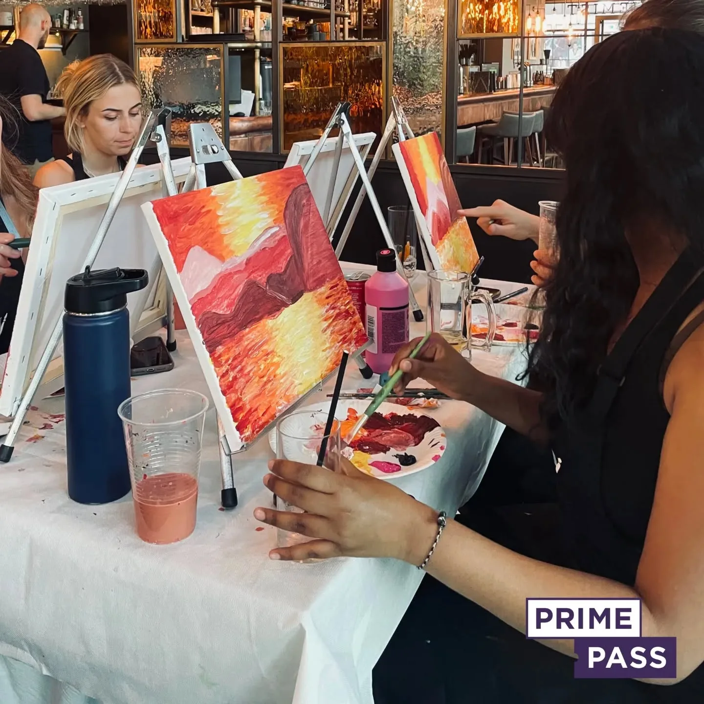
Book Your Sip and Paint Classes with Prime Pass

Ready to explore the power of magenta in your next masterpiece? 🎨✨ Join Prime Pass Sip and Paint classes in Manchester, London, and other exciting locations! Whether you’re a beginner or a seasoned artist, our fun and relaxing workshops offer step-by-step guidance while you sip on your favourite drink.
From bold magenta strokes to soft pastel hues, our classes help you experiment with colour, texture, and techniques to bring your creativity to life.
Perfect for Any Occasion!
Prime Pass offers special themed events, including:
✅ Hen Parties & Baby Showers – Add a pop of magenta to your celebration!
✅ Team-Building Events – Strengthen connections through art and creativity.
✅ Date Nights – A unique and romantic experience with a colourful twist.
✅ Christmas & Seasonal Classes – Brighten up your holiday artwork with festive magenta shades!
Whether you’re painting vibrant florals, abstract designs, or dreamy sunsets, our Sip and Paint classes let you express yourself with confidence.
🖌️ Book your spot today and make unforgettable memories with art, fun, and friends!
👉 Reserve your Sip and Paint class now with Prime Pass! 🎟️

