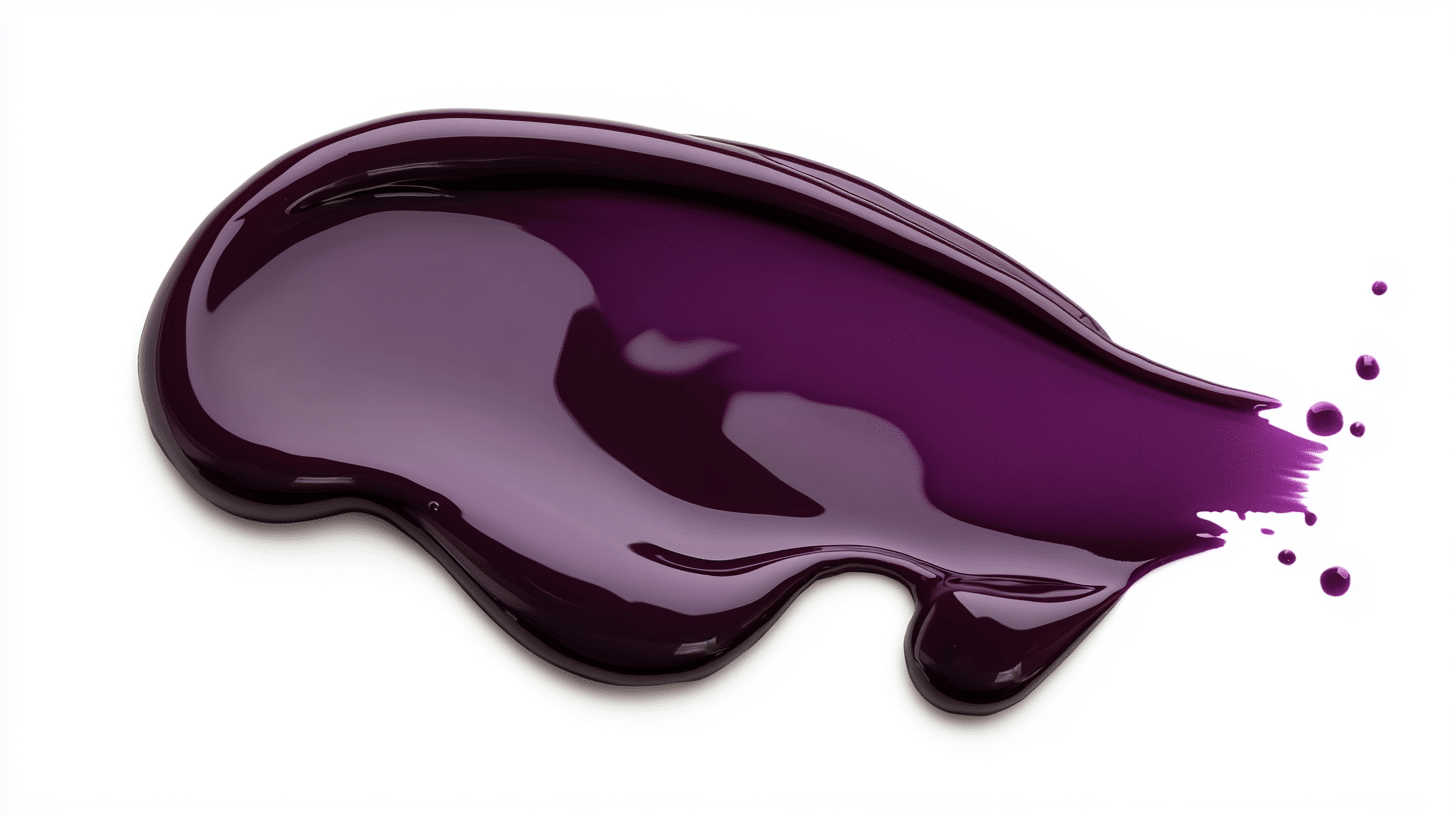
With burgundy, you can instantly elevate any colour combination and give it a sense of refinement. But have you ever wondered which colours blend to create this stunning shade?
Burgundy’s depths are finally laid bare as we dissect the precise Pigment equation responsible for its dramatic, eye-catching effect – a true masterclass in colour choreography. Ever tried combining warm red tones with soothing blue hues? Getting the mix just right can elevate your design game. Boost your design game by mastering the art of burgundy – it’s the secret to elevating your space, outfit, or project to the next level. For a fun, creative way to explore colour, check out Sip and Paint Brunches.
Understanding Burgundy
Set aside some me-time and let the rich, bold tones of burgundy take centre stage during a painting session, melting your worries away. Paint and sip Session with us at Prime Pass, where art meets beauty. We’ll show you the techniques that bring a sophisticated colour to life, one stroke at a time. Imagine injecting fun and innovation into your next social gathering – that’s what our sessions are all about, whether it’s friends, family, or colleagues.
Burgundy’s deep, rich tone relies on a sturdy foundation – a bold red base that sets the stage for this dramatic colour. By adding blue in precise proportions—typically two parts red to one part blue—we introduce the characteristic purplish undertones. Participants can adjust the mix, using about four parts red to one part blue, to perfect their shade. For those seeking a darker hue, a small amount of black can be incorporated without compromising the colour’s depth.
From the moment you step inside, our warm and inviting space puts everyone at ease, allowing artists of all levels to let their creativity shine. colour blending becomes a breeze when guided instruction takes the stress out, leaving you to enjoy the ride – and that glass of wine you’ve been eyeing. Prime Pass’s painting sessions go beyond a simple evening activity. Imagine a space where you can unabashedly express yourself, connect with like-minded individuals, and have a blast – all culminating in a unique digital masterpiece that radiates the warmth and elegance of burgundy.
The Basics of colour Mixing
Mastering colour mixing is crucial for creating the perfect shade of burgundy. In our paint and sip sessions, the combination of art supplies, good company, and a pinch of creative freedom yields a recipe for exploring new techniques in a relaxed, empowering environment. If you’re looking to expand your creative skills further, check out What Is Art Journaling: A Complete Guide from Beginner to Advanced Level.
Primary colours for Burgundy
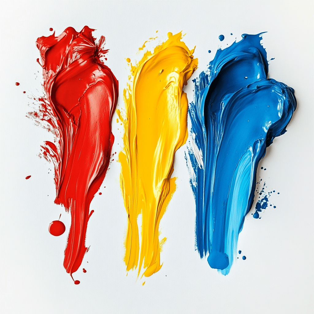
Burgundy forms by blending red and blue. We use a ratio of two parts bright red, such as Cadmium Red, to one part blue like Ultramarine Blue. By combining these elements, we get a deep, dark brown suffused with subtle purple hints – a rich burgundy that really makes a statement.
Secondary colours Influencing Burgundy
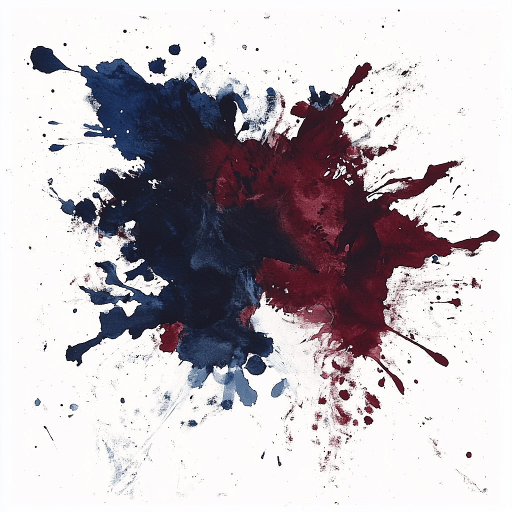
Enhancing burgundy involves adding neutral dyes. We incorporate dark brown, charcoal grey, or black to the red and blue mixture. For instance, mixing cardinal red with dark brown creates a richer, more sophisticated burgundy. As more colours are introduced, the resulting hue becomes exponentially more interesting, with each shade building upon the last to create a sense of layered sophistication.
Techniques to Create Burgundy
Mastering these techniques allows us to create the rich hue of burgundy. Prime Pass paint and sip sessions guide participants through each method.
Proportions and Ratios
Achieving burgundy requires mixing two parts red with one part blue. You get a dramatic, deep brown-red colour with a hint of plum beneath the surface.
| colour | Parts |
| Red | 2 |
| Blue | 1 |
Adjusting Shades and Tones
To modify burgundy, add neutral dyes like brown or charcoal grey. Incorporate green incrementally to adjust the tone, achieving the desired depth and richness.
Common Mistakes to Avoid
When mixing colours to create burgundy, certain errors can prevent achieving the desired shade. Avoid these common mistakes to ensure a rich and accurate burgundy:
- Incorrect colour Ratios Using too much blue can result in a purplish hue, while excess red may produce a brighter, less deep colour. Maintain the recommended two parts red to one part blue to achieve the proper balance.
- Using Unsuited Paint Types Different paint mediums may behave differently. Ensure you’re using compatible paints, such as acrylics, to maintain consistency in colour mixing and application.
- Adding Too Much Darkening Agent Incorporating excessive brown or black can overpower the red and blue mixture, leading to a muddy appearance. Add darkening agents gradually to control the depth of the burgundy.
- Neglecting to Test Small Batches Mixing large quantities without testing can waste materials and time. Create small samples first to verify the colour before committing to larger batches.
- Ignoring colour Undertones Burgundy should have purplish undertones. Failing to account for these can result in a burgundy that leans too heavily towards brown or red, lacking the desired sophistication.
- Inadequate Mixing Ensure thorough blending of all components. Incomplete mixing can lead to uneven colour distribution and inconsistencies in the final shade.
So you want to paint with confidence? Avoiding common burgundy pitfalls gets you there – you’ll be shocked at how easily you can hit that perfect, rich tone.
Applications of Burgundy in Design
Burgundy enhances various design elements with its rich and elegant hue. Burgundy hues magically emerge in furniture staples like plush sofas and stately accent chairs, consequently enveloping the space in warmth and invitation. If you want to bring a touch of sophistication to your space, try incorporating burgundy into your decor through wall art and accessories – its depth and complexity will elevate the entire atmosphere.
Our paint and sip sessions at Prime Pass use burgundy to inspire creativity in every participant. At our painting classes, the wine flows and the creativity spills over! Join us for a fun night out or special event, where you can tap into your artistic side, relax with friends, and take home a beautiful masterpiece to show for it.
Paintbrushes meet party vibes at Prime Pass, where friends and family get to unleash their creative sides and team-builders tap into their artistic facets. We craft an atmosphere that’s warm and inviting, where creatives of all levels – from total newbies to seasoned pros – can feel at ease exploring the rich tones of burgundy. With guided instruction and a glass of wine or favourite drink, participants enjoy the joy of creating art together.
Book a Paint and Sip Session with Prime Pass Today!
If you want to have a great time, a paint-and-sip session with Prime Pass is the way to go. Paint along with a helpful instructor with a glass of Prosecco in hand and unleash that artistic flair you’ve always possessed.
Get yourself and book a painting event from primepass.
Frequently Asked Questions
What is the colour burgundy?
Rich, sumptuous, and sophisticated, burgundy drapes its deep reddish-brown hue with subtle flecks of blue, yielding an aristocratic colour fit for kings and queens. Whether you’re decking out your pad, stitching together a show-stopping outfit, or crafting a masterpiece, this fabulous material brings a certain je ne sais quoi that takes your creation from basic to brilliant.
How is burgundy created?
Burgundy is created by mixing two parts bright red, such as Cadmium Red, with one part blue like Ultramarine Blue. Two become one, and that one is a breathtakingly deep, intense colour that commands attention. To enhance burgundy, neutral dyes like dark brown, charcoal grey, or black can be added gradually to deepen the colour and add complexity.
What are common mistakes when mixing burgundy?
Adding darkening agents too quickly can throw off the entire mix, making it too strong. This mistake often goes hand-in-hand with misjudging the type of paint to use or botching the colour ratio. Before scaling up, test drive small batches to guarantee a rich, uniform burgundy hue that’s simply envy-worthy.
How can burgundy be used in home decor?
Picture this: a warm, inviting room filled with burgundy touches that tie everything together, from the curved lines of a chair to the flowing folds of a curtain – it’s a design dream come true. Imagine a space that’s equal parts warm and refined – that’s what this does, crafting an atmosphere that’s as inviting as it is elegant.
What are Prime Pass’s paint and sip sessions?
In need of a timeout from the daily grind? Step into Prime Pass’s artistic oasis, where the warmth of burgundy comes alive on canvas as you sip, socialise, and let your creative spirit soar. colour outside the lines with us! Our sessions combine the fundamentals of colour mixing with a healthy dose of creative freedom, all within a supportive environment that welcomes artists of every stripe.
Who can participate in Prime Pass’s paint and sip sessions?
Anyone can unleash their inner artist at Prime Pass, where relaxed paint and sip sessions bring people together – whether that’s pals looking for a fun night out, families creating memories, or coworkers breaking the ice. All skill levels are welcome in our art sessions, where the focus is on having fun and exploring your creativity in a pressure-free zone.
Why choose burgundy for fashion?
One glance at burgundy and you’ll understand why it remains a timeless favourite – versatile, elegant, and radiating a quietly confident air. Fashion insiders swear by this hue – it adds a level of polish and nuance that takes even the simplest ensembles to the next level. Rich burgundy pieces can instantly elevate a room’s style, pulling together an eclectic mix of colours and patterns with surprising ease.
How can you enhance burgundy with neutral dyes?
To enhance burgundy, neutral dyes like dark brown, charcoal grey, or black can be added incrementally. With neutral tones taking centre stage, the colour’s surface character recedes, revealing an unbridled intensity that resonates with viewers. For projects that call for a deep, rich burgundy, this method makes it happen, every single time.
What techniques are important for mixing the perfect burgundy?
Mastering the two-to-one ratio of red to blue is crucial for mixing the perfect burgundy. Additionally, adjusting shades by incorporating neutral dyes or green incrementally allows for customised depth and richness. Thorough mixing and testing small batches help ensure consistency and prevent overpowering the colour.
What applications does burgundy have in design?
This ultra-versatile hue is the ultimate design neutral, complementing equally well bold decor statements and understated fashion choices. Imagine walking into a room and being enveloped in warmth – that’s what this element brings to furniture and accessories in interior spaces. With this, even the most basic pieces become elevated, sophisticated statements. During a painting session, burgundy’s rich tones effortlessly get the creative juices flowing, allowing designers to craft memorable, expressive work across various mediums.
How do Prime Pass’s sessions foster creativity and social interaction?
Prime Pass’s paint and sip sessions create a welcoming environment where participants can express themselves artistically while socialising. As colours blend and Brushes stroke, collective inspiration ignites. Join the fun, exchange ideas, and let your artistic side shine in our creativity-fueled painting sessions.

