Taupe is a sophisticated and timeless neutral shade that falls between gray and brown. It is widely used in interior design, fashion, art, and digital media due to its adaptability and ability to pair well with both warm and cool tones. Depending on how it’s mixed, taupe can exhibit subtle undertones of purple, pink, green, or beige, making it a versatile Colour suitable for various applications.
This guide will take you through the process of creating taupe using traditional paint mixing methods as well as digital Colour blending. By understanding its undertones and learning how to adjust them, you can create a perfect taupe shade to suit your project.
Understanding Taupe

Taupe is a neutral Colour that combines brown and gray in different proportions. While some shades of taupe appear warm and earthy, others lean toward cooler, more muted tones. Because taupe is not a single, fixed shade, its definition can vary based on personal interpretation and the surrounding Colours.
How to Mix Taupe Paint Manually – A Detailed Guide
Taupe is a sophisticated, muted Colour that sits between brown and gray, with subtle warm or cool undertones. Achieving the perfect shade of taupe requires careful blending of Colours. Below, we explore two effective methods for creating taupe paint manually.
Option 1: Mixing Brown and Gray
This is the most straightforward method for creating taupe and provides a balanced, neutral result.
Step 1: Create a Brown Base
Brown is a composite Colour that can be made by mixing the three primary Colours:
- Red + Yellow + Blue → Creates brown.
- Adjust the proportions:
- If the brown is too warm (reddish), add a little blue to neutralise it.
- If the brown is too cool (greenish or dull), add a bit more red or yellow to bring warmth.
👉 Want to learn more about colour mixing? Check out our guide on what makes red colour and how primary colors interact!
Step 2: Create Gray
Gray is essential to mute the brown and turn it into taupe.
- Mix Black + White → Creates a neutral gray.
- Adjust the gray’s shade:
- A lighter gray will create a soft, warm taupe.
- A darker gray will create a deeper, richer taupe.
Step 3: Blend Brown and Gray
- Slowly add gray to the brown base, mixing thoroughly after each addition.
- Observe the Colour transition:
- Too warm? Add a little more gray or a small amount of blue.
- Too cool? Introduce a tiny bit of yellow or red to balance it out.
Final Adjustments:
- To lighten the taupe → Add a touch of white.
- To darken the taupe → Add a small amount of black.
- For a warm taupe → Slightly increase the brown or red ratio.
- For a cool taupe → Add a little extra blue or gray.
Option 2: Using Complementary Colours
This method involves using complementary Colours (opposites on the Colour wheel) to create a neutral taupe with depth.
Step 1: Mix Blue and Orange to Create a Brown
- Orange = Red + Yellow (mix equal parts to create a vibrant orange).
- Add a small amount of blue to neutralise the orange and turn it into brown.
- If the brown appears too dark, add a tiny bit of white.
- If it’s too warm, add a little more blue to balance it.
Step 2: Lighten the Brown to a Beige Tone
- Add white to soften the brown into a beige shade.
- Keep blending until you reach a soft, neutral beige.
Step 3: Muting the Colour to Achieve Taupe
- Add a tiny bit of black to tone down the beige and create a taupe effect.
- Adjust the warmth or coolness:
- If the Colour is too brown, introduce a little more gray (black + white).
- If the Colour is too gray, add a bit more brown or a drop of red.
Key Tips for Mixing Taupe Successfully
✔ Mix gradually – Adding small amounts of Colour at a time helps avoid over-adjusting.
✔ Test on a white surface – Colours appear different on palettes versus walls or canvases.
✔ Let the paint dry – Wet paint often looks different once dried.
✔ Use undertones wisely – A touch of red or yellow creates a warm taupe, while blue or gray creates a cooler taupe.
How to Make Taupe in Digital Design (RGB & Hex)
For those working in graphic design, digital art, or web design, taupe can be created using RGB and HEX codes.
Common Taupe Shades in Digital Design
- Dark Taupe: RGB(72, 60, 50) | HEX: #483C32
- Medium Taupe: RGB(139, 118, 101) | HEX: #8B7665
- Light Taupe: RGB(179, 139, 109) | HEX: #B38B6D
How to Adjust Taupe in Digital Tools
- To warm it up: Increase red and reduce blue.
- To cool it down: Increase blue and decrease red.
- To darken it: Add black or lower brightness.
- To lighten it: Add white or increase brightness.
Shades of Taupe & How to Adjust Them
Since taupe is a versatile shade, you may want to modify it based on your needs.
1. Warm Taupe
- Mix more brown and a hint of red or yellow.
- Works well in cosy, inviting spaces.
2. Cool Taupe
- Add a touch of blue or gray to neutralise warmth.
- Ideal for modern, sophisticated designs.
3. Light Taupe
- Incorporate white to soften the shade.
- Perfect for airy, bright environments.
4. Dark Taupe
- Deepen the shade with black or dark brown.
- Great for bold, dramatic settings.
Applications of Taupe
Taupe is a versatile, neutral shade widely used across various industries due to its timeless elegance and adaptability. Below are some key areas where taupe plays a significant role:
1. Interior Design
Taupe is a highly sought-after Colour in interior design, known for its ability to create a warm, inviting atmosphere while maintaining a sense of sophistication.
- Wall Paint: Taupe is a popular choice for walls because it complements a wide range of Colours, from crisp whites and soft creams to deep navy and luxurious gold accents.
- Furniture & Upholstery: Sofas, armchairs, and headboards in taupe offer a neutral yet stylish look, making them easy to pair with other Colours and patterns.
- Flooring & Textiles: Taupe-Coloured carpets, rugs, and curtains provide a subtle elegance, working well in both modern and traditional interiors.
- Kitchen & Bathroom Design: Taupe cabinetry and tiles create a refined, minimalist aesthetic that blends seamlessly with metallic finishes like brass, chrome, or matte black.
2. Fashion
Taupe is a staple in the fashion industry, valued for its neutrality and ability to flatter various skin tones.
- Clothing: Taupe is a go-to Colour for coats, sweaters, dresses, and trousers, as it pairs effortlessly with classic hues like black, white, navy, and earthy tones.
- Accessories: Handbags, shoes, and belts in taupe provide a sophisticated alternative to black or brown, offering versatility for both casual and formal outfits.
- Makeup & Beauty: Taupe is a key shade in eyeshadows, lipsticks, and nail polishes, delivering a subtle yet refined look that suits various skin tones and occasions.
3. Art & Painting
Artists appreciate taupe for its depth and neutrality, making it an excellent base Colour or complementary background.
- Canvas & Backgrounds: Taupe serves as a muted backdrop, allowing brighter Colours to stand out without overwhelming the composition.
- Shading & Depth: The neutral nature of taupe makes it perfect for adding dimension in paintings, particularly in portraits, landscapes, and still-life artwork.
- Mixed Media & Contemporary Art: Taupe blends well with metallics, pastels, and bold hues, making it a go-to Colour in abstract and modern art.
4. Web Design & Branding
In the digital space, taupe is widely used for branding and website aesthetics due to its understated yet sophisticated appeal.
- Logos & Brand Identity: Many luxury and high-end brands incorporate taupe in their logos and packaging to convey timeless elegance and refinement.
- Website Design: Taupe is often used in web design as a neutral background Colour, enhancing readability while maintaining a sleek, modern look.
- Marketing & Advertising: This Colour is associated with reliability, sophistication, and warmth, making it ideal for brands in fashion, beauty, home décor, and wellness industries.
5. Home Décor & Lifestyle
Beyond interior design, taupe is a popular choice in everyday lifestyle products.
- Bedding & Linens: Taupe-Coloured sheets, duvet covers, and towels offer a soothing, spa-like feel in bedrooms and bathrooms.
- Stationery & Packaging: Many premium brands use taupe-Coloured gift wrapping, notebooks, and business cards to create a refined and professional look.
- Car & Automotive Industry: Taupe interiors in cars (leather seats, dashboards) exude luxury and timeless appeal.
Why Choose Taupe?
✔ Versatile & Neutral – Works well with various Colours, textures, and materials.
✔ Timeless & Elegant – A sophisticated alternative to stark grays or browns.
✔ Adaptable to Different Styles – Complements both modern minimalism and classic aesthetics.
Taupe is more than just a Colour—it’s a statement of sophistication, comfort, and balance. Whether in fashion, art, design, or branding, it remains a go-to hue for those seeking a refined and enduring appeal.
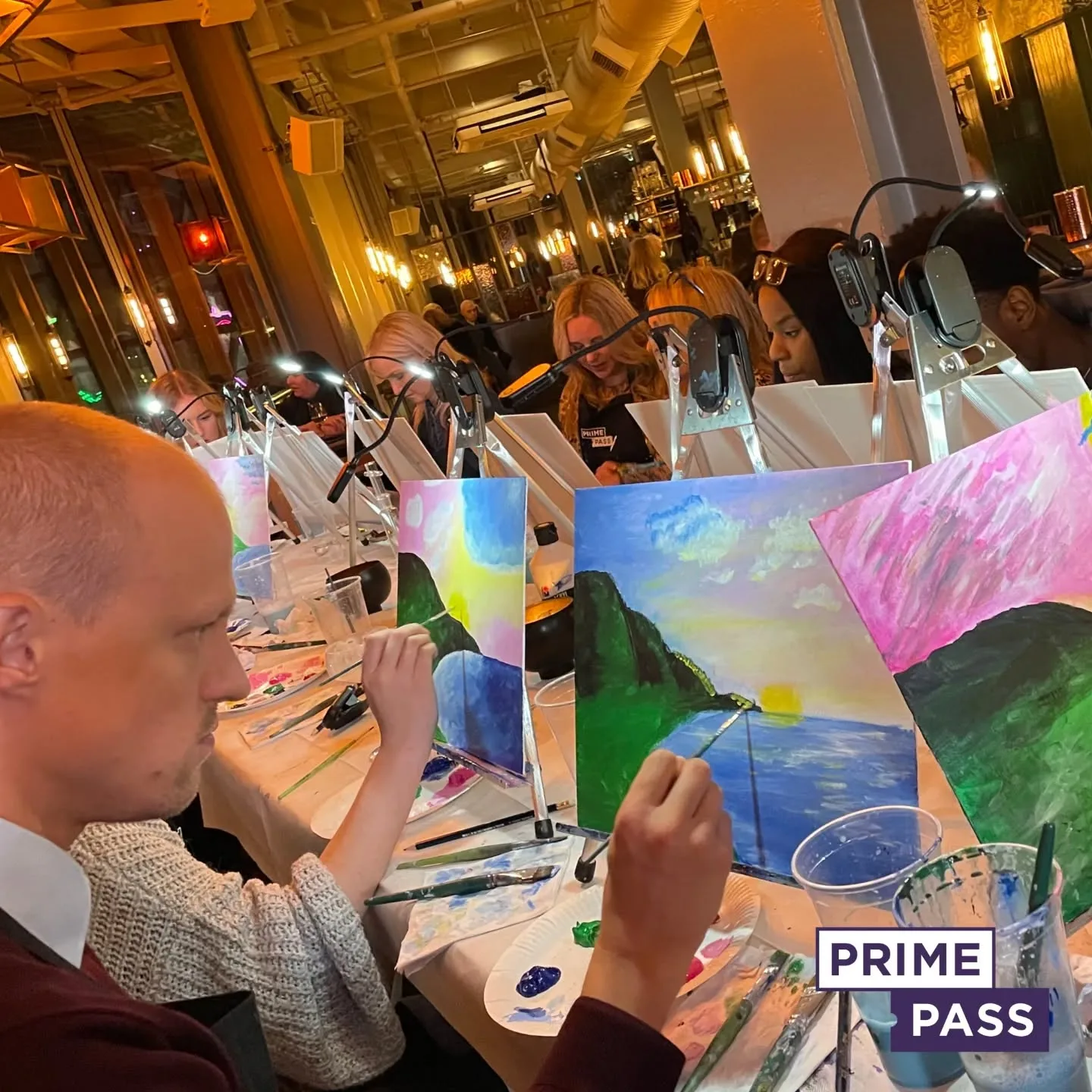
Book Your Painting Session with Prime Pass!

Looking for a unique and creative way to spend your time? Join a Paint and Sip session with Prime Pass! Whether you’re an experienced artist or a complete beginner, our sessions are designed to be fun, relaxing, and inspiring.
Enjoy an evening of painting, sipping your favorite drink, and unwinding in a welcoming atmosphere. Our expert instructors will guide you step by step as you create your masterpiece—no prior experience is needed!
Why Choose Prime Pass?
✅ Perfect for All Skill Levels – Whether you’re a first-timer or a pro, you’ll have a great time.
✅ Social & Fun – A great way to meet new people or enjoy time with friends.
✅ Great for Special Events – Perfect for date nights, birthdays, corporate events, and team-building activities.
✅ Everything Provided – We supply all the materials, so you just bring yourself and your creativity!
🎟️ Don’t Miss Out!
Book your Sip and Paint Class today and get ready for an unforgettable experience!
👉 Reserve Your Spot Now!

