Pastel colours are soft, muted versions of bright, saturated hues. They’re created by mixing a pure colour with white, which reduces the saturation (intensity) of the original hue and results in a lighter, more delicate tone.
These colours are often associated with:
- Calmness and serenity (like in wellness or therapeutic art)
- Youthfulness and playfulness (think nurseries, springtime themes, or dreamscapes)
- Light and airiness (perfect for balancing bold or dark compositions)
Some common examples of pastel colours include:
- Pale Pink (Red + White)
- Mint Green (Green + White, sometimes with a hint of blue)
- Baby Blue (Blue + White)
- Lavender or Lilac (Purple + White)
- Peach (Orange + White with a touch of red)
These colours are widely used across various art styles—especially in portraiture, floral painting, interior design, and modern digital art—to introduce softness, elegance, and emotional warmth. If you’re curious about how base colours like blue are created and adjusted for pastel shades, check out our full guide on what makes blue colour: mastering colour mixing.
How to Make Pastel Colours: The Basic Formula

While that’s technically true, creating the perfect pastel hue involves more than just tossing in white paint. You’ll need to consider tone (lightness/darkness), saturation (intensity), and undertone (temperature and colour bias). Let’s explore each step in greater depth:
1. Choose a Pure Base Colour
Start by picking a clean, vibrant primary or secondary colour. The more saturated the base hue, the better control you’ll have when adjusting it into a pastel version.
- Why this matters: Dull or already-muted colours can produce muddy pastels. Instead, begin with bold pigments like Cadmium Red, Ultramarine Blue, Phthalo Green, or Cadmium Yellow for the most luminous results.
- Pro Tip: If your goal is a soft, cool pastel, choose a cooler base (like blue or green). For a warm pastel (like peach or coral), start with a warmer base (like red or orange).
2. Add White Paint Gradually
Use Titanium White—the best choice for making pastels—because it’s highly pigmented, opaque, and brightens without compromising the body of your paint.
- Add small amounts at a time. It’s much easier to add more white than to fix a pastel that has been lightened too much.
- As you add white, observe the changes in both value (lightness) and intensity (brightness).
- The more white you add, the less saturated the colour becomes—so go slowly if you want to preserve vibrancy.
- What to avoid: Using too much white too quickly can wash out the colour, making it look chalky or lifeless.
3. Blend Thoroughly
Once your white and base colour are combined, make sure to mix them thoroughly using either:
- A palette knife (best for acrylic or oil) for consistent, smooth blending.
- A brush (for watercolour or gouache) to gradually integrate the tones.
- Why this step matters: Incomplete blending leads to patchy, inconsistent colours that can appear streaky when applied to canvas or paper.
- Smooth mixing also helps you identify whether the colour needs warming (add a touch of red/yellow) or cooling (add a touch of blue/green).
4. Test Before You Commit
This is one of the most overlooked yet crucial steps—always test your mix before applying it to your final work.
- Use a scrap piece of the same material you’re painting on (canvas, paper, etc.).
- Observe how the colour looks when dry. Many paints, especially acrylics and watercolours, dry darker or more muted than they appear when wet.
- If the colour isn’t quite right:
- Too dull? Add a tiny amount of pure colour.
- Too chalky? Mix in a hint of a warmer tone (like yellow ochre or peach) to soften.
- Not pastel enough? Carefully add a little more white.
- Too dull? Add a tiny amount of pure colour.
- Bonus Tip: Keep a notebook or swatch chart of your pastel mixes for future reference—you’ll thank yourself later.
How to Mix Popular Pastel Shades (Expanded)
Want to create your dreamy pastel palette? Below are popular pastel hues, the base colours you’ll need, and how to mix them for soft, beautiful results:
🌸 Pastel Pink
- Mix This: Cadmium Red or Alizarin Crimson
- Add: Titanium White
- Result: A soft, romantic pink perfect for florals, blush tones in portraits, or gentle backgrounds.
- Pro Tip: Alizarin Crimson gives a cooler, rosy tone, while Cadmium Red makes a warmer coral-pink.
💙 Baby Blue
- Mix This: Ultramarine Blue or Phthalo Blue
- Add: Titanium White
- Result: A cool, calming baby blue—ideal for skies, water, or soothing backgrounds.
- Pro Tip: Ultramarine gives a more muted, violet-blue pastel, while Phthalo produces a vibrant, crisp aqua-leaning tone.
🌿 Mint Green
- Mix This: Viridian or Phthalo Green
- Add: Titanium White
- Result: A refreshing, pastel green with a clean, slightly cool undertone.
- Pro Tip: For a warmer mint, add a tiny touch of yellow ochre. For a cooler mint, add a drop of blue.
💜 Lilac
- Mix This: Dioxazine Purple
- Add: Titanium White
- Result: A soft lavender or lilac hue, perfect for whimsical or dreamy compositions.
- Pro Tip: Dioxazine is very strong—start with a tiny amount to avoid overpowering the white.
🍑 Peach
- Mix This: Cadmium Red + Yellow Ochre
- Add: Titanium White
- Result: A warm, soft peach perfect for skin tones, floral highlights, or warm glows.
- Pro Tip: Balance is key—too much red will make coral, too much yellow turns it orange.
☀️ Soft Yellow
- Mix This: Cadmium Yellow or Lemon Yellow
- Add: Titanium White
- Result: A buttery, sun-kissed yellow that’s cheerful and light.
- Pro Tip: Lemon Yellow creates a cooler, pale pastel, while Cadmium Yellow is warmer and creamier.
If you’re exploring other soft tones, don’t miss our guide on what makes pink colour: guide to mixing the perfect shade, where we break down the steps to achieve flawless pastel pinks for any art style.
🔍 Pro Tips for Perfect Pastel Mixing
✅ Use a Clean Palette
Pastels are delicate—just a bit of leftover dark pigment can muddy your mix. Always clean your palette and brush thoroughly between colours to keep your pastels pure and vibrant.
✅ Adjust with a Neutral Tone
If your pastel turns out too intense or looks artificial, add a touch of grey or its complementary colour (e.g., a hint of violet in yellow) to gently neutralise it without losing its softness.
✅ Consider the Lighting
Natural daylight reveals true colours, while warm indoor lights can shift hues. Always review your mixes in multiple lighting conditions—especially for final pieces.
✅ Pair with Bold or Neutral Tones
Pastels pop when paired with contrast:
- Use bold, saturated colours for drama and contrast.
- Use earthy tones for a grounded, natural aesthetic.
- Example: Lilac next to deep plum, or soft peach beside warm ochre, creates instant depth.
🖌️ Using Pastel Colours in Your Artwork
Pastel tones aren’t just pretty—they’re versatile and emotional. Here are some ways to use them effectively:
- Soft, romantic portraits: Add pastel pinks, peaches, and lilacs to create gentle, lifelike skin tones and mood.
- Dreamy landscapes or skies: Use pastel blues, lavenders, and buttery yellows for peaceful skies or dawn/dusk scenes.
- Background washes: Let pastel tones fade softly in the background, making foreground details pop.
- Spring-inspired designs: Pastels are synonymous with renewal and freshness, perfect for florals and seasonal themes.
- Whimsical, childlike compositions: Mint, lilac, and soft pinks evoke innocence and imagination.
Emotional Impact: Pastels can evoke calm, nostalgia, serenity, joy, and lightness, bringing a quiet magic to any canvas.
🧠 Want to Master Colour Mixing Even Further?
Understanding pastel colours is just one part of the colour wheel. Dive deeper into colour theory with our companion guide:
👉 What Colours Make Yellow? Colour Mixing & Theory
This guide breaks down how to mix clean, vibrant yellows—and how to avoid common colour mixing pitfalls.
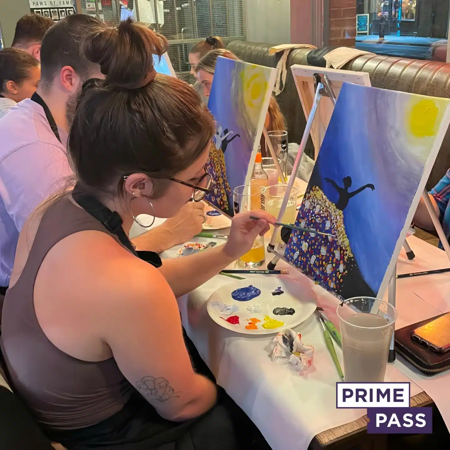
Book Your Paint and Sip Session
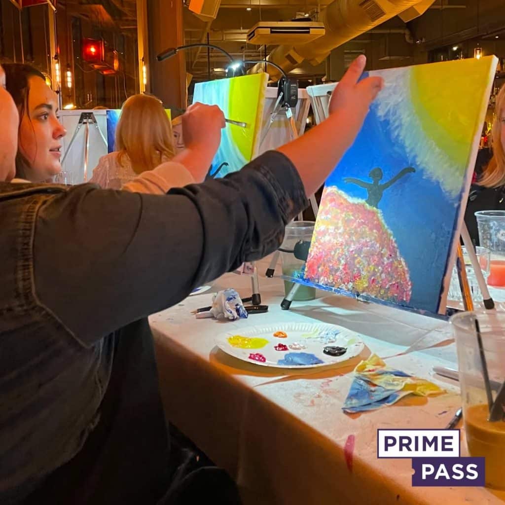
Ready to turn your knowledge of pastel colour mixing into a stunning masterpiece? Join us for an unforgettable Paint and Sip session, where creativity flows as freely as the wine!
Whether you’re looking to unwind after a long week, celebrate a special occasion, or simply explore your artistic side, our events offer the perfect blend of relaxation, fun, and guided painting. You’ll learn how to work with colour, layer pastels, and add soft, beautiful details—all in a welcoming, no-pressure environment.
🖌️ What’s Included:
- Step-by-step guidance from expert instructors
- All materials provided (canvas, paints, brushes)
- A glass of wine or your favourite drink
- A vibrant, social atmosphere
- A finished painting you’ll be proud to take home
No experience necessary—just bring your imagination and we’ll handle the rest!
👉 Book your Paint and Sip session now and discover the joy of painting with pastels in a creative, social space you’ll love.

