Fuchsia is a bold and energetic colour that sits between pink and purple on the colour wheel. It exudes vibrancy, confidence, and creativity, making it a popular choice across various fields, including fashion, interior design, digital art, and painting.

This eye-catching hue is often mistaken for magenta, but fuchsia has a cooler undertone due to the presence of blue. This gives it a more refined and elegant depth than the warmer, red-based magenta. Whether you are an artist, designer, or DIY enthusiast, knowing how to create and use fuchsia effectively can help you achieve stunning visual results in your projects.
Characteristics of Fuchsia
Fuchsia is widely recognised for its:
- Vivid appearance – A high-impact colour that instantly draws attention.
- Cool undertones – Unlike magenta, which leans more towards red, fuchsia contains subtle hints of blue.
- Versatility – Works well in fashion, home décor, graphic design, and even beauty products.
- Symbolism – Often associated with creativity, playfulness, and individuality.
The History of Fuchsia
The name “fuchsia” originates from the fuchsia plant, a flowering shrub renowned for its drooping blossoms in pink, purple, and red hues. The plant was named after the 16th-century German botanist Leonhart Fuchs, whose research contributed to the study of medicinal plants.
The colour fuchsia gained widespread popularity in the 19th century, particularly in textiles and fashion. Its striking nature made it a favourite for high-society dresses, decorative arts, and later, graphic design. Over time, it became a staple in modern branding, print media, and digital aesthetics.
Fuchsia vs. Magenta: What’s the Difference?
Although fuchsia and magenta are visually similar, there are distinct differences between the two:
| Feature | Fuchsia | Magenta |
| Undertones | Leans slightly towards blue (cooler) | Leans more towards red (warmer) |
| Appearance | Closer to deep pinkish-purple | Stronger, reddish-pink hue |
| Use in Design | Works well in modern, sophisticated palettes | Often associated with bold, energetic branding |
How to Choose Between Fuchsia and Magenta
- If you want a colour that feels slightly more refined and cool-toned, fuchsia is the better choice.
- If you prefer a warmer, more intense pink-red shade, magenta may be more suitable.
- For a contemporary and fashion-forward aesthetic, fuchsia often works best in clothing and interior design.
- For striking visuals in marketing and graphic design, magenta can make a bolder statement.
For more information:- How to make Magenta Colour
What Colours Make Fuchsia?
Fuchsia is a vibrant hue that falls between pink and purple. It is typically created by blending two primary colours with an optional secondary colour to enhance vibrancy. The key colours used to mix fuchsia are:
Essential Colours for Fuchsia
- Primary Red (Warm Tone) – A bright, warm red like crimson, cadmium red, or vermilion forms the base of fuchsia.
- Primary Blue (Cool Tone) – A cooler blue like ultramarine, cobalt, or phthalo blue deepens the colour and gives it a slightly purplish tint.
- Pink or Magenta (Optional) – Adding a touch of pink or magenta can enhance the vibrancy and brightness of fuchsia, making it more intense and neon-like.
By adjusting the proportions of red, blue, and pink, you can achieve different variations of fuchsia, ranging from warmer reddish tones to cooler purplish hues. To better understand how red plays a crucial role in color mixing, check out our detailed guide on What Makes Red Colour: Understanding Colour Mixing.
Colour Ratios for Fuchsia
Depending on the amount of red and blue used, fuchsia can appear warmer, cooler, or neon-like. Here are some common mixing ratios:
- Standard Fuchsia → 60% red + 40% blue (Balanced and vibrant)
- Warmer Fuchsia → 70% red + 30% blue (Leans towards deep pink)
- Cooler Fuchsia → 50% red + 50% blue (Closer to purple)
- Neon Fuchsia → 60% red + 30% blue + 10% pink (Bright and glowing)
Each variation of fuchsia can be customised further by tinting (adding white) or shading (adding black) to adjust brightness and depth.
Step-by-Step Guide to Mixing Fuchsia Paint
Mixing fuchsia paint requires careful blending to achieve the desired shade. Follow these steps for the best results:
1. Start with a Red Base
- Begin with a warm-toned red, such as crimson, cadmium red, or vermilion.
- Place a small amount of red paint on your palette as the foundation for fuchsia.
2. Gradually Add Blue
- Slowly mix in a cool blue like ultramarine, cobalt, or phthalo blue.
- Add blue in small increments to prevent the mixture from turning too purple.
- Mix thoroughly after each addition to evenly blend the colours.
3. Adjust the Shade
- If the colour appears too purple, add a little more red to bring it back towards fuchsia.
- If the colour looks too red, add a tiny amount of blue to cool it down.
- For extra vibrancy, introduce a small amount of pink or magenta to intensify the shade.
- To brighten the mixture, incorporate a touch of white to create a softer, pastel fuchsia.
4. Test the Colour on Paper or Canvas
- Before applying fuchsia to your artwork, test the mixture on a scrap piece of paper or canvas.
- Allow it to dry slightly, as some paints (especially acrylics and oils) can darken when dry.
- If needed, tweak the mixture by adjusting the red, blue, or pink proportions.
5. Modify for Different Media
The technique for achieving fuchsia varies slightly depending on the type of paint you are using:
- Acrylic Paints – Mix in a small amount of white to enhance brightness and opacity.
- Watercolours – Dilute with more water to achieve a transparent, delicate fuchsia.
- Oil Paints – Use a blending medium like linseed oil for smoother colour transitions.
By following these steps, you can create the perfect fuchsia shade tailored to your needs, whether for painting, design, or DIY projects.
Fuchsia Colour Variations and How to Mix Them
Fuchsia is a versatile colour that can be customised into various shades depending on your desired outcome. By adjusting the amounts of primary colours, secondary colours, and additional tints, you can achieve a wide range of fuchsia variations—from bold and neon to soft and pastel. Here are a few popular fuchsia variations and tips on how to mix them effectively:
1. Neon Fuchsia
Neon fuchsia is a bright, electric version of the traditional fuchsia that appears almost glowing. This shade is perfect for creating high-energy, bold designs or for use in fashion, graphic design, or art installations.
How to Mix Neon Fuchsia
To create neon fuchsia, the key is to make the colour intense and luminous. Here’s how to mix it:
- Start with the base fuchsia mixture using the standard ratio of 60% red and 40% blue.
- Gradually add a small amount of white to the mixture. The white will lighten the colour and make it appear more vibrant, intensifying the neon effect.
- Test your mix and adjust by adding more red if the colour leans too much toward purple, or more blue if it’s too pink.
- Neon fuchsia often works best when it’s used alongside dark backgrounds to make the bright hue really pop.
Tip: For an even more intense neon effect, consider using fluorescent or neon paints that have built-in glowing properties under UV light.
2. Deep Fuchsia
Deep fuchsia is a richer, darker variation of the standard fuchsia. It has a greater emphasis on the purple tones, making it ideal for luxurious or dramatic designs. This variation is perfect for creating shadows or depth in artwork or adding an element of sophistication in fashion and décor.
How to Mix Deep Fuchsia
To achieve deep fuchsia, you’ll need to intensify the cool tones of the fuchsia mixture:
- Start with the base fuchsia of 60% red and 40% blue.
- Add extra blue (preferably a cool shade like ultramarine or phthalo blue) to deepen the overall tone.
- If the resulting colour appears too cold or purple, you can add a little more red to balance it out.
- The result should be a rich, dark fuchsia that leans slightly towards a deep pinkish-purple, giving it a more elegant, understated feel.
Tip: Deep fuchsia works well for nighttime events, formal attire, or dramatic, shadowed effects in paintings. Combine it with gold accents for a touch of luxury.
3. Pastel Fuchsia
Pastel fuchsia is a softer, lighter version of fuchsia that is more muted and subtle. This version has a gentler, airier appearance and is often used in baby clothing, wedding decorations, or gentle art pieces that require a more subdued colour palette.
How to Mix Pastel Fuchsia
To create pastel fuchsia, the process involves lightening the colour significantly:
- Start with the base fuchsia mixture of 60% red and 40% blue.
- Gradually add more white to the mixture to lighten the tone. The more white you add, the softer and paler the fuchsia will become.
- To maintain the pinkish undertones, add a little more pink or magenta to prevent it from becoming too lavender or purple.
- The result should be a soft, pastel fuchsia that is both delicate and vibrant, perfect for creating a gentle and romantic mood.
Tip: Pastel fuchsia works beautifully in combination with other pastel colours like mint green, light yellow, or soft lavender for a dreamy, harmonious look. It can also be used for baby shower decorations or spring fashion.
Summary of Fuchsia Colour Variations
Fuchsia can be manipulated in many ways to fit the mood, theme, and purpose of your project. Here’s a quick breakdown:
| Shade | How to Mix |
| Neon Fuchsia | Add a small amount of white to brighten the mixture and create a glowing, electric effect. |
| Deep Fuchsia | Increase the amount of blue to deepen the colour and give it a rich, luxurious purple-pink hue. |
| Pastel Fuchsia | Add more white and a touch of pink to soften the colour, creating a delicate and gentle pastel tone. |
Where Is Fuchsia Used?
Fuchsia is a dynamic, attention-grabbing colour that is utilised across various industries and applications. From fashion to art, its vibrant energy makes it a popular choice for creating impact and standing out. Here’s where you’ll often see fuchsia:
1. Fashion and Clothing
Fuchsia is an eye-catching and bold colour often used to make a statement in the fashion world. Whether it’s for spring and summer collections or nighttime glamour, fuchsia’s striking hue is a favourite for making outfits pop.
- Dresses and Gowns – Fuchsia is frequently seen in evening wear and cocktail dresses, offering a chic and lively alternative to traditional colours like red or black.
- Handbags and Accessories – Bright fuchsia handbags, scarves, and hats add a playful and luxurious touch to any outfit.
- Footwear – Fuchsia is popular in shoes, particularly high heels or sneakers, giving footwear a fun and vibrant look.
Fashion Tip: Fuchsia pairs beautifully with neutral tones like black, white, or beige for a striking contrast.
2. Interior Design
In interior design, fuchsia is used to bring energy and personality to spaces. It’s a great choice for those looking to add bold accents or create a vibrant atmosphere.
- Accent Walls – A fuchsia feature wall in a living room or bedroom can instantly elevate the room’s style.
- Furniture – Upholstery in fuchsia is a dramatic statement piece, perfect for chairs, sofas, or cushions.
- Statement Décor – Fuchsia lampshades, vases, or art pieces can add a burst of colour to any space without overwhelming the entire room.
Interior Tip: Combine fuchsia with gold accents for a luxurious and glamorous feel, or with grey tones to balance out the intensity of the colour.
3. Graphic Design & Branding
Fuchsia’s vibrant and energetic quality makes it a popular choice in graphic design and branding, where it can attract attention and evoke a sense of creativity and excitement.
- Logos and Branding – Many modern brands use fuchsia in their logos or advertisements to create a bold, youthful image. Companies in the tech, fashion, and beauty industries often embrace fuchsia for its modern appeal.
- Web Design – Fuchsia works well for call-to-action buttons, backgrounds, and headlines on websites, drawing users’ eyes to important elements.
- Digital Art – Fuchsia is frequently used in digital illustrations and motion graphics to create impactful visuals.
Design Tip: When using fuchsia in branding, pair it with clean fonts and minimalistic designs to allow the colour to stand out without overwhelming the viewer.
4. Makeup & Nail Art
Fuchsia has a bold, confident vibe, making it a favourite choice in the world of beauty. Its vibrancy makes it perfect for creating standout looks in makeup and nail art.
- Lipsticks – Fuchsia lipsticks give a dramatic and fun look, whether as an everyday statement or for a night out.
- Nail Polish – Fuchsia nails are a go-to for those wanting a bright, playful look. From matte to glossy finishes, fuchsia adds a pop of colour to any manicure.
- Eyeshadows – As a bold alternative to traditional neutral shades, fuchsia eyeshadow creates striking, intense eye looks, often paired with darker eyeliner for added drama.
Beauty Tip: Fuchsia lipstick looks fantastic when paired with minimal makeup elsewhere, letting the bold colour take centre stage.
5. Painting and Artwork
Fuchsia is also widely used in painting for its vibrant, energetic qualities. It’s a popular choice in various art forms, whether in abstract art, landscapes, or portraits. Artists use fuchsia to create bold contrasts, emphasise details, or to add emotional intensity to their work.
- Abstract Art – The vibrancy of fuchsia makes it ideal for creating dramatic, eye-catching pieces. It can be used to evoke emotion or highlight certain areas in the artwork.
- Floral Paintings – Fuchsia is commonly used to paint flowers like orchids, roses, or peonies, giving them a lively and fresh look.
- Pop Art and Street Art – Fuchsia’s boldness aligns with the dynamic, graphic quality of pop art and street art.
Art Tip: Use fuchsia as a contrast colour alongside cooler tones like blues and greens to create a vibrant, complementary palette.
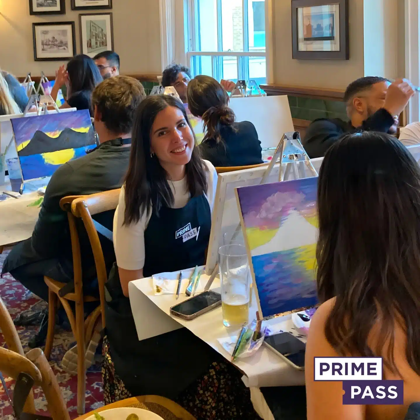
Book Your Sip and Paint Class with Prime Pass

Looking for a fun and creative way to unwind? Book a Sip and Paint Class with Prime Pass today! Whether you’re a seasoned artist or a beginner, our interactive painting classes are perfect for any skill level.
🍷 Enjoy a glass of wine as our expert instructors guide you step-by-step through creating your very own masterpiece.
🎨 Unleash your creativity in a relaxed, vibrant atmosphere!
💬 Great for groups, date nights, or solo artists – bring your friends or come solo for a unique experience.
🔗 Book now to reserve your spot and create lasting memories at our Prime Pass Sip and Paint event.

