Ivory is a timeless, elegant, and warm neutral colour often associated with sophistication, purity, and luxury. It sits between white and cream on the colour spectrum but with a distinct golden or yellow undertone that makes it unique. Its name is derived from the tusks of elephants, historically used to carve fine objects, which gives it an exotic and classical connotation.
Understanding how to mix the perfect ivory colour is essential for artists, designers, and anyone looking to recreate this soft and inviting shade in their work. Whether you are mixing paints, decorating a space, or choosing a fabric for fashion, knowing how to achieve ivory allows you to bring that perfect off-white, creamy colour to life. This article will walk you through the process of creating ivory colour, its historical significance, and its applications in art, design, and fashion. If you want to explore other classic and timeless shades, you can check out our guide on What Makes Magnolia Colours a Complete Guide.
What Is Ivory Colour?

Before diving into how to mix ivory, it’s important to understand its composition and why it’s different from pure white or cream. Ivory is a light, warm, off-white colour with subtle yellow and beige undertones. It can often appear as a more sophisticated and refined alternative to plain white, which can sometimes be harsh or sterile in certain design applications.
The key to achieving ivory is the balance between the yellow, beige, and white tones, with just a hint of brown for depth. This combination results in a versatile colour that complements a wide range of other hues, especially in design and fashion.
Materials and Tools Needed to Create Ivory Colour
Creating ivory involves mixing a few basic colours, and the process may vary depending on whether you’re working with acrylic, oil paint, watercolours, or digital design. Below is a detailed breakdown of the materials and tools you will need for each medium.
1. Acrylic or Oil Paints
Acrylic and oil paints are the most common medium for creating ivory colour. To start, you’ll need a few key colours and tools:
Essential Paints:
- Titanium White: This is your base colour and will serve as the foundation for the ivory tone. It’s an opaque white that is bright and pure.
- Cadmium Yellow or Lemon Yellow: This yellow adds warmth and will create the yellowish hue typical of ivory. Choose a warm yellow like cadmium yellow to make the tone more vibrant.
- Burnt Umber or Raw Sienna: Both of these colours are browns that will help you add depth to the ivory. Burnt umber adds a darker, earthier tone, while raw sienna offers a softer, more neutral brown. These are used sparingly to avoid making the ivory too dark.
Tools:
- Palette: A clean surface to mix your paints. It should be large enough to give you plenty of space to experiment with proportions.
- Brushes: Various sizes for mixing and applying the paint. A flat brush is useful for even colour mixing, while smaller round brushes are good for applying the final layer of ivory.
Steps for Mixing Ivory with Acrylic or Oil Paint:
- Prepare your Palette: Squeeze a generous amount of titanium white onto the palette as the base. This is the lightest and most opaque colour you’ll work with, so it will form the foundation of your ivory.
- Add Yellow: Gradually mix in cadmium yellow or lemon yellow. Start with a small amount and continue to add until you achieve a warm, yellowish tone. The more yellow you add, the warmer your ivory will become. Adjust the quantity depending on the warmth you desire.
- Introduce Brown or Beige: Add burnt umber or raw sienna to the mix, but only in small amounts. You want to maintain the lightness of the ivory while adding enough depth to prevent the colour from becoming too stark. Mix carefully to avoid overpowering the yellow and white.
- Adjust to Desired Tone: If the ivory is too dark, add more titanium white or yellow to lighten it. If the ivory appears too light and lacks depth, mix in a little more burnt umber or raw sienna to adjust the tone.
2. Watercolours
Watercolours are another popular medium for creating ivory, as they have a light, translucent quality. Follow these steps to mix ivory with watercolours:
Essential Paints:
- Titanium White (or any other opaque white): This will be your base and will help create a soft, light ivory tone.
- Cadmium Yellow or Yellow Ochre: Use these yellow hues for warmth and depth. Yellow ochre offers a more muted yellow compared to cadmium yellow, which can make your ivory appear softer.
- Burnt Sienna or Raw Umber: These brown colours are perfect for adding richness and subtle depth. They work similarly to their oil and acrylic counterparts, providing a grounded tone to the ivory.
Tools:
- Watercolour Brushes: Use round brushes for controlled colour application and blending.
- Watercolour Palette: A flat palette is ideal for mixing watercolours, as it allows for gradual mixing without too much dilution.
Steps for Mixing Ivory with Watercolours:
- Prepare the White Base: Start by mixing titanium white with a little water to create a watery base. This will ensure the ivory remains light and translucent.
- Add Yellow: Mix in cadmium yellow or yellow ochre to create warmth. The amount you use depends on how warm or pale you want your ivory to be.
- Introduce Brown: Add small amounts of burnt sienna or raw umber to your mixture. Remember that watercolours tend to be lighter in tone, so avoid overloading the mixture with brown. The goal is to add just enough to bring in the depth without overshadowing the yellow and white.
- Fine-tune the Mixture: Add more white or yellow to adjust the tone, making the ivory lighter, or add more brown if you need more depth. Remember, watercolours are transparent, so the final ivory colour will look slightly different once it dries.
3. Digital Design Tools
In the realm of digital design, creating an ivory colour is a more technical process that relies on specific colour values. Use the following tools and steps:
Digital Colour Settings:
- RGB Values: To create ivory digitally, start with the following RGB values: 255, 255, 240. This will give you a soft ivory tone. You can adjust these values slightly to match your preferred shade, but this base value will get you close to a traditional ivory look.
- HEX Code: The HEX code for ivory is typically #FFF8E1 or #F0E68C. These can be used in any design software that supports colour input by code.
- Adjustments: In digital design tools such as Photoshop, Illustrator, or Canva, you can adjust the brightness and contrast of your white or light tones to achieve ivory. Increasing the yellow saturation and reducing the blue can also enhance the warm aspect of ivory.
Steps for Creating Ivory in Digital Design:
- Start with a White Background: Begin with pure white as your base colour.
- Adjust the Yellow Tone: Use the RGB or HEX values mentioned above to add warmth to the base white. For example, adjust your RGB values to 255, 255, 240 to create a creamy, yellowish ivory.
- Fine-tune: If your ivory colour appears too bright or too light, reduce the RGB value of green or blue slightly, or increase the yellow. Keep tweaking until you achieve the desired warmth and tone.
4. Brushes and Palettes
Regardless of the medium you choose, the following tools will help with your mixing and application process:
- Brushes: A variety of brush sizes is essential. For mixing, use flat brushes to ensure even distribution of colours. For finer details and applying your ivory mix, use smaller round brushes.
- Palettes: Depending on the medium, use either a traditional paint palette (for acrylics or oils) or a watercolour palette for mixing your colours. In digital design, a digital colour palette or the colour picker tool in your software will be your primary mixing tool.
Expanded Step-by-Step Guide to Mixing Ivory Colour
Now that you have gathered all your materials, it’s time to dive into the detailed process of mixing the perfect ivory shade. Depending on whether you’re using traditional paints or working digitally, the method may vary slightly, but the fundamental steps remain the same.
Step 1: Start with a Base of White

The first and most crucial step when mixing ivory is to start with a solid white base. This is because white serves as the foundation for creating lighter tones, and it will allow the other colours you add to mix evenly.
Traditional Paints (Acrylic, Oil, or Watercolours):
- Titanium White is the best choice here, as it’s an opaque white that provides full coverage and gives your mix a bright, clean base.
- Squeeze a generous amount of Titanium White onto your palette. If you’re working with watercolours, use a concentrated amount of white gouache or opaque white to achieve the same result.
Digital Design:
- Start with pure white in your design software (RGB: 255, 255, 255). This will give you a blank canvas from which you can gradually introduce warmth and depth.
Step 2: Add Yellow to Warm the Tone
The next step is to introduce warmth to your ivory mix, and yellow is the colour that brings out this warmth. Yellow can be a dominant colour, so it’s essential to add it gradually.
Traditional Paints:
- Cadmium Yellow or Lemon Yellow are perfect for this step. Cadmium Yellow will give your ivory a rich, golden hue, while Lemon Yellow will create a more delicate, pale yellow undertone.
- Add a small amount of yellow to your white base. Start by mixing just a dab of yellow, then check the result. You want to warm up the tone without overwhelming the white.
Digital Design:
- In digital design, select RGB (255, 255, 240) to create a warm ivory. Adjusting the yellow saturation slightly will help you add warmth without making the ivory too bold. Experiment with RGB (255, 255, 220) for a more pastel-like ivory tone.
Step 3: Introduce a Hint of Brown or Beige
Once you’ve added the yellow and achieved the warm undertone, it’s time to introduce some depth to your ivory. Brown or beige tones are perfect for this, as they will soften the yellow while maintaining the colour’s subtlety.
Traditional Paints:
- Burnt Umber is ideal for adding a rich depth. It’s a warm, earthy brown that complements the yellow without overpowering it.
- Raw Sienna is a lighter, more muted brown with a slightly reddish tint. This adds a softer depth and warmth to the ivory without darkening it too much.
- Add just a tiny touch of brown to the mix. Keep in mind that brown is a potent colour, so proceed with caution—start with a small amount, then mix thoroughly. You can always add more later if needed.
Digital Design:
- Add a subtle amount of RGB (205, 175, 145) or HEX #C9A98A to introduce an earthy, beige tone. You can do this by adjusting the brightness and contrast of your white and yellow mix to give it an elegant depth.
Step 4: Adjust the Tone with White or Yellow
Now that your ivory mix has started to come together, it’s essential to fine-tune it to get the perfect shade. Depending on whether your mix is too dark, too warm, or too light, you’ll need to adjust it.
Traditional Paints:
- If your ivory is looking too dark or too rich, simply add a little more Titanium White. This will lighten the tone and bring back the brightness.
- If your ivory appears too light or too cool, add a little more Cadmium Yellow or Burnt Umber to balance it out.
- Continuously mix the colours until you achieve the precise ivory tone you’re aiming for.
Digital Design:
- If your digital ivory is too dark, reduce the amount of brown or yellow and bring the white values back up.
- If your ivory looks too light or too stark, increase the yellow or beige saturation slightly to warm it up and make it look richer.
Step 5: Test the Colour
It’s important to test the ivory mix before finalising it, as colours can appear different depending on the context in which they’re used.
Traditional Paints:
- Use a test piece of canvas, paper, or any material you’re working on. Apply a small swatch of the ivory mix to see how it looks once dried. Paintings or projects done under various lighting conditions might show the ivory differently, so it’s a good idea to check the shade under natural light, artificial light, or any specific lighting conditions in your workspace.
Digital Design:
- View the ivory colour on a digital background or design project. Digital colours can look different on various screens, so it’s worth viewing the design on different devices to see how the ivory interacts with other colours and lighting.
Step 6: Optional – Add Metallic or Shimmering Effects
If you want your ivory to have an extra touch of elegance or luxury, you can experiment with adding metallic or shimmering effects. This is often used in design and decorative art for a more glamorous finish.
Traditional Paints:
- Metallic Gold or Pearl Pigment: These can be mixed into the ivory to create a shimmery effect. Adding these pigments can give your ivory a luminous, reflective finish, ideal for luxurious art pieces, fashion, or high-end designs.
- Add a small amount of metallic gold or pearl pigment to your ivory mix and test it out. Be careful not to overdo it, as the shimmer effect should remain subtle and not overpower the ivory colour.
Digital Design:
- In digital design, use tools like gradient overlay or shiny textures to create a metallic or pearlescent effect. Many design software options like Photoshop allow you to layer effects that give the ivory a glowing or reflective appearance. Using a subtle glow effect can also simulate the appearance of shimmer in your ivory tones.
Variations of Ivory Colour
Ivory can range from a very pale, almost white shade to a richer, deeper beige. Here are a few variations to consider:
- Cream Ivory: A lighter version of ivory, where more white and less brown is used. It has a soft, delicate appearance.
- Warm Ivory: A deeper, richer ivory with more yellow and brown mixed in. It has a golden tone and is commonly used in traditional art and design.
- Cool Ivory: A more neutral, less yellow-based ivory with a touch of gray or blue. This version can sometimes be called “off-white” or “soft pearl” and is popular in contemporary design.
Applications of Ivory Colour in Art, Design, and Fashion
1. Art:
Ivory is a popular choice in painting, especially for artists who wish to evoke a sense of timeless elegance and subtle warmth. Whether used as a base for skin tones, backgrounds, or light sources, ivory is highly versatile and adds an element of richness without being overpowering. It is often used in classical paintings, where softer, neutral tones complement more vivid colours.
2. Interior Design:
In home décor, ivory works beautifully as a neutral background colour. It’s often used for walls, furniture, and fabrics because it complements most colour schemes while creating an elegant and peaceful atmosphere. Ivory is popular in both traditional and modern designs, from luxurious bedrooms with ivory linens to sophisticated living rooms with ivory-coloured furniture and accents.
3. Fashion:
Ivory is a go-to colour in fashion, particularly for formal and wedding attire. Its warm tone exudes elegance and refinement, making it a popular choice for dresses, suits, and accessories. The soft, muted hue makes ivory less stark than white, while still maintaining an air of sophistication.
4. Graphic Design:
In digital design, ivory is used to create clean, modern, and refined visuals. It’s commonly used in website backgrounds, packaging designs, and branding for luxury products. Designers often use ivory to evoke feelings of simplicity and elegance while providing a soft alternative to white
Common Mistakes When Mixing Ivory Colour
While mixing ivory may seem simple, there are a few common mistakes that can occur. Here are some of them and how to avoid them:
- Using Too Much Yellow: Too much yellow can make your ivory look too bright or golden. It’s essential to use yellow sparingly and always adjust the tone by adding white or brown.
- Overdoing the Brown: Brown is used to add depth, but too much of it can make the colour look muddy. Always add small amounts and gradually build up the depth.
- Not Testing the Colour: Ivory can look different depending on the medium and lighting. Always test the colour on the canvas, paper, or digital screen before finalizing your choice.
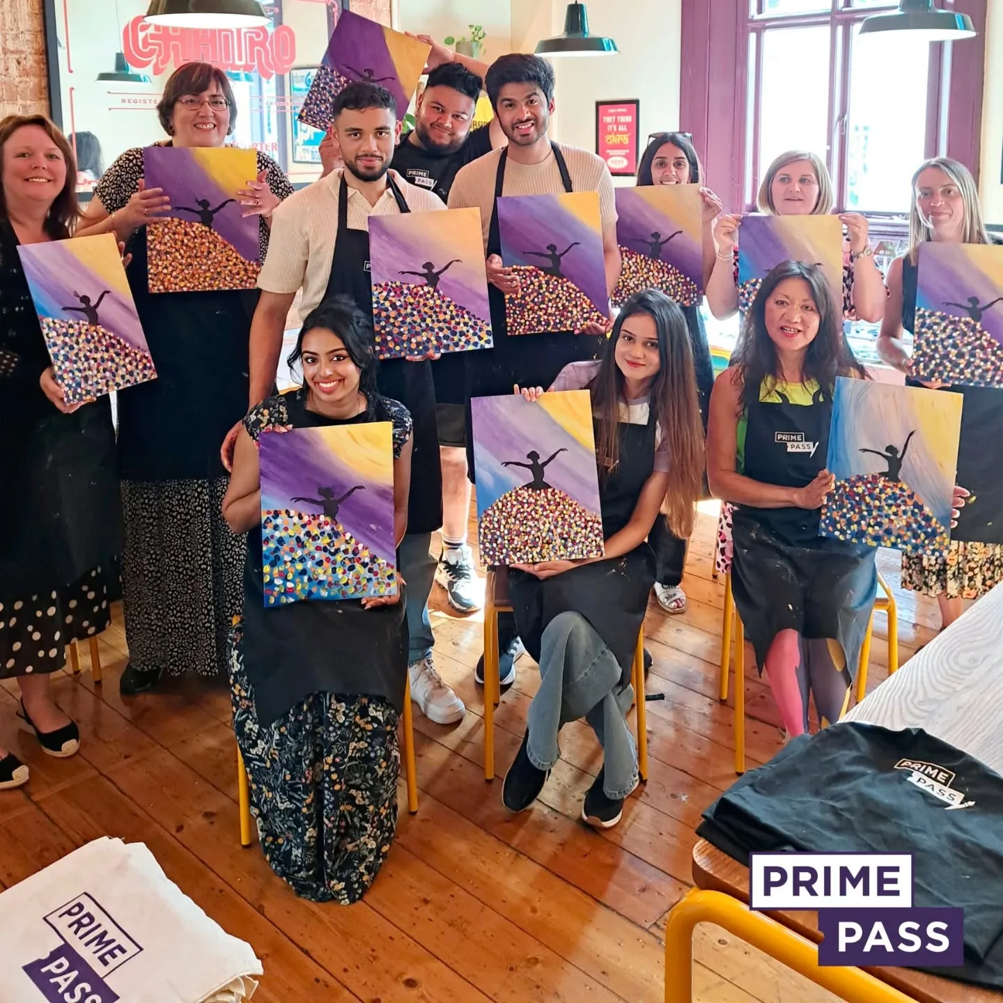
Book Your Sip and Paint Classes With Prime Pass

If you’re looking for a fun and creative way to unwind, why not Book your Sip and Paint classes with Prime Pass? Whether you’re a beginner or an experienced artist, our classes are designed for everyone to enjoy a relaxing and entertaining experience.
With Prime Pass, you can enjoy:
- Step-by-step guidance from skilled instructors.
- A fun and laid-back atmosphere where you can socialise and express your creativity.
- All materials provided, including paints, brushes, and canvases.
- BYOB policy for drinks, allowing you to sip your favourite beverage as you paint.
- Perfect for groups, team-building events, or a unique night out.
So, if you’re in the mood to create something beautiful, all while enjoying a drink and some great company, book your Sip and Paint class with Prime Pass today! It’s the ideal way to tap into your artistic side, have fun, and make lasting memories.
Visit Prime Pass to reserve your spot and find out more about our upcoming classes and events!

