Coral Colour is one of those vibrant and versatile hues that can make a space, a wardrobe, or a piece of artwork pop with energy. Coral’s cheerful, yet calming properties make it a popular choice in various industries, from fashion and interior design to graphic design and art.
This article will serve as your ultimate guide to mixing coral colour. Whether you are an artist looking to create the perfect shade for your next masterpiece, a fashion enthusiast trying to craft a tailored outfit, or a designer wanting to find the ideal coral tone for your next project, you’ll find everything you need here.
If you are exploring various colours for painting and design, it might also be interesting to learn about other colours like sage and how they pair with coral in artwork or interiors. For more information on how to incorporate sage into your creative projects, you can explore our guide on What Makes Sage Colour Essential & Combinations for Painting.
Understanding Coral Colour: What Makes Coral Colour

Coral is typically a pinkish-orange colour that can vary from soft, pastel-like tones to deeper, more saturated hues. The combination of red, yellow, and pink tones gives coral its warm and vibrant appearance. Coral is closely related to its namesake—the coral reefs found in tropical and subtropical oceans—which often display rich shades of pink and orange. This colour is full of life, warmth, and an undeniable sense of cheer.
Why Coral Colour is Popular?
People love coral because it brightens things up but also has a classy feel. This colour is just right—it’s versatile enough for many different projects. It is equally at home in the world of fashion, interior design, art, and even digital design.
In interior design, coral works wonderfully as a statement wall or accent colour in rooms where a pop of colour is needed. In fashion, coral has been a perennial favourite, especially in the warmer months, and is flattering on a variety of skin tones. Think sunshine and the ocean: that’s the feeling coral gives art. It’s a powerful tool for expressing positive emotions. Want a website or logo that screams “young and fresh”? Use coral. The colour’s lively energy combined with its subtle elegance makes it ideal for brands targeting a younger demographic. Think of the vibrancy of a sunrise meeting the calmness of the ocean. That’s coral.
With all of this in mind, let’s dive into the process of mixing coral and how you can create your own perfect version of this lively and beautiful colour.
How to Mix Coral Colour

Coral is essentially a combination of red and orange with a touch of pink. To mix coral, start with a base of red and yellow, then add white to lighten and adjust the hue as needed, aiming for a pinkish-orange shade. However, depending on the desired shade, you may need to adjust the ratio of these colours and blend them carefully to achieve the perfect coral.
Step 1: Start with Red, Yellow, and Pink
The first step in mixing coral is to start with the base colours: red, yellow, and pink. These colours are the foundation of any coral shade, with red and yellow being the dominant hues. You can either use primary colours (red, yellow, blue) or premixed colours for this process.
- Red: The red you use can influence the final result. A cool red will produce a more subdued, pinkish coral, while a warm red will create a more vibrant, orange-toned coral.
- Yellow: Yellow plays a big role in coral, as it imparts warmth to the final hue. A warm yellow will push the tone toward the orange side of the spectrum.
- Pink: Adding pink softens the intensity of the orange-red mixture and introduces a more feminine, pastel quality to the mix.
Step 2: Combine Red and Yellow to Make Orange
To get started, mix equal parts of red and yellow to create a basic orange. This will be the foundation of your coral mix. Be sure to start with a small amount, as you can always add more to adjust the shade. Stir the mixture thoroughly to create a smooth, uniform colour.
- Warm Orange: If you want a more vivid coral, use a warm yellow (such as cadmium yellow) and a slightly warm red (like cadmium red) for a more vibrant, fiery orange base.
- Cool Orange: If you want a softer, pastel coral, use a cooler yellow (such as lemon yellow) with a cool red (like alizarin crimson) for a more subtle orange.
Step 3: Add Pink to Adjust the Shade
Once you have your orange base, add a small amount of pink. Pink will not only soften the colour but also add depth and complexity to the hue. Depending on the shade of pink you use, you can make the coral appear more muted, pastel, or bright.
- Soft Pastel Coral: Use a soft, cool pink, such as quinacridone rose or rose madder, to give the coral a delicate, pastel appearance.
- Bright Coral: Use a vibrant, warm pink (such as permanent rose or hot pink) for a lively, more intense coral colour.
Step 4: Fine-Tune the colour
After mixing the red, yellow, and pink to create your base coral, take a step back and assess the colour. If the shade is too vibrant and leaning toward orange, add more pink or a touch of red to cool it down. On the other hand, if the coral is too cool and leaning toward pink, add a little more yellow to bring it back into the warm orange spectrum.
- For a Lighter Coral: Add a touch of white paint to lighten the coral mix, giving it a softer, more pastel appearance.
- For a Deeper Coral: Add a small amount of brown or burnt umber to deepen the tone and make it more earthy and subdued.
Step 5: Testing Your colour
It’s important to test your coral colour on a surface similar to the one you’ll be working with. The lighting in the room or environment can affect how the colour looks, so swatching the paint is a good idea before committing to large-scale application.
If you’re painting on canvas, try mixing a small sample of the coral and applying it to the surface to see how it looks once it dries. For fashion or digital design, testing the colour with fabrics or in design software can help ensure the coral will give the desired effect.
Different Variations of Coral colour
Coral can be mixed and adjusted to achieve a wide range of shades. The hue is not limited to a single tone but can encompass several variants depending on the colour proportions. Here are some common types of coral and how they differ:
Peach Coral
- Peach coral is a lighter, softer version of coral, with more yellow and pink undertones than orange. It’s often used in more delicate and feminine designs and is a popular shade for weddings, baby showers, and spring fashion.
Salmon Coral
- Salmon coral features a more pronounced pink undertone, giving it a muted, pastel-like effect. It’s a sophisticated choice often seen in interior design and art.
Deep Coral
- Deep coral has more red in it, giving it a richer, more intense look. It is often used for bold statements in fashion and home décor and can be paired with more neutral tones for contrast.
Living Coral
- Living Coral was declared Pantone’s colour of the Year in 2019, and it’s a bright, vibrant coral that incorporates both pink and orange tones. It’s lively, fresh, and playful, making it perfect for fashion, graphic design, and web design.
Applications of Coral Colour
Coral is a versatile colour that has applications across various industries. From clothing to home décor, art to digital design, coral can be used to create striking, impactful visuals.
Fashion
Coral is a staple in spring and summer wardrobes due to its bright, cheerful appearance. Many different skin tones look amazing in this colour; it’s a great choice for everyone! It appears in fashion—dresses, shirts, and jewelry—plus, you can even find it in cosmetics.
Interior Design
In interior design, coral is used to add warmth and energy to spaces. It pairs beautifully with neutral colours like gray, beige, and white, as well as with shades of teal, navy, and gold. Coral can be used for accent walls, throw pillows, curtains, or decorative items to create a vibrant atmosphere.
Art
Coral gives art a burst of warmth and energy. Landscapes, portraits, and abstract art all use it often. Coral makes colours pop! It works beautifully in both watercolour and oil paintings.
Web Design
In the digital realm, coral is used in web design to convey warmth, enthusiasm, and positivity. Its vibrant tone makes it ideal for call-to-action buttons, highlights, and branding. It pairs well with other energetic colours like turquoise or yellow.
Branding
Many brands use coral in their logos and visual identity. It’s modern, fresh, and friendly—ideal for beauty, wellness, and lifestyle brands
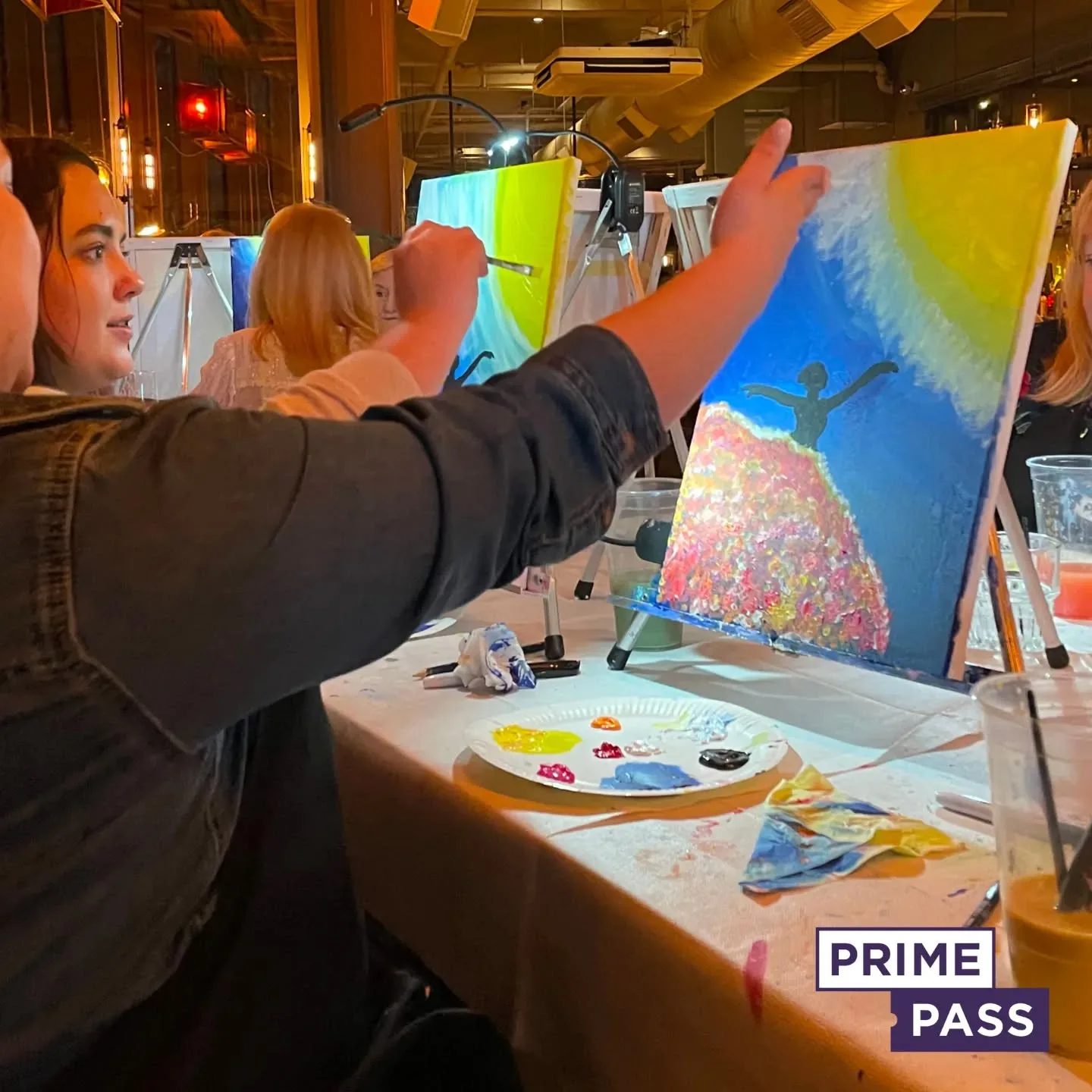
Book your sip and paint session with Primepass

Looking for a fun and creative way to unwind? Book your Sip and Paint session with Prime Pass today and explore the vibrant beauty of coral colour! Coral, a blend of pink and orange, is a lively and warm hue that adds energy and charm to any painting. Whether you’re a seasoned artist or just starting our Sip and Paint sessions offer the perfect opportunity to experiment with coral and create your masterpiece.
What We Offer:
- A guided painting experience led by professional artists, where you can explore the various shades of coral and other beautiful colours.
- All materials provided, including paint, brushes, canvases, and of course, your favourite drinks to sip on while you unleash your creativity.
- A wide range of painting styles and themes to choose from, allows you to incorporate coral into any art piece—whether it’s a sunset, floral design, or abstract creation.
- A welcoming environment where you can relax, socialise, and tap into your artistic side, all while enjoying the vibrant, warm tones of coral.
Perfect for expressing yourselves artistically, this is ideal for friends, couples, and teams. Use coral; it’ll make your art cheerful and warm. You really shouldn’t skip this.
Book your session now and let coral colour bring your creativity to life with Prime Pass!

