When you dip your brush into paint, you’re not just choosing a colour — you’re setting a mood, crafting depth, and shaping the viewer’s emotional response. One of the most powerful tools in an artist’s toolkit is understanding the difference between Warm vs Cool Colours. At Prime Pass, we explore how colour can completely transform your painting experience, especially during our fun and educational sip and paint sessions.
This guide will take you through the fundamentals of warm and cool colours, how they interact, and how to use them effectively in your own art. Looking for more creative activities this Easter? Check out our list of the best things to do in London this Easter holiday for even more inspiration!
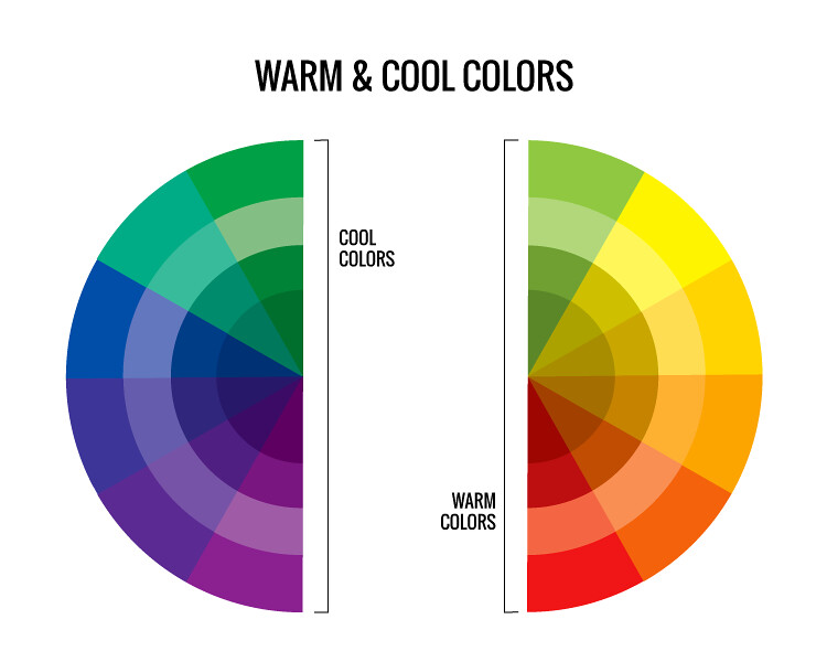
What Are Warm and Cool Colours?
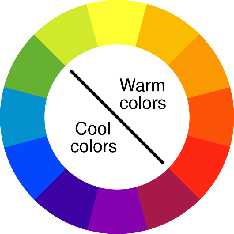
At the most basic level, the colour wheel is divided into two halves:
- Warm Colours: Red, orange, and yellow tones. These evoke heat, sunshine, energy, and passion. Think of glowing sunsets, roaring fires, and autumn leaves.
- Cool Colours: Blue, green, and purple hues. These feel calm, soothing, and sometimes melancholic — like oceans, moonlight, and shaded forests.
But it’s not always that simple. Every colour has a warm or cool version:
- Warm Blue (e.g., Ultramarine) vs Cool Blue (e.g., Cerulean)
- Cool Red (e.g., Alizarin Crimson) vs Warm Red (e.g., Cadmium Red)
Learning to recognise these temperature differences within a single colour family is key to mastering harmony and contrast.
Explore more: Discover how lavender is made from warm and cool tones in our Mixing Colour with Paint Guide.
Why Colour Temperature Matters in Painting
Colour temperature isn’t just theory—it’s the difference between a flat, lifeless painting and one that breathes. Here’s why it matters:
1. Depth and Dimension
Artists use warm colours to bring elements forward and cool colours to push them back. This creates the illusion of depth on a two-dimensional canvas.
- Example: In a landscape, warm tones in the foreground and cool blues in the background create distance and perspective.
2. Mood and Emotion
Warm colours energise a painting and convey joy, excitement, and intimacy. Cool colours are calming, melancholic, or mysterious.
- Use warm colours for passion, sunsets, or warmth.
- Use cool colours for serenity, sadness, or nighttime scenes.
3. Visual Focus
Warm colours tend to attract attention more than cool ones. Placing warm elements strategically helps lead the viewer’s eye around your composition.
Warm Colours: Creating Energy and Emotion
Warm colours spark attention and ignite energy. In art, they can bring subjects to life and evoke emotion in a way that’s bold and direct.
Common Warm Colours:
- Red: Love, anger, heat, urgency.
- Orange: Creativity, vitality, enthusiasm.
- Yellow: Joy, optimism, light.
Warm colours are often used in:
- Portraits (to enhance skin tones)
- Abstract art (to express emotion)
- Floral and nature scenes (sunlight, autumn tones)
Tips for Using Warm Colours:
- Use sparingly in a cool painting to create focal points.
- Balance with neutral tones to avoid overwhelming the viewer.
- Combine different warm hues for richness and variation.
Want to experience using bold colours firsthand? Try one of our themed sessions at Prime Pass Painting Events.
Cool Colours: Inviting Calm and Distance
Cool tones give your art a feeling of openness, quiet, and space. They’re less aggressive than warm tones but just as powerful in storytelling.
Common Cool Colours:
- Blue: Peace, trust, sorrow.
- Green: Nature, balance, growth.
- Purple: Mystery, luxury, contemplation.
Cool colours work well for:
- Backgrounds and shadows
- Landscapes and seascapes
- Night scenes or wintery environments
Tips for Using Cool Colours:
- Layer different cool tones to add visual interest.
- Use alongside warm highlights to create contrast.
- Consider emotional themes—cool colours are excellent for conveying solitude or reflection.
Mixing Warm and Cool Colours
The real magic happens when warm and cool colours are used together. It’s this dynamic contrast that makes a painting pop.
Examples of Dynamic Colour Pairings:
- Warm orange sunset with a cool blue sea
- Cool purple shadows against warm yellow highlights
- Warm red flowers against cool green foliage
Balancing both colour temperatures helps your painting feel alive and complete. But it takes experimentation. That’s what makes sip and paint events so fun—you get to test combinations and discover what works best for you.
Planning a Valentine’s activity? Try our Paint a Pair experience — a perfect way to mix colours and connect with a loved one.
Colour Temperature and Light
Another factor that influences colour temperature is light. Warm and cool light affect how we perceive colour.
- Natural light changes throughout the day, shifting the warmth or coolness of colours.
- Artificial light can distort colours and should be taken into account when painting.
Artists often paint with a limited palette of warm and cool primary colours to create harmonious artwork that adapts to different lighting.
How to Build a Warm vs Cool Colour Palette
Creating an effective warm or cool colour palette is all about selecting hues that work together to tell a visual story — one that expresses mood, depth, and harmony. Whether you’re preparing for a themed painting night or just exploring colour theory in your own time, here’s how to build palettes that pop.
1. Start with the Basics: Primary Colours
Every great palette begins with the primary colours — red, blue, and yellow. To build a warm or cool palette, choose the temperature version of each:
- Warm Primary Palette:
- Red: Cadmium Red or Scarlet Lake
- Yellow: Cadmium Yellow or Indian Yellow
- Blue: Ultramarine Blue
- Red: Cadmium Red or Scarlet Lake
- Cool Primary Palette:
- Red: Alizarin Crimson or Quinacridone Rose
- Yellow: Lemon Yellow or Hansa Yellow Light
- Blue: Cerulean or Phthalo Blue (Green Shade)
- Red: Alizarin Crimson or Quinacridone Rose
These act as your foundation. From here, you can mix virtually any hue while maintaining a consistent temperature across your painting.
2. Mix to Create Harmonious Secondaries
Use your warm or cool primaries to mix secondary colours that align with your temperature goal:
- Warm Orange = Cadmium Red + Cadmium Yellow
- Cool Purple = Alizarin Crimson + Cerulean Blue
- Warm Green = Cadmium Yellow + Phthalo Green
- Cool Green = Lemon Yellow + Cerulean Blue
Stick to temperature-consistent pairings for smooth, cohesive results. But don’t be afraid to cross over if you want intentional contrast or tension in your piece.
3. Add Neutrals and Earth Tones
Neutrals help balance your palette and keep your painting from becoming overly saturated. These can also have temperature!
- Warm Neutrals: Burnt Sienna, Yellow Ochre, Raw Umber
- Cool Neutrals: Payne’s Grey, Neutral Tint, Dioxazine Purple
Earth tones add depth and realism, especially in landscapes or figurative art. They’re also great for shadows, underpainting, and skin tones.
Want to learn how different colours interact in real time? Our sip and paint sessions are perfect for experimenting with new palettes in a relaxed, social environment.
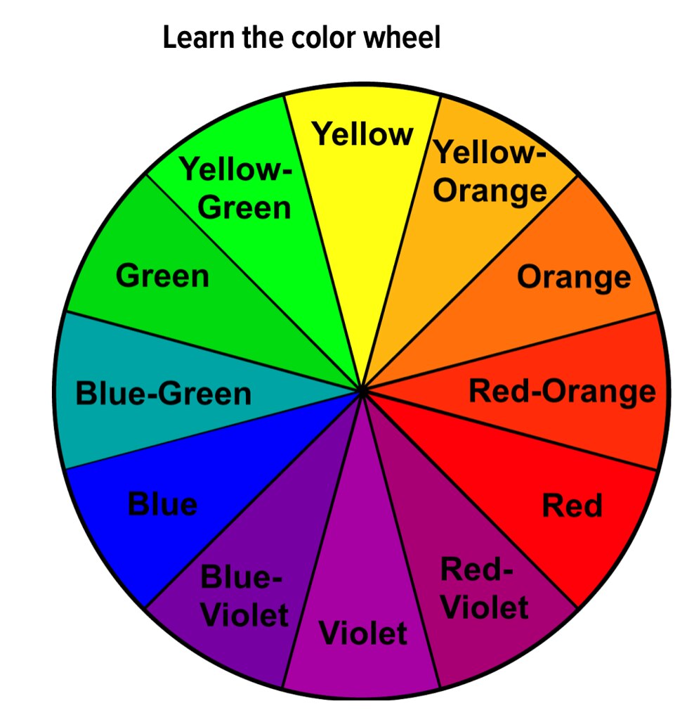
4. Plan with a Colour Wheel
Using a colour wheel helps you quickly identify which hues fall into warm or cool ranges. When creating your palette:
- Choose an analogous scheme (3–4 colours side by side) for harmony.
- Pick complementary colours (opposites on the wheel) to create contrast and drama.
When working with both warm and cool colours, aim to use one temperature dominantly and the other as an accent.
5. Test Swatches Before You Start
Every artist knows: colours look different on canvas than in the tube. Always test your chosen colours:
- Mix small swatches on a scrap piece of canvas or paper.
- Check how they dry — some colours shift slightly.
- Observe under both natural and artificial light.
Doing this helps avoid surprises and gives you confidence in your palette before you dive into your full piece.
Common Mistakes to Avoid When Working with Warm and Cool Colours
Even experienced artists can run into challenges when mixing temperatures. Here are some of the most frequent mistakes and how to avoid them:
1. Mixing Temperatures Without Intention
While blending warm and cool colours can create beautiful contrasts, doing so randomly often results in muddy tones or visual imbalance. For example:
- Mixing a warm red with a cool green may produce a dull brown if not carefully controlled.
- Using warm highlights on a cool background (or vice versa) can cause jarring effects if there’s no clear purpose.
Solution: Decide early if you want your painting to lean warm or cool overall, and then introduce opposite temperatures with intention, like a cool accent in a warm portrait to highlight contrast.
2. Ignoring the Role of Lighting
Lighting in your painting affects colour temperature, and vice versa. For instance:
- Shadows often appear cooler, while light sources (like firelight or sunshine) bring warmth.
- A painting meant to depict twilight might fall flat if too many warm tones dominate the cooler light of dusk.
Solution: Match your colour temperature to the type of lighting in your scene to enhance realism and depth.
3. Using All Bright Colours Without Neutral Anchors
Without neutral or desaturated tones, warm and cool colours can compete, making your painting feel overwhelming or chaotic.
Solution: Incorporate neutral greys, earth tones, or desaturated colours to let your temperature contrasts shine without clashing.
4. Forgetting About Skin Tones
For portrait artists, skin tones are a blend of both warm and cool hues, not just peach or beige. Blood flow, lighting, and shadow all affect the temperature of skin.
Solution: Observe the subtle shifts — cool tones in shadows (like blue or purple), warm tones on cheeks or noses. Practice mixing nuanced tones for realism.
Tips for Choosing the Right Temperature for Your Art
Choosing the right temperature for your palette depends on the emotional tone, mood, and atmosphere you wish to convey. Here are some key considerations that will help you master this essential aspect of painting:
1. Understand the Mood You Want to Convey
Each temperature has a psychological impact on the viewer. Warm colours like reds, yellows, and oranges can evoke feelings of energy, passion, and warmth, while cool colours like blues, greens, and purples tend to be calming, serene, and introspective. Here’s how to choose based on mood:
- For warmth and energy: Use a predominance of warm colours in your artwork. A sunset scene, for example, would benefit from a mix of warm reds, yellows, and oranges to create a sense of vibrancy and dynamism.
- For calmness and introspection: Cool colours are your go-to. A cool blue or green sky will immediately evoke a sense of tranquility, peace, and even melancholy, depending on how it’s used.
Tip: If you want to suggest a sense of harmony and balance, try to include both warm and cool tones strategically. This creates a more dynamic tension, keeping the viewer engaged.
2. Consider the Subject Matter
The subject matter of your piece can significantly influence whether you use warm or cool tones. Here are some guidelines:
- Portraits: Faces typically have warm tones in highlights and cooler tones in shadows. This is especially noticeable in skin tones, where cooler blues, purples, and greens can represent shadows or contouring, while warmer tones like reds, oranges, and yellows appear on the high points of the face (e.g., cheeks, nose, and forehead).
- Landscapes: In nature, warm colours suggest sunlight and warmth (think golden fields, sunsets, or autumn leaves), while cool tones suggest shade, cool waters, or mountains in the distance.
- Still Life: For objects like flowers or fruit, decide whether you want to evoke freshness (using cool tones) or warmth and ripeness (using warm tones). For example, a vibrant red apple will come to life with a warm palette, while a cool-toned blue vase suggests serenity.
3. The Time of Day and Lighting
The time of day and lighting conditions can influence the choice of temperature. Think of how the lighting affects the overall feel of your composition:
- Morning or afternoon light often produces warmer tones due to sunlight, with highlights in golden yellow, orange, and soft red.
- Twilight or night introduces cooler tones, with the shadows becoming rich in purples and blues, reflecting the fading light of the day or moonlight.
- Artificial light, like street lights or lamps, often casts a warm yellow or orange hue. Meanwhile, fluorescent lights tend to cool everything down with greenish undertones.
Tip: To depict a time of day, consider how the light will impact your overall palette. For instance, painting a cityscape at night would require more cool tones, while a sunrise scene would naturally call for warm colours.
4. Play with the Power of Contrast
Sometimes, the best way to emphasise a certain element in your painting is to contrast warm and cool tones effectively. A well-executed contrast can guide the viewer’s eye and create visual interest. For instance:
- Focus on the subject with warm colours: If you want to draw attention to a particular object (like a red flower), use warm tones around the subject and cool colours in the background to make it pop.
- Create atmosphere with cool tones: If your subject is small or specific (such as a person or an object), use cool colours in the background or surrounding areas to push the focal point forward. This can create a feeling of depth.
Tip: Use contrasting temperatures in the background and foreground to create dynamic movement and visual contrast. Try to keep your main subject within the warm or cool temperature scheme, and use the opposite in the background.
5. Consider the Harmony of Your Composition
While contrast is essential in art, harmony plays a vital role in achieving an aesthetically pleasing result. Too many contrasting temperatures can overwhelm the viewer, whereas a carefully balanced palette can produce a calm, cohesive composition. Here’s how to maintain harmony:
- Use a dominant temperature: Either warm or cool, with the other as an accent. For example, in a portrait, you might use warm tones for the skin and cool tones for the background.
- Create an overall temperature effect: Think about how the entire piece feels. If you’re aiming for warmth, consider using warm colours throughout your composition, punctuated with small cool elements for visual interest.
Tip: If you’re uncertain, limit your palette to a few key colours in the warm or cool family and add a touch of the opposite temperature for contrast.
Book Your Sip and Paint Session Today
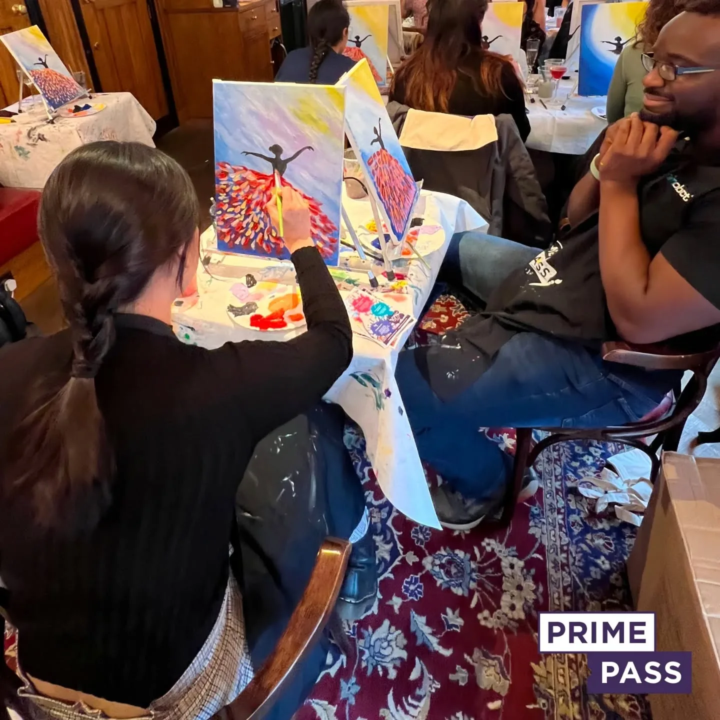
Ready to dive into the world of warm vs cool colour palettes and unleash your creative potential? There’s no better way to explore the magic of colours than by joining one of our Sip and Paint events at Prime Pass!
Whether you’re new to painting or an experienced artist, our events provide a fun and relaxed atmosphere where you can experiment with colour temperature, learn from expert instructors, and create your own masterpiece. And of course, you’ll be enjoying a drink or two as you paint, making for a perfect night of creativity and connection with friends, family, or a loved one.
Don’t wait—spaces fill up fast, especially around special occasions like Valentine’s Day! Book your Sip and Paint session today and join us for an unforgettable evening where the colours are as vibrant as the memories you’ll create.
Looking for a unique team-building experience? Prime Pass also offers incredible team-building activities that blend creativity and collaboration, perfect for strengthening bonds with colleagues while having fun!

