Vintage colours aren’t just about aesthetics — they tell a story. Whether you’re evoking the soft pastels of the 1950s, the earthy tones of the ’70s, or the vibrant yet faded hues of retro signage and fashion, vintage palettes add charm, nostalgia, and warmth to your artwork. These colours feel familiar, lived-in, and timeless, making them perfect for anyone looking to create art with a touch of history.
At Prime Pass, we celebrate creativity in all its forms, and experimenting with vintage colour mixing is one of the most enjoyable ways to learn more about colour theory and personal style. For example, if you want to master a rich, jewel‑toned hue, our guide on crafting the perfect ruby mix shows you exactly how to blend those muted reds just right. Dive into the step‑by‑step tutorial here: How to make Ruby Colour. In this guide, we’ll explore what defines a vintage palette, how to mix these muted tones effectively, and how to apply them to your art, especially during our sip and paint events where colour play is encouraged and creativity flows freely.
Understanding Vintage Colours: What Makes a Colour “Retro”?

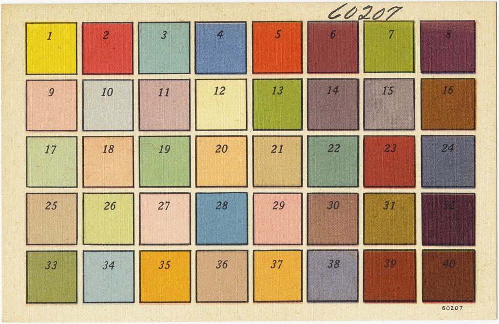
Before mixing, it’s important to understand what sets vintage colours apart from modern ones. Vintage or retro palettes are typically:
- Muted or desaturated – Think of colours softened with grey or brown, giving them a weathered, aged look.
- Earth-toned – Many retro colours are rooted in nature, featuring olive greens, mustard yellows, burnt oranges, and dusty blues.
- Warm and nostalgic – They evoke specific decades and moods, often feeling cosy, familiar, and emotionally resonant.
Some common vintage colour examples:
- Dusty Rose (faded pink)
- Avocado Green
- Muted Mustard
- Powder Blue
- Terracotta
How to Mix Vintage Colours: Step-by-Step Guide
Creating a retro colour palette is easier than you might think — it just takes a few basic paint colours, a bit of grey or brown, and a good eye for subtlety. Here’s how to get started:
1. Start with Basic Colours
Begin with your primary and secondary colours — red, yellow, blue, green, orange, and purple. These will be your foundation.
2. Tone Them Down
Vintage colours are never too bright. To achieve that muted retro feel:
- Add grey to reduce intensity and brightness.
- Mix with a bit of brown (or complementary colour) to create a weathered, aged tone.
- Use white to soften or lighten without over-saturating.
Example:
Bright red + a touch of grey = Dusty Rose
Yellow + a hint of brown = Mustard Yellow
3. Stick to Earthy, Warm Shades
Retro colours often mimic the tones found in 1960s–1980s decor — autumn leaves, vintage fabrics, and faded signage. Think:
- Olive + Khaki Greens
- Rusty Oranges
- Burnt Reds
- Faded Blues
4. Test and Adjust
Use a test sheet to experiment. Add more grey to tone down, or a bit of the complementary colour to mute further. Adjust in small amounts and keep your ratios noted for consistency.
5. Combine with Neutrals
Pair your vintage tones with neutral shades like warm white, taupe, or soft black to balance the overall palette and help your retro hues pop.
Popular Vintage Colour Combinations
If you’re looking to build a retro palette that instantly captures a nostalgic vibe, these tried-and-true combinations are perfect starting points. They reflect the most iconic colour trends from the ’50s to the ’80s:
1. Mustard Yellow & Olive Green
A classic 1970s combo that’s warm, earthy, and pairs beautifully in both abstract and landscape art.
2. Dusty Rose & Teal
Soft, romantic, and full of vintage charm — ideal for portraits, floral scenes, or anything with a delicate, feminine edge.
3. Burnt Orange & Cream
Bold and retro with a mellow base. Use this duo for bold statement pieces or interior-inspired artwork.
4. Turquoise & Coral
This retro duo has a lively 1950s feel — think diners, jukeboxes, and vintage swimsuits. Great for playful, pop-art-style pieces.
5. Rust Red & Sage Green
Perfect for an elegant, mid-century modern aesthetic. These muted tones create visual harmony while retaining personality
Tips for Mixing a Vintage Palette
Creating a truly authentic vintage colour palette takes more than just choosing old-fashioned hues — it’s about mixing with intention. These tips will help you achieve that perfectly muted, retro look:
1. Start with Primary Colours and Soften Them
Begin with your basic primaries (red, blue, yellow), then tone them down. Add small amounts of grey, brown, or white to soften the vibrancy. For example:
- Bright red + touch of brown = brick red
- Blue + grey + white = faded denim
2. Use Earthy Additions
Add a touch of burnt sienna, raw umber, or ochre to your mix. These earth tones help you mute colours and give them that aged, “lived-in” appearance that’s so iconic in vintage design.
3. Desaturate with Complementary Colours
Mixing a colour with its complement (e.g. red with green, blue with orange) reduces saturation and gives you more toned-down versions of a hue. This is ideal for achieving retro softness.
4. Stick to a Limited Palette
Vintage aesthetics often feature a cohesive, harmonious look. Limit your palette to 4–6 colours and remix from those for a consistent retro feel throughout your artwork.
5. Keep a Colour Mixing Journal
Take notes and swatch samples as you mix. Documenting your ratios and combinations will make it easier to recreate that perfect sage green or dusty rose again in the future.
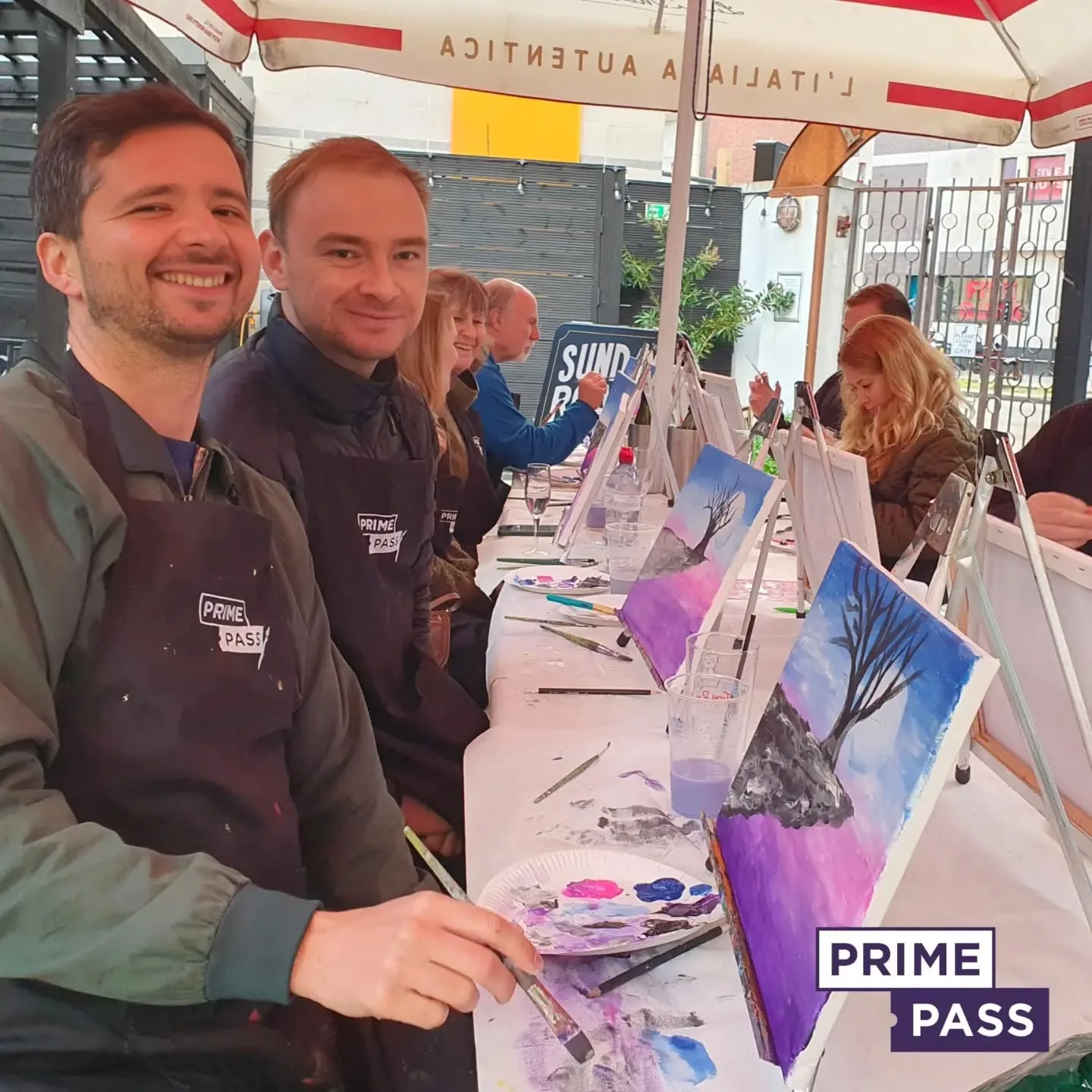
Book Your Sip and Paint Session Today
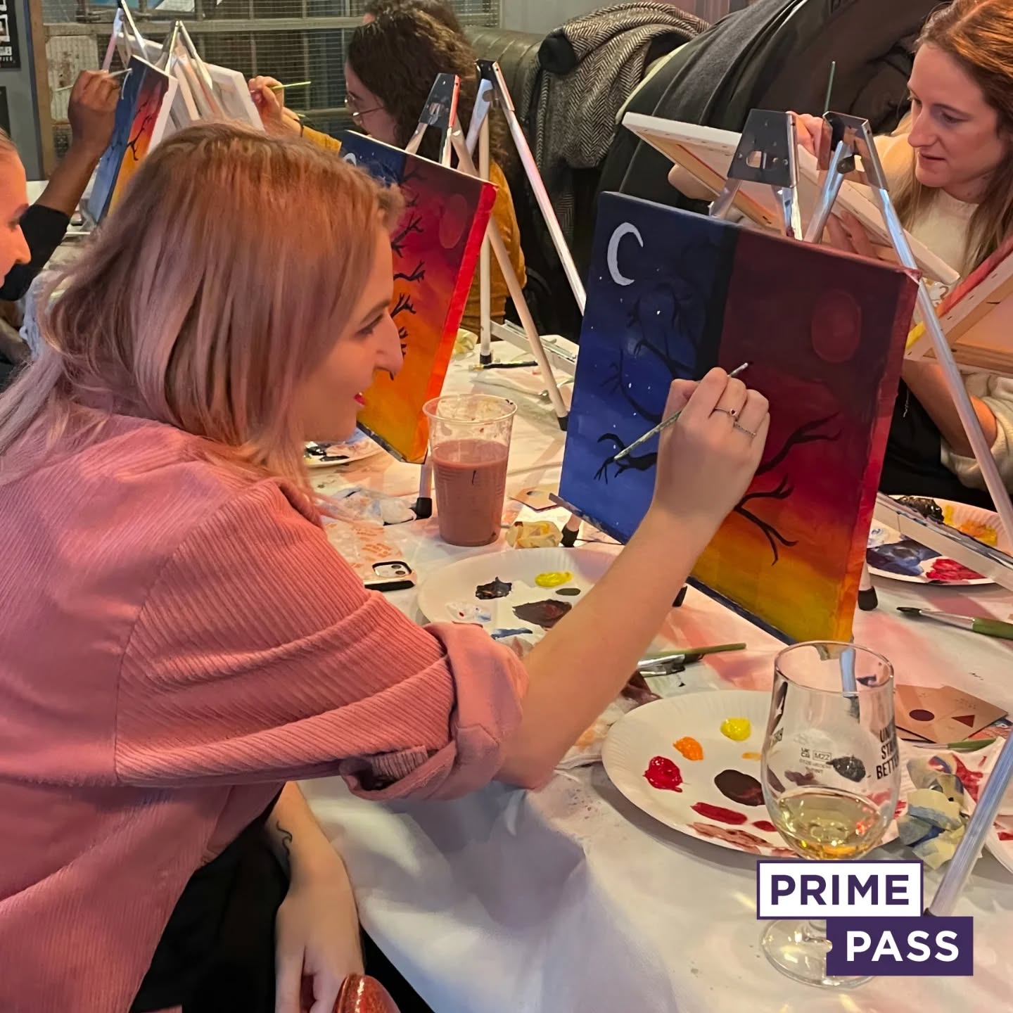
Now that you know how to mix your vintage colour palette, why not put your skills to the test in a fun, relaxed setting? At Prime Pass, our Sip and Paint events let you explore colour, creativity, and connection — whether you’re a beginner or a seasoned artist.
Looking for a group experience? Our team-building painting sessions are perfect for sparking collaboration and creativity in a relaxed, social atmosphere.
Ready to mix retro hues, sip something tasty, and make art you’ll love? Book your spot today and paint the past with a modern twist.


