Sapphire is one of the most coveted gemstones in the world, admired for its deep, rich, and mystical blue hue. The colour, often associated with royalty, wisdom, and luxury, has found its way into various forms of art, design, fashion, and even home décor. Whether you’re a painter looking to capture the depth of a sapphire gemstone in your work, a designer crafting elegant interiors, or someone simply looking to incorporate this beautiful hue into your creations, knowing how to replicate the sapphire colour can elevate your work. In this guide, we will take a deep dive into creating and using sapphire colour, its properties, and practical tips for working with it in different mediums.
What is Sapphire Colour?

Sapphire, as a gemstone, can be any colour of blue, ranging from light to dark. However, the traditional sapphire that we associate with luxury and elegance is a deep, vibrant blue with hints of purple. It’s a striking Colour; rich and deep, full of symbolism. Think prestige, sophistication, and lasting beauty—that’s what the Colour sapphire brings to any artistic endeavor.
Properties of Sapphire Colour
- RGB: 15, 82, 186
- Hex Code: #0F52BA
- CMYK: 92, 56, 0, 27
This particular shade of blue is rich, deep, and almost jewel-like, giving off an aura of elegance and mystique. The richness of sapphire colour comes from a blend of blue with slight undertones of purple and grey.
Sapphire blue is perfect for creating visual contrasts and can be used both as a dominant colour and as an accent in design. It is versatile enough for fashion, interior design, graphic design, and more, offering a bold yet refined look. If you’re interested in exploring more about colour mixing, check out what colour makes cyan on Prime Pass.
Basic Colour Theory Behind Sapphire Colour
To understand how to create sapphire colour, it’s crucial to first grasp the basics of colour theory. Sapphire is not a simple shade; it’s a sophisticated blend of different hues and tones.
Primary Colours Involved
Sapphire colour is derived from three main primary colours:
- Blue: The foundational hue of sapphire. Blue is a cool primary colour that sets the tone for the deep, jewel-like quality of sapphire.
- Purple: A touch of purple is added to the base blue to achieve the rich, regal look associated with sapphire.
- Grey/Black: Adding a small amount of grey or black deepens the colour, giving it the jewel-like depth and muted tone that makes sapphire stand out.
Secondary Colours Involved
- Purple/Violet: By mixing blue with a little red, we get purple or violet. This undertone adds to the warmth and richness of the sapphire colour.
- Green (Optional): For certain varieties of sapphires, such as those with a greenish tint, a small amount of green can be added to the mix.
Step-by-Step Guide on How to Create Sapphire Colour
Creating the perfect sapphire shade takes patience and precision. Here’s a step-by-step guide to help you mix and create the perfect sapphire colour for your painting, design, or craft project.
Step 1: Begin with a Strong Blue Base
The first step in creating sapphire colour is to start with a deep blue base. You can use Ultramarine Blue or Cobalt Blue for this, both of which are well-known for their vibrant, rich shades. These blues make a good starting point for sapphire; their shades are quite similar.
- Ultramarine Blue: A warm, reddish-blue that works well to create a deeper and slightly warmer shade of sapphire.
- Cobalt Blue: A cooler blue, often used to achieve a more subdued or slightly muted sapphire look.
To start, mix equal parts of either Ultramarine Blue or Cobalt Blue on your palette. To start, mix equal parts of either Ultramarine Blue or Cobalt Blue on your palette. For more details on mastering coloor mixing and understanding the nuances of blue tones, check out this helpful guide on what makes blue colour on Prime Pass.
Step 2: Add a Touch of Purple
Next, add a small amount of Purple or Violet to the blue mix. Purple is a mixture of blue and red, and adding this will give the sapphire its signature richness and warmth.
- Purple: Adds a warm tone to the blue, making the colour more sophisticated and regal.
- Violet: This offers a cooler, more muted shade, which can make the sapphire look more refined and jewel-like.
Start by adding just a small amount of purple or violet to your blue mix. Test the colour as you go to make sure it doesn’t turn too purple. The goal is to enhance the blue without overwhelming it with too much red.
Step 3: Add Grey or Black to Deepen the Colour
Sapphire is known for its deep, almost metallic tone. To achieve this, introduce a very small amount of Black or Grey to darken and mute the colour.
- Black: Use sparingly, as black can overpower the other colours quickly. A small drop will add depth and richness.
- Grey: A less intense alternative to black, grey will deepen the blue and purple mix without making it too dark.
The amount of black or grey you use depends on how dark or light you want your sapphire colour to be. For a more traditional sapphire look, add just a hint of black. This will help create the depth typical of the gemstone.
Step 4: Optional – Add a Hint of Green
Some sapphires, such as those with a greenish hue (e.g., green sapphires), can be mimicked by adding a small amount of green to the mix. To achieve this, you can use a small amount of Phthalo Green or Emerald Green.
Be cautious when adding green, as it can easily overpower the blue mix. A tiny drop will suffice if you want to achieve a slight greenish tint. If you prefer a traditional sapphire look, you can skip this step altogether.
Step 5: Test and Refine
Once you’ve mixed the colours, test the sapphire shade on a piece of scrap paper or a small section of your work. This will give you an idea of how the colour looks when applied. If the shade is too light, add more blue or purple. If it’s too dark, add more blue or a touch of purple to lighten it up.
Continue adjusting until you achieve the perfect sapphire shade. Always mix in small amounts to ensure you don’t accidentally over-darken or over-lighten your mix.
Best Paints and Mediums for Sapphire Colour
Creating sapphire colour can vary slightly depending on the medium you are using. Every paint and medium is different; understanding their behavior helps you get the best results.
Acrylic Paint
It’s easy to mix, and it dries fast—acrylic paint is great for making colours as rich as sapphires! The pigments in acrylics are intense and work well to create the depth and richness of sapphire.
- Pro Tip: Because acrylics dry quickly, mix smaller amounts at a time and test the colour as you go. Acrylics are also great for layering, allowing you to add more depth and intensity as needed.
Oil Paint
Oil paints offer a slower drying time, which makes them perfect for achieving smooth blends and depth. The slower drying process allows you to manipulate the colours more thoroughly and achieve a more refined sapphire hue.
- Pro Tip: Use a medium like linseed oil to help mix the colours smoothly. Oil paints tend to be more vibrant, and the longer drying time allows for better blending of hues.
Watercolour Paint
Watercolour paints provide a lighter and more translucent effect, which can create a softer version of sapphire. If you want to achieve a semi-transparent sapphire effect, watercolours are a great choice.
- Pro Tip: Use a heavier amount of pigment to create more saturated shades. Layering the paint can also help you build up the colour to create a richer sapphire look.
Creative Uses for Sapphire Colour
Once you’ve mastered how to create sapphire colour, it’s time to explore the many creative ways you can use it in your work.
1. Fashion Design
Sapphire colour is highly sought-after in fashion for its elegance and richness. It’s commonly used for evening wear, accessories, and special occasion clothing. Whether you’re designing a dress, handbag, or jewelry, sapphire will make your designs stand out with a royal, sophisticated appeal.
2. Interior Design
Sapphire is an excellent accent colour for interiors. Use it for furniture, drapes, floor coverings—even a feature wall! It’ll add so much character to a room. When combined with neutral tones like beige, white, or grey, sapphire creates a luxurious, calming atmosphere.
3. Graphic Design
In graphic design, sapphire colour can be used to convey professionalism and prestige. It’s often used in branding for luxury products, corporate logos, and high-end advertisements. Using sapphire in your digital designs can elevate the overall aesthetic and make your work feel more polished.
4. Art
Depth and dimension—that’s what artists get from using sapphire. You see it in everything from landscapes and portraits to the wildest abstract paintings. The deep blue of sapphire is perfect for highlighting key elements. Think of how it could dramatically shift the viewer’s focus in a landscape, drawing the eye to a distant mountain peak or a small, intimate flower.
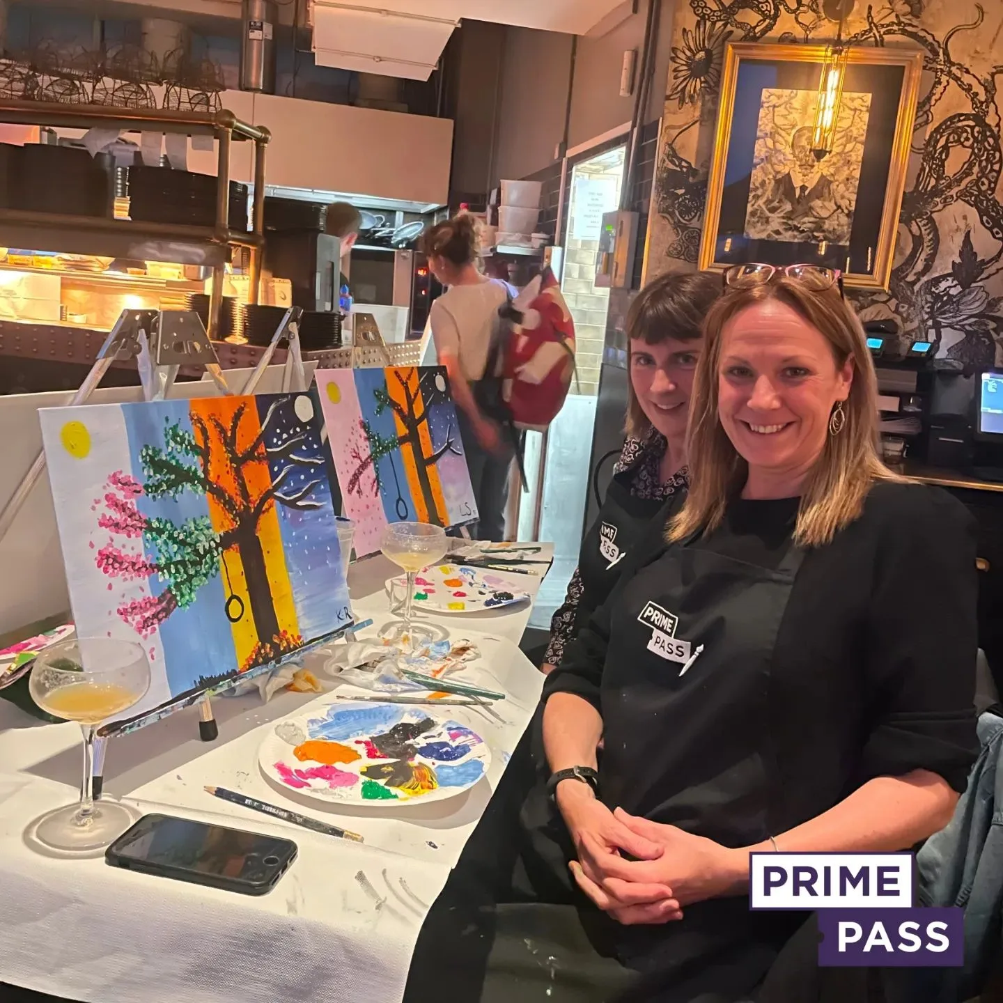
Book Your Paint and Sip Session with Prime Pass

Looking to explore the beauty of sapphire colour and other artistic techniques? Why not experience it in a fun and relaxing way? At Prime Pass, we offer Paint and Sip sessions that provide you with the perfect opportunity to express your creativity while enjoying a refreshing drink in a comfortable, social environment.
Our instructors are here to help everyone, from beginners to pros! They’ll walk you through painting, step by step, so you can make amazing art with bright, beautiful Colours. Sapphire blue, for example, is stunning. All art supplies are provided, and you’ll have the freedom to experiment with various techniques, from blending colours to mastering shading.
Our Paint and Sip sessions are a great way to unwind with friends, family, or colleagues while enjoying a night of creativity. So, whether you’re looking to relax, learn something new, or simply have fun, book your session with Prime Pass today!
Visit Prime Pass to reserve your spot and join us for an unforgettable artistic experience!

