Lime colour is a vibrant, refreshing shade that sits between yellow and green on the colour spectrum. Known for its energetic and lively qualities, lime is commonly used in graphic design, art, fashion, and branding to create bold statements. Whether you’re painting with traditional mediums like acrylics, oils, or watercolours, or working with digital design tools, understanding how to create the perfect lime colour is essential for artists and designers.
In this guide, we’ll walk you through the process of creating lime colour, its symbolism, and how to incorporate it into your artistic work.
What is Lime Colour?

Lime is a bright, yellow-green hue that exudes energy and excitement. It’s often associated with freshness, vitality, and creativity. It is a vibrant mix of green and yellow but with a more noticeable dominance of yellow, which gives it that characteristic “zesty” feel.
Lime is commonly used in various industries, such as:
- Fashion: Adds a bold pop of colour to outfits, accessories, and collections, often seen in streetwear and high fashion.
- Graphic Design: Creates eye-catching visuals, perfect for energetic and modern branding.
- Interior Design: Used as a statement colour in accents, furniture, or highlight walls to refresh spaces.
- Painting: Brings vibrancy to artwork, ideal for focal points, contrasts, and adding energy to any composition.
How to Create Lime Colour in Painting
Creating the perfect lime colour for your artwork involves understanding both the colour mixing process and how to adjust its tone and intensity based on the medium you’re using. Whether you’re working with acrylics, oils, or watercolours, lime colour can be achieved through a careful balance of yellow and green pigments. This vibrant hue can be customised for various creative effects, so here’s a detailed step-by-step guide on how to create lime colour in painting.
1. Choosing the Right Base Colours
The foundation of any colour mix begins with selecting the right base colours. To achieve lime, you’ll primarily use yellow and green, but the exact tones you choose will affect the overall brightness and intensity of the lime.
- Primary Yellow: This is ideal if you’re aiming for a bright, clean lime colour. It gives a fresh, bold result when mixed with green. For more insights into colour mixing and the theory behind creating vibrant shades, check out our guide on What Colours Make Yellow: Colour Mixing and Theory.
- Cadmium Yellow: This yellow is slightly deeper and richer, creating a more intense lime with a warm, golden undertone.
- Phthalo Green: This is a cooler, bluish-green pigment that will create a more neon-like lime with a cooler tone. It’s perfect for modern, energetic pieces.
- Yellow Ochre: If you’re seeking a more muted or earthy lime, yellow ochre provides a warmer, less vibrant version of lime, creating a softer effect in your artwork.
By selecting the right base yellow and green, you can adjust the intensity and character of your lime, whether it’s bright and neon or softer and more pastel.
2. Mixing Yellow and Green
The key to making lime is finding the right balance between yellow and green. To create a vibrant lime, you’ll want the yellow to dominate the mix. The ratio of yellow to green plays a crucial role in determining the brightness and intensity of your lime colour.
- Basic Mix: Start with 3 parts yellow to 1 part green. This gives you a balanced lime colour, where the yellow still stands out but is slightly enriched by the green.
- Adjusting the Shade: Depending on the effect you want:
- Add more yellow for a brighter, lighter lime. This will enhance the “zesty” feel of lime, especially useful if you’re creating more lively or playful compositions.
- Add more green if you prefer a deeper, more subdued lime. This works well if you’re aiming for a richer, earthy tone that feels more natural or muted.
- Add more yellow for a brighter, lighter lime. This will enhance the “zesty” feel of lime, especially useful if you’re creating more lively or playful compositions.
You can experiment by using different types of yellow and green to find the perfect balance for your artwork. Keep in mind that each combination will yield a slightly different result, so be sure to test and adjust as needed. For more tips on mixing the perfect shade of green, check out our guide on What Makes Green Colour: Tips for Mixing the Perfect Shade.
3. Adjusting the Tone
Sometimes, your initial mix may not be exactly what you want. You can adjust the tone of your lime colour to suit the atmosphere or feeling you’re trying to convey in your painting.
- To Brighten the Colour: If your lime is too dark or muted, adding a small amount of white paint will lighten it. This will create a pastel lime shade that’s softer and more subtle. This is perfect for creating lighter, airy compositions, such as in a spring-themed painting or a peaceful landscape.
- To Dull the Colour: If you need a more toned-down lime, you can reduce its intensity by adding a hint of grey or brown. This will mute the brightness and create a more subdued, earthy lime tone that works well for natural scenes or vintage-inspired artwork.
These adjustments give you greater control over the lime colour, allowing it to match the desired mood of your piece.
Shades of Lime
Lime is a vibrant and energetic colour, but it can be modified to create different shades, each bringing a unique effect and feel to your artwork or design. Here’s how you can adjust lime to achieve various tones:

1. Bright Lime
- Description: This is the bold, neon-like version of lime that exudes energy and vibrancy. It’s often used to create striking, attention-grabbing designs and adds a punch of colour wherever it’s applied.
- How to Create: To achieve bright lime, mix pure yellow with bright green in equal parts, ensuring a high saturation. The result will be a vivid, almost fluorescent shade of lime.
- Uses: Ideal for high-energy compositions, contemporary art, branding, or any design element where you want the lime to stand out. It’s great for digital design, fashion, and interior accents like statement walls.
2. Pastel Lime
- Description: Pastel lime is a softer, more subdued version of lime, created by lightening the lime colour with white. This shade retains the fresh, zesty quality of lime but in a gentler, more approachable form.
- How to Create: Mix your lime colour (created from yellow and green) with a small amount of white paint. The more white you add, the lighter and more pastel the lime will become.
- Uses: Perfect for subtle accents in modern designs, gentle highlights in paintings, or pastel-themed designs. It’s often used in interior design for a calming touch or in fashion for a softer pop of colour.
3. Muted Lime
- Description: Muted lime is a more earthy, subdued shade that takes on a natural, vintage-inspired feel. It’s created by adding a hint of brown or grey to the lime mix, reducing its vibrancy while maintaining its distinctive green-yellow tone.
- How to Create: Start with your lime mixture, then gradually add a small amount of brown or grey to tone down the brightness. This results in a more subdued and balanced lime.
- Uses: Ideal for creating natural, organic artworks or vintage-inspired designs. It’s also great for when you need lime to act as a complementary accent rather than a bold statement colour, such as in rustic interiors or earthy fashion designs.
Tips for Using Lime Colour in Design and Art
Lime is an incredibly bold and eye-catching colour, which makes it effective for creating focal points in art and design. However, due to its vibrancy, it can be overwhelming if used too much. To maintain a balanced composition, it’s best to use lime sparingly, either as an accent or to highlight key features in your work. Pairing it with neutral tones like white, black, or grey helps tone down its intensity, allowing the lime to stand out without overwhelming the overall design. It also works well when combined with complementary colours such as pink, red, or purple, creating dynamic contrasts that make the lime pop.
- Use Sparingly: Lime is vibrant and can be overwhelming, so it’s best used as an accent or focal point.
- Pair with Neutral Colours: Combine lime with white, black, grey, or beige to allow the vibrant hue to stand out without overpowering the design.
- Combine with Complementary Colours: Lime pairs beautifully with pink, red, or purple to create striking contrasts and add visual interest.
Mistakes to Avoid When Using Lime Colour
Using lime in design and art can be tricky, and while it’s a striking colour, it can easily detract from the overall aesthetic if not used properly. Here are some common mistakes to avoid:
- Overusing Lime: Lime is an intense and bold colour. Using it in large quantities can overwhelm the viewer and cause visual fatigue. Always use it sparingly as an accent or focal point rather than filling large areas.
- Ignoring Balance: Lime can clash with other bright colours if not balanced properly. It’s essential to consider the overall colour harmony when incorporating lime. Without the right balance, lime can feel out of place or too jarring.
- Pairing with Too Many Bright Colours: While lime pairs well with some bold colours, using it alongside too many other vivid hues can create chaos. Stick to a few accent colours to allow lime to shine without competing with other colours.
- Not Considering Lighting and Context: Lime may look different depending on the lighting or the environment it’s in. Always test your lime colour under various lighting conditions to ensure it doesn’t appear too harsh or out of place.
- Forgetting Contrast: Lime needs contrast to make it pop. Avoid using it on backgrounds with similar tones (like yellow or light green). Pair it with darker, neutral, or complementary colours to help it stand out.
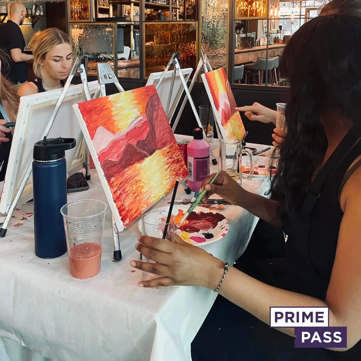
Book a Paint and Sip Session with Prime Pass

Ready to explore the bold vibrancy of lime colour? Book a Paint and Sip session with Prime Pass and dive into the exciting world of colour mixing! Whether you’re a beginner or an experienced artist, our guided sessions provide the perfect opportunity to experiment with lime’s energetic and striking qualities. Our talented instructors will walk you through the process step by step, helping you blend colours and create your unique shades of lime, from soft pastel greens to bright, neon pops.
Prime Pass’s Paint and Sip events are a fun and relaxed way to unleash your creativity while enjoying your favourite drink. All materials are provided, so you can simply show up and let your imagination run wild. It’s a great chance to try new techniques, meet fellow art lovers, and create personalised artwork in a supportive and friendly environment. Book your spot today and experience the joy of painting with lime at Prime Pass!

