Crimson is a rich, deep red that has captivated artists, designers, and creatives for centuries. Whether you’re working with paint, digital design, fabric dye, or food colouring, knowing how to mix and manipulate crimson effectively can transform your artwork.
In this comprehensive guide, we’ll explore how to create crimson colour in different mediums, understand its history, adjust its shade for various effects, and even learn how it’s used in art, fashion, branding, and interior design.
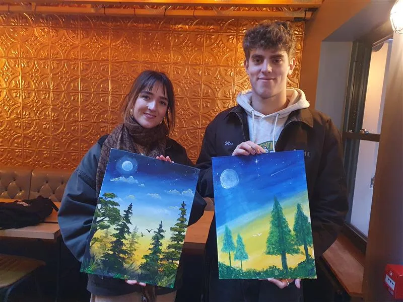
And if you’d love to experiment with colour mixing in a fun, interactive way, consider attending a Sip and Paint session in London, where you can explore your creativity with expert guidance!
What Is Crimson?

Crimson is a deep, cool-toned red with a hint of blue or purple. Unlike standard red, which leans warm, crimson has a richer, more dramatic undertone. It has been historically associated with royalty, power, and passion, making it a favourite in art and design.
Crimson vs. Other Reds
Each red shade has its undertones and characteristics that influence how it interacts with light, surrounding colours, and different materials.
1. Scarlet (#FF2400)
- Tone: Bright, slightly orange-leaning red.
- Characteristics: Scarlet is a warm red that appears fiery and vibrant. It is commonly used in warning signs, sports team colours, and high-visibility designs.
- Mixing Tips: Add a small amount of yellow to red to create a scarlet-like shade. Too much blue will neutralise the warmth.
2. Vermilion (#E34234)
- Tone: A vivid, warm-toned red with a hint of orange.
- Characteristics: Vermilion was historically made using cinnabar and has been used in traditional Chinese and Renaissance paintings. It has a strong, fiery quality.
- Mixing Tips: To achieve vermilion, mix red with a touch of orange and a hint of yellow.
3. Burgundy (#800020)
- Tone: A deep red with strong brown and purple undertones.
- Characteristics: Burgundy is commonly seen in fashion, wine labels, and luxurious designs. It is rich and subdued compared to brighter reds.
- Mixing Tips: Combine crimson with a small amount of brown or black to create a deep burgundy tone.
4. Maroon (#800000)
- Tone: A dark, brownish-red.
- Characteristics: Maroon is often associated with academia, uniforms, and classic interior design. It is darker and more muted than crimson.
- Mixing Tips: Add a small amount of brown to crimson or red to get a maroon shade.
5. Ruby Red (#9B111E)
- Tone: A bright, slightly pinkish red.
- Characteristics: Ruby red is named after the gemstone and is often used in jewelry, branding, and bold fashion statements.
- Mixing Tips: Mix crimson with a touch of magenta to achieve a ruby-like glow.
For more updates on how to make Red read out:- How to make Red Colour
History of Crimson Colour
Crimson has been a highly valued colour for centuries, used extensively in royal garments, religious art, and textiles. It has long been associated with power, status, and authority, making it a favourite among monarchs, the church, and even the military. The methods for producing crimson have evolved, from natural dyes to synthetic pigments.
Ancient Crimson Dyes: The Prestige of Natural Pigments
Before the advent of synthetic pigments, crimson was created using natural sources, primarily insects that produced deep red dyes when crushed.
1. Kermes Dye (Mediterranean & Europe)
- The earliest form of crimson dye came from Kermes vermilio, a small insect found on Mediterranean oak trees.
- These insects were collected, dried, and ground to extract a deep red pigment.
- Because harvesting kermes was labour-intensive, the dye was extremely expensive, making it a luxury reserved for royalty, high-ranking officials, and the wealthy elite.
- Kermes-dyed fabrics were commonly seen in ancient Rome, medieval European courts, and Renaissance art.
2. Cochineal Dye (Aztec & Spanish Influence)
- A more potent red dye was later discovered in Mesoamerica, where the Aztecs and Mayans had mastered the use of cochineal insects (Dactylopius coccus).
- When Spanish conquistadors arrived in the 16th century, they quickly recognised the value of cochineal dye, and it became one of Spain’s most lucrative exports—second only to silver.
- This dye produced a more intense and colourfast crimson than kermes, leading to its widespread use in European fashion, art, and religious garments.
- Even today, cochineal extract (E120) is still used in fabric dyes, cosmetics, and food colouring (like certain red lipsticks and beverages).
3. The Shift to Synthetic Crimson Pigments
With advancements in chemistry and industrialisation, artists and manufacturers sought cheaper and more accessible alternatives to natural crimson.
- Alizarin Crimson (1868):
- Chemists discovered how to synthesise alizarin, the key pigment in madder root dye.
- This synthetic crimson was cheaper, more stable, and widely available, replacing expensive natural dyes.
- Chemists discovered how to synthesise alizarin, the key pigment in madder root dye.
- Modern Synthetic Crimson:
- Today, crimson pigments are produced using chemical compounds that ensure colour consistency, durability, and affordability.
- Artists and manufacturers can now use crimson in paints, inks, textiles, and digital design without relying on insect-derived dyes.
- Today, crimson pigments are produced using chemical compounds that ensure colour consistency, durability, and affordability.
Because of its historical significance and rich visual impact, crimson remains a symbol of prestige and power in art, fashion, and design.
The Science of Colour Mixing: Understanding Pigments and Light
Colours behave differently based on whether they are light-based (additive mixing) or pigment-based (subtractive mixing).
Additive Mixing (Light Colours – RGB Model)

- Used in screens, digital design, and stage lighting.
- In RGB colour mode (used in computers and TVs), colours are created by adding red, green, and blue light.
- To create crimson in digital media, you adjust the intensity of red and blue:
- RGB Code for Crimson: (220, 20, 60)
- HEX Code: #DC143C
- Increasing blue results in a cooler crimson, while decreasing it creates a warmer red.
- RGB Code for Crimson: (220, 20, 60)
For more colour mixing check out:- Blue Colour
Subtractive Mixing (Paints, Inks – CMY Model)
- Used in traditional painting, printing, and fabric dyes.
- In pigment mixing, colours are created by absorbing certain wavelengths of light.
- Crimson is made by mixing a true red with a small amount of blue to cool it down.
Since crimson is a pigment colour, subtractive mixing is the primary method used in paints, inks, and dyes.
How to Mix Crimson Paint: Step-by-Step Guide
If you’re working with acrylics, oils, or watercolours, you can mix crimson by blending the right hues.
Materials You’ll Need
✔ Primary colours: Red and blue
✔ White and black: For brightness and depth adjustments
✔ Palette knife or brush (for mixing)
✔ Mixing palette (to blend the colours)
✔ Acrylic, oil, or watercolour paints
Step 1: Choose the Right Red Base
Start with a true red or a slightly cooler red as your base. Some ideal choices include:
- Cadmium Red: A warm red with orange undertones (use sparingly as it leans too warm).
- Alizarin Crimson: A cooler red that’s already close to a true crimson—a great base.
- Vermilion: A vibrant red with a hint of warmth but still suitable for adjusting toward crimson.
✅ Best choice: If you already have Alizarin Crimson, you may not need to mix at all!
Step 2: Add a Small Amount of Blue
To cool down the red and shift it towards crimson, carefully mix in a tiny amount of blue:
- Ultramarine Blue: Adds richness and depth.
- Cobalt Blue: A softer blue that prevents over-saturation.
⚠ Tip: Mix in small increments—too much blue will push the mixture into purple rather than crimson.
Step 3: Adjust the Hue
Once you’ve created a crimson base, fine-tune the shade as needed:
- Too bright? Add a small amount of black to deepen the shade.
- Too dull? Add more red to increase vibrancy.
- Too purple? Add a touch of yellow or a warmer red to neutralise excess blue.
Step 4: Test and Refine
- Apply a small swatch on your canvas or mixing paper.
- Let it dry, as some pigments darken as they settle.
- Adjust as needed before committing to large sections of your artwork.
How to Make Crimson in Digital Art (RGB & HEX Codes)
Crimson is a bold and striking colour that plays a crucial role in digital art, graphic design, branding, and UI elements. Unlike physical paint, where you mix pigments, digital colours are created using the RGB model (Red, Green, Blue) or represented in HEX codes for web design.
Standard Crimson Colour Codes
For an accurate crimson shade in digital art, use the following values:
- RGB Code: (220, 20, 60)
- HEX Code: #DC143C
Customising Crimson Shades
While the standard crimson is widely used, you may want to tweak its tone based on your artistic needs. Below are some quick adjustments:
✔ Brighter Crimson – Increase the red component slightly while keeping blue low (e.g., RGB 230, 40, 70). This creates a more vibrant, energetic crimson.
✔ Deeper Crimson – Increase blue slightly for a richer, darker variation (e.g., RGB 200, 10, 80). This works well for dramatic lighting and deep shadows in art.
✔ Cooler Crimson – Add more blue to shift towards a purple-red (e.g., RGB 190, 30, 90). This is great for moody, sophisticated designs.
✔ Muted or Vintage Crimson – Reduce saturation slightly and mix in some brownish tones (e.g., RGB 180, 50, 60). This creates a more aged, classical feel, perfect for retro design aesthetics.
Tips for Digital Artists
⚡ Want to practice mixing colours? Try using blending tools in Photoshop, Procreate, or Illustrator to experiment with different crimson shades! Many digital art programs allow you to create custom colour palettes to refine your perfect crimson hue.
Shades and Variations of Crimson
Crimson is not just one fixed shade—it has a range of variations that artists and designers can use for different moods and effects.
🎨 Bright Crimson – Lighten with white or increase red for a fiery, energetic look.
🔴 Deep Crimson – Add blue or black to create a darker, more dramatic shade.
🌺 Crimson Lake – Increase blue tones for a cooler, slightly purplish hue.
🟥 Muted Crimson – Mix in brown or grey for an earthy, vintage-inspired shade.
Each of these variations allows you to tailor crimson for art, branding, and decor, making it a versatile and dynamic colour.
The Role of Crimson in Art and Design
Crimson has been a symbol of passion, power, and luxury for centuries. In modern times, it plays a key role in art, fashion, branding, and digital design.
1. Painting & Fine Art
Artists have long favoured crimson for its intensity and emotional depth. It appears in:
🎭 Dramatic portraits – Renaissance painters used crimson to highlight wealth and nobility in clothing and backgrounds.
🌅 Sunsets and floral compositions – Crimson enhances the warm tones of nature, making it ideal for romantic landscapes.
🎨 Bold abstract art – Crimson is used to evoke strong emotions like passion, anger, and intensity.
🔥 Want to experiment with crimson painting techniques? Try a Sip and Paint session in London, where you can explore your creativity while enjoying a social art experience!
2. Fashion & Interior Design
💃 Luxury fashion: Crimson is a statement colour, often seen in high-end gowns, coats, and accessories. It symbolises power, confidence, and sophistication.
🏡 Interior design: Crimson accents, such as walls, furniture, or décor elements, create a sense of warmth and opulence. It works well in classic, vintage, and modern settings.
3. Branding & Marketing
Crimson is used by brands that want to convey strength, passion, and leadership. Some notable examples include:
- Netflix – The crimson-red branding enhances the bold and engaging nature of the platform.
- Harvard University – The deep crimson represents prestige and tradition.
- CNN – The red tones create a sense of urgency and authority in news reporting.
In advertising, crimson is used to grab attention and evoke emotions, making it ideal for sales promotions, banners, and product packaging.
4. Digital & UI Design
Crimson is frequently used in website and app design because of its high visibility and impact. Some common uses include:
🖱 Call-to-Action (CTA) buttons – “Buy Now,” “Subscribe,” and “Learn More” buttons often use crimson to draw the user’s attention.
🌐 Website colour schemes – Crimson can be paired with neutrals, gold, or black for a bold, elegant aesthetic.
📱 Gaming & app design – Many video game interfaces and UI elements use crimson to signify danger, power-ups, or alerts.
Common Mistakes When Mixing Crimson
Mixing colours—whether digitally or with paints—can be tricky. Here are some common mistakes to avoid when creating crimson:
❌ Adding too much blue – This will shift the colour into purple instead of crimson. Always mix in small increments.
❌ Choosing the wrong red base – Some reds, like Cadmium Red, have orange undertones that can make your crimson appear too warm or reddish-orange.
❌ Skipping a test swatch – Colours often dry darker than they appear when wet. Always test on a small area first to ensure accuracy.
Book Your Sip and Paint Event Today with Prime Pass! 🎨🍷

Looking for a fun and creative way to unwind? Join our Sip and Paint classes! Whether it’s a relaxing night with friends, a team-building activity, or a solo creative escape, we’ve got you covered. No experience needed—our expert instructors guide you step by step as you sip your favourite drink and create your masterpiece.
Why Choose Us?
- All materials provided: Canvas, paints, and brushes.
- Perfect for any occasion: Birthdays, corporate events, or just a fun night out.
- Aqua Colours Theme: Create beautiful water-inspired art in soothing blues.
Don’t miss out! Book your spot today and enjoy a fun, creative, and social experience!

