Bronze is a warm, earthy colour with a rich, metallic quality. Historically, bronze referred to the alloy made from copper and tin, but in the world of colours, it evokes the same golden-brown tones that shine with a metallic luster. It has long been used in art, sculpture, and decoration, from the ancient bronze statues of Greece and Rome to contemporary artistic and design trends. The colour bronze can bring a sense of luxury, rustic charm, or antique elegance depending on how it is used. In this guide, we will explore how to create the perfect bronze colour, whether you’re a painter, designer, or DIY enthusiast.
The Historical Significance of Bronze Colour

The term “bronze” has roots in the ancient world, where it was originally used to describe the copper-tin alloy known for its strength, durability, and ability to be moulded into statues, tools, and weaponry. The iconic greenish patina that forms on bronze sculptures over time has added another layer of visual interest to its legacy.
As a colour, bronze represents a fusion of the golden and earthy tones of yellow and brown. Its association with ancient monuments and artistry makes it a symbol of historical and artistic value. In modern times, bronze has been used to signify elegance, refinement, and durability in various industries, including interior design, fashion, and graphic design.
What Makes the Colour Bronze?
To understand how to create the perfect bronze colour, we need to first look at the composition of this rich hue. Bronze, in colour terms, is a mixture of various elements:
- Yellow: A warm, light base tone that gives the colour its bright, golden essence.
- Brown: The earthy undertone that gives the colour its depth and richness.
- Red/Copper: The red and copper undertones that make bronze feel warm and somewhat reddish in certain lights.
- Metallic Shine: While not a colour in itself, the metallic sheen that bronze can sometimes exhibit is an important characteristic. This effect can be enhanced by adding metallic paints or pigments.
These elements work together to create a colour that is both vibrant and sophisticated, and it can vary in tone depending on how the artist chooses to balance these ingredients.
Step-by-Step Guide to Mixing Bronze Colour
Creating the perfect bronze colour may sound challenging at first, but with a bit of practice and the right techniques, it becomes a manageable and rewarding process. Here’s an expanded step-by-step guide to help you get started on your journey to mixing bronze.
Basic Colour Wheel Understanding
Before diving into the actual mixing process, it’s important to understand how colours work together. The colour wheel is a tool that helps you visually represent how different colours relate to each other. Yellow, red, and brown are key players in creating the perfect bronze, and understanding how they interact will guide you in achieving the right balance.
- Yellow is a warm, primary colour that provides brightness and warmth.
- Red is also a primary colour but adds intensity, depth, and a touch of vibrancy to the bronze.
- Brown is a more muted colour, often made by combining red and yellow, and it adds richness and depth to the hue. For more information, Follow :- how to make Brown
When combined in the right proportions, these colours will help you achieve a beautiful bronze shade, though the result will vary depending on how much of each colour is used.
Materials and Tools You’ll Need
To create your ideal bronze colour, you’ll need the right paints, tools, and materials. Here’s what you’ll require:
- Paints (Acrylic, Oil, or Watercolour—depending on your medium)
- Yellow: Choose a bright, warm yellow like lemon yellow or cadmium yellow.
- Red: A deep, rich red such as red Colour or crimson will give the necessary warmth and depth.
- Brown: Burnt sienna or raw umber is ideal for adding earthy undertones and depth.
- White and Black: These are optional but helpful for adjusting the brightness or darkness of your bronze.
- Metallic Paint (Optional): Metallic copper or gold paint will help add a true reflective metallic shine, essential for capturing the look of bronze.
- Palette for mixing paints.
- Brushes or Mixing Tools to help blend the colours.
- Paper or Canvas to test the final mix before application.
Mixing Paints to Achieve Bronze

Now that you have your materials ready, it’s time to start mixing. Follow these simple steps to create your perfect bronze hue:
- Start with a Base of Yellow:
- Begin by squeezing a moderate amount of bright yellow paint (lemon or cadmium yellow) onto your palette. Yellow will act as the foundation of your bronze colour and give it a warm, golden undertone. You’ll want to have more yellow than any other colour to maintain the brightness.
- Add Red Gradually:
- Next, add a small amount of red to the yellow paint. Mix thoroughly to see how the colours blend. As you add red, you’ll notice the colour shift from a bright yellow to a warm, golden-orange hue. This is the beginning of your bronze, with the red adding a rich, earthy undertone to the yellow base.
- Add Brown for Depth:
- Slowly introduce brown paint, such as burnt sienna or raw umber, into your mixture. Start with a small amount and mix it in thoroughly. The brown will deepen the colour, shifting it away from yellow and red to something more muted and earthy, mimicking the rich, complex tones of bronze. It’s important to add the brown gradually, as too much can overpower the mix.
- Adjust the Tone with White or Black:
- To fine-tune your bronze, consider adjusting the lightness or darkness of the mix. If the bronze is too dark, add a small amount of white to lighten it. If the colour is too light or too warm for your liking, add a bit of black to darken it and give it more depth. Always add these colours sparingly and mix well to avoid over-correcting.
- Incorporate Metallic Pigments (Optional):
- For a truly reflective bronze effect, you can mix in metallic pigments such as copper or gold. These metallic paints will give your mixture a shiny, lustrous finish that mimics the true appearance of bronze metal. If you want a subtler effect, you can use metallic paint in small quantities or opt for a light touch of metallic powder to create a more delicate sheen.
Final Touches
After mixing your bronze colour, step back and assess the result. Sometimes, it’s the subtle adjustments that make all the difference.
- If the colour feels too yellow or gold: Add a touch more red or brown to balance it out and give it a deeper, more complex hue.
- If the colour feels too dark or too muted: A tiny bit of white can help lighten and freshen it, bringing out the vibrancy.
- If the colour isn’t metallic enough: Gently blend in more metallic copper or gold until the desired shine is achieved.
Remember, it’s essential to test your colour on paper or canvas before finalising your mix. The light reflecting off the surface can significantly affect how the colour appears, so a quick test will help you ensure you have the perfect bronze tone. Don’t hesitate to make small tweaks until it matches your desired effect.
Tips for Perfecting Your Bronze Colour:
- Use a clean palette and tools for each new colour you mix to avoid muddying the colours together.
- Mix in small batches at first to avoid wasting paint. This also allows you to fine-tune the colour gradually.
- Experiment with different ratios of red, yellow, and brown to create varying shades of bronze. A more reddish bronze will have more red, while a more golden bronze will have more yellow.
Common Mistakes When Mixing Bronze Colour and How to Avoid Them
Mixing the perfect bronze can be tricky, but with careful attention to detail and a good understanding of colour theory, you can avoid common pitfalls. Below, we highlight the most frequent mistakes people make when mixing bronze colour, along with tips on how to avoid them.
1. Overusing Brown:
One of the most common mistakes when mixing bronze is the overuse of brown. Brown is a key component in achieving depth and richness in your bronze colour, but it can also darken the mix too much, turning the colour muddy or dull. Adding too much brown too quickly can overpower the warm, golden tones that make bronze unique.
How to Avoid It:
- Add brown gradually: Begin with small amounts and mix thoroughly before assessing the colour. It’s always easier to add more brown later than to fix a mix that’s too dark.
- Balance with yellow and red: Ensure the balance of yellow and red is maintained, as these colours help keep the overall tone warm and vibrant, even when brown is added.
- Use a lighter brown: Opt for a lighter brown, like burnt sienna, instead of darker shades, which will help maintain the warmth of the colour.
2. Not Adding Enough Red or Copper:
Another common mistake is not incorporating enough red or copper into the mix, especially when aiming for a warmer, more vivid bronze. Without sufficient red or copper, the bronze can appear too yellow or dull, lacking the warmth and richness that makes the colour pop.
How to Avoid It:
- Gradually add red or copper: If you’re aiming for a warmer, richer bronze, be sure to incorporate enough red or copper pigments. Adding these slowly allows you to control the depth and warmth of the mix.
- Experiment with metallic copper paint: If you want a true, lustrous bronze effect, you can use metallic copper paint to give your mix a deeper, more dynamic tone.
- Test the colour: As you add red or copper, periodically test the colour on your paper or canvas to ensure the warmth is building without becoming too intense.
3. Ignoring the Metallic Effect:
Bronze is often associated with its shiny, metallic finish, which can be a key feature in art, design, or decorative work. Ignoring the metallic sheen is a common mistake when mixing bronze, particularly if you’re hoping to achieve a truly reflective, metallic look. Without the right pigments or paint, your bronze may appear flat or matte, missing that iconic metallic shine.
How to Avoid It:
- Incorporate metallic pigments or paint: For a true bronze effect, always mix in metallic copper, gold, or bronze pigments. These metallic colours are essential for achieving the reflective, lustrous finish that makes bronze stand out.
- Use metallic paints: If you’re using acrylic, oil, or watercolour, make sure to choose metallic versions of the colours you’re using, such as metallic copper, gold, or bronze. These paints have special particles that create a shiny, reflective surface.
- Test with a gloss finish: If you’re working with a non-metallic paint, you can also use a clear gloss or varnish to add a shiny finish after applying the colour.
4. Forgetting to Test the Colour:
One of the biggest mistakes in mixing any colour is not testing it before committing to your final project. Colours can look different on your palette compared to how they appear on canvas or paper. Testing is especially crucial when working with metallic pigments, as they can behave differently depending on the light and surface texture.
How to Avoid It:
- Always test on paper or canvas: Before applying the colour to your final piece, test it on a small section of your surface. This allows you to see how the colour behaves in the context of your artwork and makes it easier to adjust if necessary.
- Observe how the metallic sheen looks in different light: Metallic colours may look different depending on the angle of the light, so be sure to check how your bronze appears under both natural and artificial lighting to ensure it has the desired shine.
- Adjust accordingly: Once you’ve tested the colour, don’t hesitate to make minor adjustments. Add more yellow if it’s too dark, or more red if it lacks warmth. Always tweak the mix until you’re satisfied with the final result.
Applications of Bronze Colour in Art and Design
Bronze is a versatile and captivating colour that has been used across various artistic disciplines for centuries. In the world of painting, its warm, metallic tones offer a unique blend of richness and sophistication. Here’s a closer look at how bronze is applied in painting:
1. Enhancing Depth and Texture:
Bronze’s rich, warm hue can be used to add depth and texture to paintings. When applied in layers or as a highlight, bronze can give the impression of light reflecting off surfaces, creating a dynamic contrast with other colours.
- Use in Abstract Art: Artists use bronze in abstract works to evoke a sense of movement and texture. Its reflective quality allows it to interact with light, creating shifting visual effects depending on the viewer’s angle.
- Layering Techniques: Bronze can be layered on top of other colours to give them a metallic sheen, adding dimensionality and a tactile quality to the painting.
2. Representing Classical and Historical Themes:
Bronze has a long history in the world of art, particularly in sculpture and metalwork, so its use in paintings often evokes a sense of classical or historical themes.
- Classical and Mythological Art: Artists often use bronze tones to depict mythological gods, ancient warriors, or historical figures. Its association with ancient Greek and Roman sculpture makes it ideal for representing themes of heroism, nobility, or timeless beauty.
- Historical Representations: In historical paintings, especially those depicting the Renaissance or Baroque periods, bronze tones are used to evoke the grandeur of past civilizations or highlight important subjects in portraits.
3. Creating Focal Points in Portraiture:
Bronze can be strategically applied in portraiture to create focal points or bring attention to specific areas of the painting.
- Skin Tones and Highlights: Bronze tones can be used to depict the warmth of skin, particularly in the highlights or the inner glow of a subject’s face. The metallic sheen can create a lifelike and radiant quality to the skin, especially in portraits of people with darker or olive-toned complexions.
- Accentuating Clothing or Jewelry: Bronze is often used to paint luxurious fabrics, jewelry, and accessories in portraiture. It gives the impression of wealth and opulence, making bronze a popular choice for clothing in historical or royal portraits.
4. Evoking Warmth and Richness in Still Life:
In still life paintings, bronze tones are used to evoke warmth, luxury, and richness. The colour is often applied to objects like vases, pots, and other metallic items, enhancing their realistic appearance with a shiny, reflective finish.
- Metallic Objects: Artists often paint items like bronze goblets, lamps, and containers to reflect the metallic nature of their subject. The reflective properties of bronze allow artists to play with light and shadow, adding realism and texture to still life compositions.
- Organic and Natural Forms: Bronze tones can also be used to add warmth to natural elements like fruits, vegetables, or plants. The colour can create a sense of harmony between organic forms and man-made objects in the painting.
5. Adding Drama and Contrast in Landscape Painting:
In landscape paintings, bronze can be used to evoke the richness of the earth, especially in depictions of sunsets, autumn landscapes, or ancient ruins.
- Sunsets and Dusk Scenes: The warm tones of bronze are perfect for painting sunset skies, where the light reflects off the atmosphere and creates glowing, golden hues. It can also be used to capture the warmth of the light as it hits natural elements like mountains, trees, and rivers.
- Architectural Elements: Bronze is often applied to elements of old architecture or ruins, giving a sense of age and history. The rich colour can help create a timeless feeling, blending seamlessly with natural surroundings.
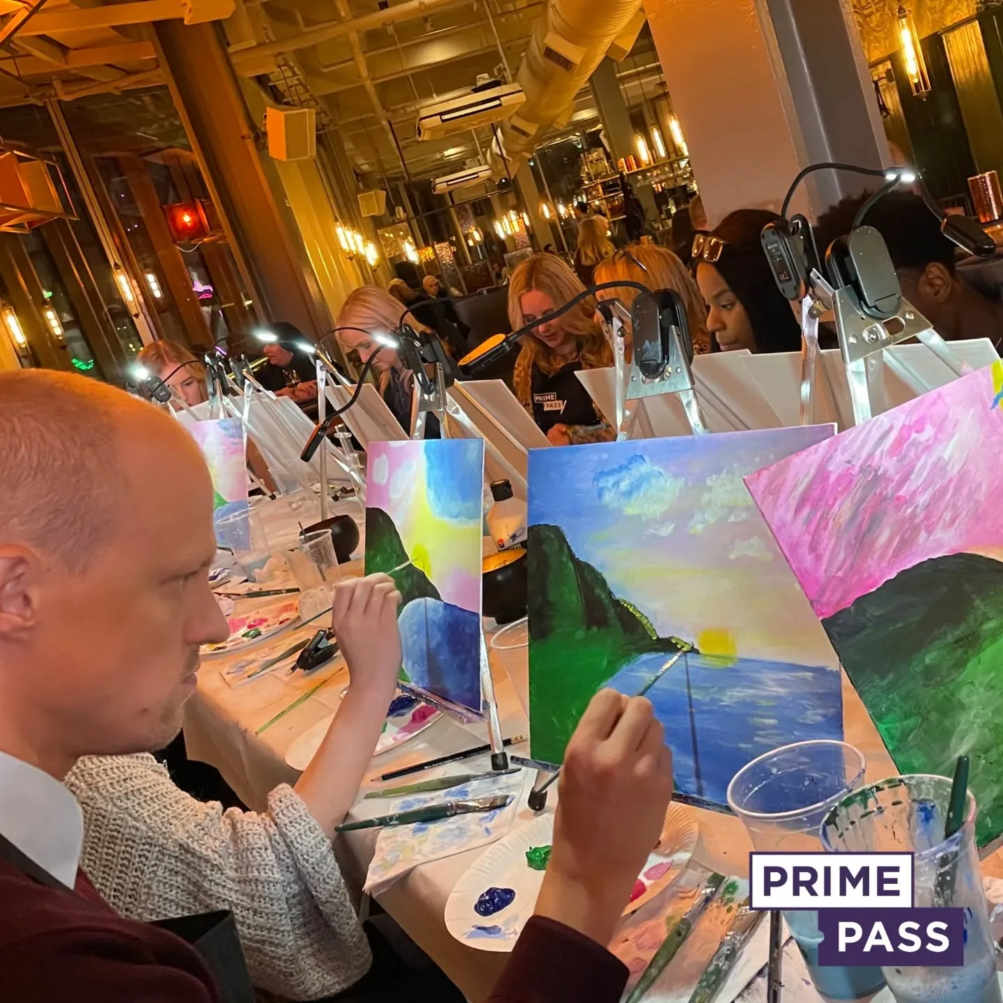
Book a Sip and Paint Class with Prime Pass and Explore the Beauty of Bronze Colour

Book a Sip and Paint class with Prime Pass and discover the stunning metallic hues of bronze! Our expert instructors will guide you through the process of mixing the perfect shades of bronze, whether you’re aiming for warm, coppery tones or rich, golden undertones. Perfect for all skill levels, our fun and relaxed sessions allow you to experiment with colour mixing while enjoying your favourite drink. All materials are provided, so you can focus on having fun and letting your creativity flow.
Prime Pass’s Paint and Sip events offer a unique opportunity to unwind, learn new techniques, and meet new people in a supportive, enjoyable environment. Whether you’re attending with friends, family, or colleagues, it’s an ideal way to explore the beautiful depth and shimmer of bronze while creating your own personalised masterpiece. Ready to bring your artistic vision to life? Book your spot now and dive into the world of bronze with Prime Pass!

