Magnolia, with its timeless elegance and subtle warmth, has become one of the most beloved colours in both interior design and art. The soft, creamy tones of this off-white shade evoke a sense of purity, grace, and sophistication. It’s no wonder that magnolia continues to be a favourite for homeowners, artists, and designers alike. But how do you achieve that perfect magnolia hue? In this comprehensive guide, we will explore everything you need to know to create and use this exquisite shade in your various creative projects.
Understanding Magnolia Colour: What Makes It So Unique?
Magnolia is a versatile off-white colour, primarily characterised by its warm undertones. Unlike other neutral whites, which may lean towards a stark or cool tone, magnolia has a soft, creamy appearance due to its subtle yellow and pink undertones. This warmth makes it incredibly versatile, suitable for a variety of applications, from home decor to fashion and art. Its understated beauty lends a sense of calm and sophistication to any space or design, making it a favourite in contemporary and traditional settings alike.
The reason magnolia works so well in interior design, for example, is due to its ability to complement a range of colour palettes. The gentle warmth of magnolia blends effortlessly with other hues, whether they be cool shades of blue or green or warmer tones like beige, gold, or terracotta. When used in art, magnolia allows other colours to stand out while creating a soft, balanced background. It’s the ideal shade for projects where you want a subtle yet elegant effect without overwhelming the space or artwork. Understanding how different hues interact with one another can significantly elevate your design and art projects, and for those interested in mastering this technique, exploring colour mixing can be incredibly beneficial. Read more about mastering colour mixing and its impact on your projects here.”
The History Behind Magnolia: Origins and Popularity
The term “Magnolia” as a colour originated in the paint industry, where it was used to describe a specific shade of off-white. This colour, which combines warm yellow undertones with a touch of pink, was named after the magnolia flower, which has been admired for its creamy, white blossoms. However, while the flower is mostly white, the paint colour incorporates a hint of pink or yellow, making it warmer and softer than pure white.
The popularity of magnolia as a paint colour grew rapidly in the late 20th century, especially in the UK, where it became synonymous with elegance and understated luxury. Unlike stark white, which can feel cold and impersonal, magnolia’s warmer hue created a more welcoming atmosphere, making it a staple in both home interiors and commercial spaces. It has since become a go-to choice for homeowners and decorators looking for a neutral, classic colour that doesn’t feel too clinical or harsh, offering a balance between warmth and sophistication.
Symbolism of Magnolia Colour in Design and Art
Magnolia’s symbolism is rooted in its soft, elegant appearance. It is often associated with purity, grace, and tranquillity, making it a popular choice in both design and art. In interior design, the colour evokes a calm, serene atmosphere, which is why it is frequently used in spaces like bedrooms, living rooms, and bathrooms. The subtlety of magnolia ensures that it doesn’t overpower the space, creating an inviting and peaceful environment that promotes relaxation and comfort.
In the world of art, magnolia plays an equally significant role. Its neutral yet warm tone allows it to serve as a balanced backdrop for other colours, letting them shine without stealing the spotlight. Whether used in a painting or a crafted design, magnolia has the power to convey elegance and refinement. For artists and creators, magnolia is an ideal base colour for portraits, landscapes, and even abstract works, adding a sophisticated, almost ethereal quality to their creations.
To create the perfect magnolia colour, you need to carefully blend white with subtle yellow and pink undertones. Achieving this perfect balance ensures that the resulting shade is neither too yellow, too pink, nor too white. Here’s a detailed, step-by-step guide on how to mix the perfect magnolia hue:
Step By Step Process To Create Magnolia Colour
Step 1: Gather Your Materials
Before you start mixing your magnolia colour, it’s important to have the right tools and materials:
- White paint (the base colour)
- Yellow paint (preferably a warm yellow, like ochre or cadmium yellow)
- Pink paint (a soft pink, like rose or blush pink, for the undertones)
- Mixing palette (to blend the paints)
- Palette knife or brush (for mixing)
- Paint containers (to store the mixed colour)
- Test paper or surface (for testing the colour as you mix)
Having high-quality paint will help ensure that the colour results are vibrant and long-lasting. Using professional-grade paints is recommended, as they blend more easily and provide better coverage.
Step 2: Start with a White Base
The first step in mixing magnolia is to create a white base. Magnolia is essentially a shade of off-white, so your starting point will be pure white paint.
- Pour a generous amount of white paint onto your mixing palette.
- The quantity you use will depend on how much magnolia paint you need for your project. If you’re just testing the shade, start with a small amount, but always keep in mind that it’s easier to add colour than to remove it.
Tip: Use a white with a neutral or slightly warm undertone, as this will work best for mixing magnolia. Avoid using pure, cold white, as it may not achieve the warm creaminess you’re looking for.
Step 3: Add Yellow Gradually
Magnolia’s warmth comes from subtle yellow undertones. To achieve this, you’ll need to gradually add yellow paint to the white base. The goal is not to overpower the white but to introduce just enough yellow to warm it up.
- Start by adding a small amount (around 10%) of yellow paint to your white base. You can begin with a warm yellow like ochre, which provides a golden, creamy feel.
- Mix thoroughly, ensuring the yellow blends evenly with the white. You should start to notice a warmer, creamier shade developing.
Tip: It’s easier to add more yellow than to fix a mix that has become too yellow, so go slowly. If you find the colour veering too far into yellow, you can always correct it later.For more insights into how yellow is made and the science behind mixing colours, check out this guide on colour mixing and theory.
Step 4: Evaluate and Adjust
After adding the yellow, take a moment to assess the colour. Magnolia should have a creamy, warm white appearance, not overly yellow. If the result is too yellow, it’s time to adjust by adding more white to balance it out.
- If the mix is too yellow, simply add more white to bring the colour back to a lighter tone.
- If the yellow tone is just right, proceed to the next step.
Tip: Testing the colour on a small test paper or surface can help you see the shade in different lighting conditions. This will give you a better sense of the final colour and how it might look in your project.
Step 5: Add Pink for Subtle Undertones
To achieve the characteristic soft, almost pinkish undertones of magnolia, you’ll need to add a hint of pink. This addition should be done sparingly, as too much pink will move the colour into a pastel or blush territory, which is not the goal for magnolia.
- Add just a tiny amount of pink paint (around 5% of your total mixture) to your yellow and white base. Soft, rose or blush pinks work best for this purpose.
- Mix carefully to avoid overblending. The pink should be subtle and only visible when closely examined. It’s the pink that gives magnolia its softness and refined warmth.
Tip: If the pink is too strong, you can always neutralise it by adding more white or yellow. But be sure to add pink slowly and cautiously to avoid an overly pastel or too-cool hue.
Step 6: Blend the Colours Thoroughly
Now that you’ve added your yellow and pink, it’s crucial to blend the colours thoroughly. A palette knife or mixing brush will ensure that the colours mix evenly, and the resulting magnolia shade will be smooth and consistent.
- Scrape the sides of your palette to mix any areas that haven’t blended properly.
- If you’re unsure whether the colour is fully blended, test it on a small surface and let it dry to see the final result. Sometimes colours can look slightly different when wet, so allow it to dry for a better idea of the final shade.
Step 7: Fine-Tuning the Magnolia Hue
Once the colour is well blended, it’s time for fine-tuning. Assess whether the magnolia shade is balanced. It should have a creamy, warm, soft white appearance with a hint of yellow and a subtle pink undertone.
- If you feel the shade is too white or too yellow, add small amounts of either white or yellow, adjusting to your desired warmth.
- If the pink undertone is too pronounced, correct it by adding more yellow or white to soften the effect.
- Keep testing and adjusting until you achieve the perfect magnolia shade.
Tip: Don’t rush this step. The key to getting the perfect magnolia is achieving a delicate balance between the yellow and pink undertones. The process is about trial and error, so be patient and make small adjustments.
Step 8: Testing the Colour
Once you believe you’ve reached the perfect magnolia shade, it’s important to test it. Magnolia can appear differently depending on the lighting conditions, so always test your mix under the same type of light where it will be applied.
- Paint a small swatch on your test surface and let it dry completely.
- Observe the shade both in natural and artificial light. Magnolia can shift slightly depending on the light, so ensure it still has the warm, creamy appearance you want.
Step 9: Store the Mixed Colour (If Needed)
If you’ve mixed a large batch of magnolia and need to store it for later use, make sure to store it in an airtight container. This will prevent the paint from drying out and maintain its consistency for future projects.
- Label the container with the date and the ratio of colours used (e.g., 90% white, 10% yellow, 5% pink) for reference.
- Keep the paint in a cool, dry place and stir it before use, as pigments can sometimes settle over time.
Step 10: Apply Your Magnificent Magnolia
With your perfect magnolia colour mixed, you’re ready to apply it to your project. Whether you’re painting a wall, creating a custom design, or working on a craft, this versatile shade of off-white will bring a soft, elegant look to your work.
Magnolia’s ability to complement other colours makes it an excellent choice for a range of creative projects, from interior design to fashion and art.
Common Mistakes to Avoid When Mixing Magnolia
One of the most common mistakes when trying to achieve the perfect magnolia shade is overmixing the yellow. It’s easy to get carried away and add too much yellow, which can shift the colour towards a more golden or cream hue, losing the softness that defines magnolia. To prevent this, always add yellow in small increments and keep a careful eye on the result.
Another mistake is insufficient blending. Magnolia is a subtle colour that requires thorough mixing to achieve an even and consistent tone. Failing to blend properly can result in uneven colouring, which will detract from the desired aesthetic. Furthermore, not accounting for the pink or purple-pink undertones can result in a magnolia shade that looks flat or too harsh. These mistakes can be avoided with proper technique and patience, and a paint and sip session like those offered by Prime Pass provides the perfect opportunity to learn from experts and refine your colour-mixing skills.
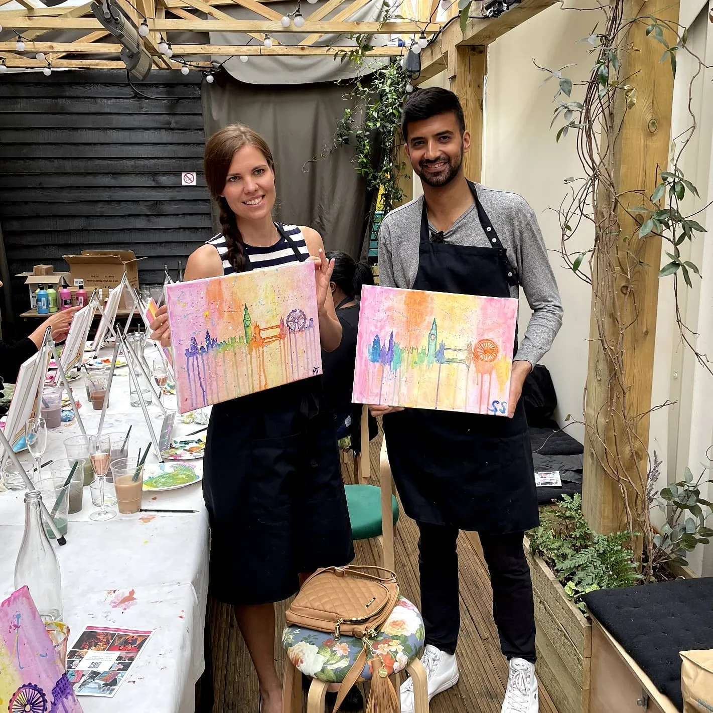
Book a Paint and Sip Session with Prime Pass
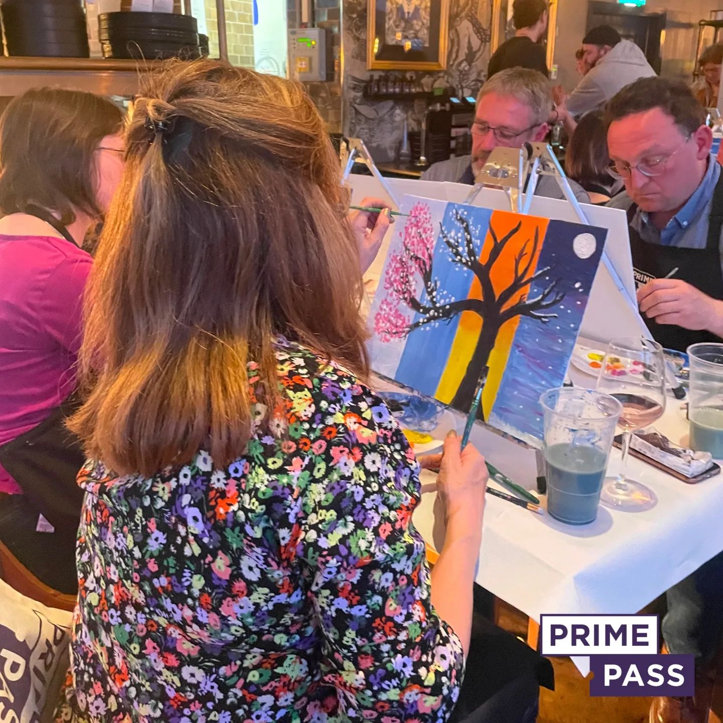
Looking for a fun and creative way to dive into colour mixing, including experimenting with magnolia hues? Book a Paint and Sip Session with a Prime Pass! Our relaxed, guided sessions are perfect for artists of all levels, whether you’re a complete beginner or a seasoned painter. During the event, our skilled instructors will lead you step-by-step through the painting process, helping you explore colour theory and create your unique shades, from soft, creamy magnolias to vibrant accent colours. With all the materials provided, you can simply show up, sip your favourite drink, and let your creativity flow.
Prime Pass’s Paint and Sip events offer a wonderful way to unwind, learn new techniques, and meet others in a fun and supportive environment. It’s a great opportunity to experiment with mixing colours, create personalised artwork, and have a memorable experience with friends, family, or colleagues. Ready to get started? Visit our website to reserve your spot and bring your artistic vision to life with Prime Pass!
Frequently Asked Questions
What is the Magnolia hue and why is it popular?
Magnolia is a versatile off-white shade with warm undertones, often featuring slight yellow or pinkish hints. There’s a certain je ne sais quoi about this mesmerising element – its delicate presence instantly elevates any room, painting, or outfit, evoking feelings of refinement, sophistication, and old-world charm. This malleable material transforms spaces with its gentle, creamy hues. From pared-down modernity to lavish traditional charm, its soft tones adapt seamlessly to any style.
How can I achieve the perfect Magnolia shade in my artwork?
To create the perfect Magnolia hue, start with a pure white base and gradually add a small amount of warm yellow, typically mixing 10% yellow with 90% white. Blend thoroughly to ensure even colour distribution. Avoid overmixing yellow or ignoring undertones to maintain the creamy, inviting appearance. Participating in structured painting sessions, like those offered by Prime Pass, can provide expert guidance to help you achieve the desired shade.
What are the primary colours that make up Magnolia?
Magnolia is primarily composed of a bright white base with warm yellow undertones. Additionally, subtle pink or purple-pink undertones distinguish it from pure white or other off-whites, adding depth and sophistication. This combination creates a creamy, inviting appearance that enhances paintings, interior spaces, and fashion items by providing a balanced and elegant colour.
How does Magnolia enhance interior design?
Magnolia enhances interior design by adding soft, warm undertones that create an inviting and elegant atmosphere. It complements various decor styles, from modern minimalist to traditional elegance, harmonising with sleek materials, natural elements, and serene coastal themes. Magnolia pairs well with warm-toned blues, greens, and yellow-based oranges and browns, while black accents or crisp whites add visual dynamism.
What are common mistakes to avoid when mixing Magnolia paint?
Common mistakes when mixing Magnolia paint include overmixing yellow, which can overpower the desired softness, and insufficient blending, leading to uneven colour. Ignoring undertones like pink or purple-pink can compromise the creamy, inviting effect of Magnolia. To achieve a balanced shade, add yellow gradually and blend thoroughly, ensuring the warm undertones remain subtle and harmonious.
Can Magnolia be incorporated into fashion, and how?
Yes, Magnolia is highly adaptable in fashion. Minimalist styles use its clean, off-white appearance for a sophisticated look, while bohemian trends incorporate it in flowing fabrics and layered textures. Magnolia is featured in seasonal collections for both casual and formal attire. Accessories like scarves in Magnolia paired with neutral tones, and gold or rose gold jewelry, add subtle warmth and a touch of luxury to outfits.
What are Prime Pass’s paint and sip sessions?
Prime Pass offers paint and sip sessions where participants can explore using the Magnolia hue in their artwork. immerses you in a space where self-expression flourishes, surrounded by like-minded individuals striving to hone their craft and produce something truly remarkable. From begineer to pro, attendees of all skill levels will discover the thrill of creating their perfect Magnolia shade, buoyed by expert insights and one-on-one coaching in a fun, hands-on setting.
What colour combinations work well with Magnolia?
Magnolia pairs beautifully with warm-toned blues, greens, and yellow-based oranges and browns, creating harmonious and inviting palettes. Whether you opt for dramatic black or pristine white accents, the result is a dynamic visual balance that’s hard to ignore. With Magnolia, the perfect palette is always within reach – seamlessly blending rich, sophisticated hues to create colour schemes that elevate any space, from country charm to contemporary chic.

