Pink Colour holds a unique place in the spectrum of colours, symbolising love, compassion, playfulness, and even rebellion in its brighter shades. This captivating hue offers endless possibilities in art, design, and everyday life. By mastering the art of creating pink, you unlock creative freedom, empowering you to craft shades that speak to your vision.
But what exactly goes into making pink? Let’s delve deeper into its creation, the factors influencing its shades, and how its versatile nature enhances our creative projects.
Understanding Pink: A Blend of Two Opposites
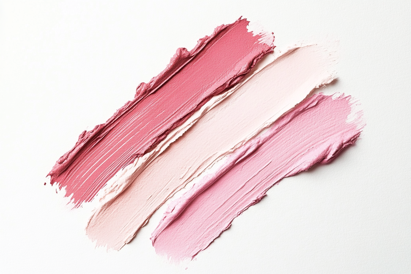
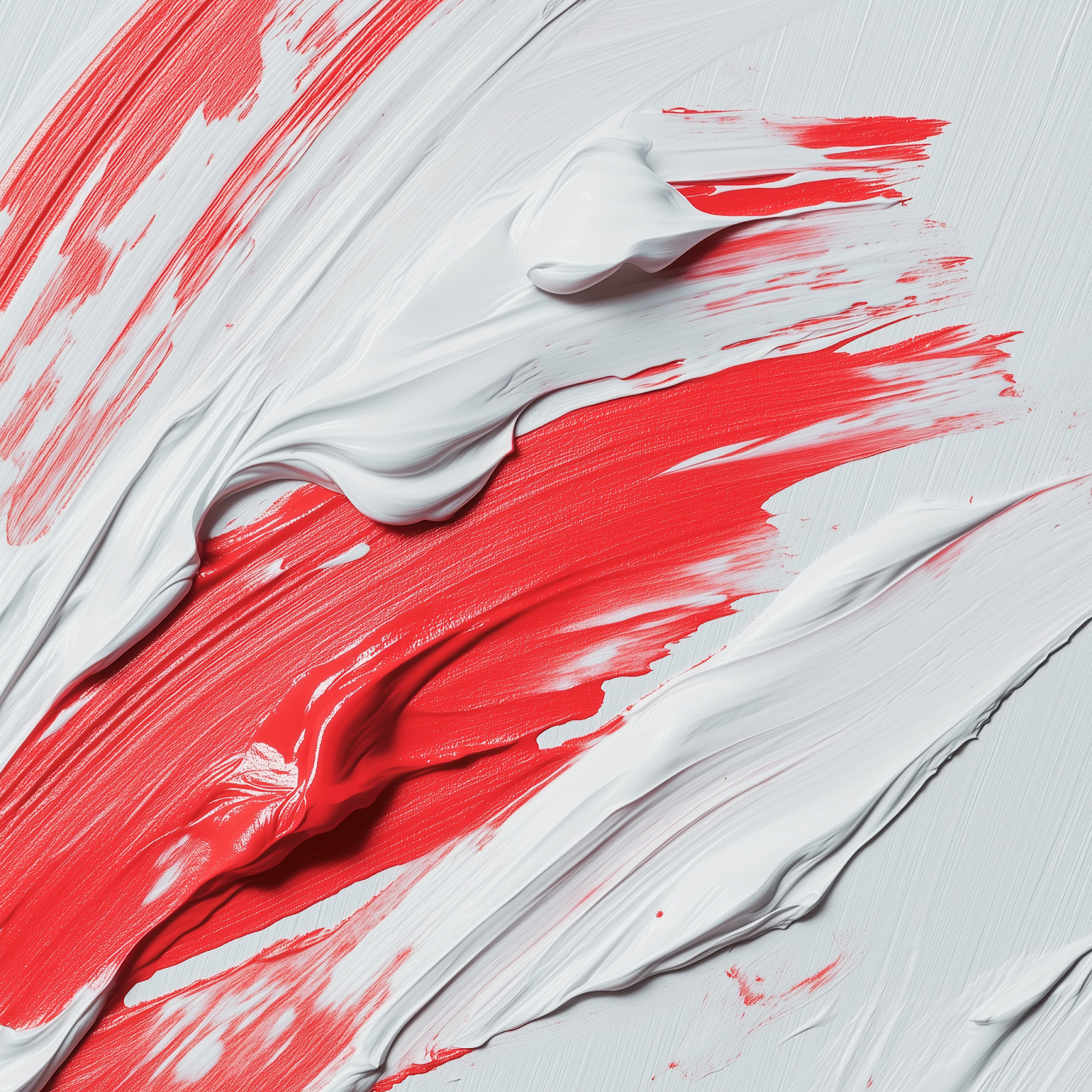
At its core, pink is a blend of two opposites—red, symbolising passion and energy, and white, representing purity and light. By varying the ratio of these two colours, you can achieve a wide array of pink tones, each with its unique personality. From soft pastels to bold magentas, pink’s versatility makes it a favourite among artists and designers.
For those looking to understand the nuances of colour mixing even further, it’s useful to explore the role that red plays in creating pink. The primary red hue you choose can significantly influence the resulting shade of pink. Whether you are looking to create a vibrant, warm pink or a cooler, more subdued tone, knowing how to mix red properly is essential. To dive deeper into the process of understanding red and how it interacts with other colours, check out What Makes Red Colour: Understanding Colour Mixing, where we explore the science and techniques behind this powerful colour. Understanding how red functions in the colour spectrum helps you master pink mixing and take your artistic creations to the next level.
The Basic Composition of Pink
Red and White: The Foundation of Pink
Pink is created by mixing red and white, but the exact ratio determines the shade. Here are the essentials:
- Light Pink: 1 part red to 2 parts white for a soft, delicate hue.
- Deep Pink: Increasing red to 2 parts with 1 part white creates a richer, more vibrant tone.
- Pastel Pink: Adding more white results in a lighter, airy shade perfect for subtle designs.
Types of Red and Their Effects
Different types of red can influence the resulting pink shade significantly:
- Warm Reds
Warm reds like cadmium red or scarlet create coral and peach tones. These are ideal for cheerful, summery palettes. - Cool Reds
Cool reds such as alizarin crimson or quinacridone red produce purples and magentas when mixed with white, offering a dramatic and rich visual impact.
Exploring the Shades of Pink
Soft Pastels
Perfect for creating calm and serene artwork, pastel pink is achieved by using titanium white for a strong, opaque base or zinc white for a more translucent finish. These shades evoke feelings of innocence and nostalgia.
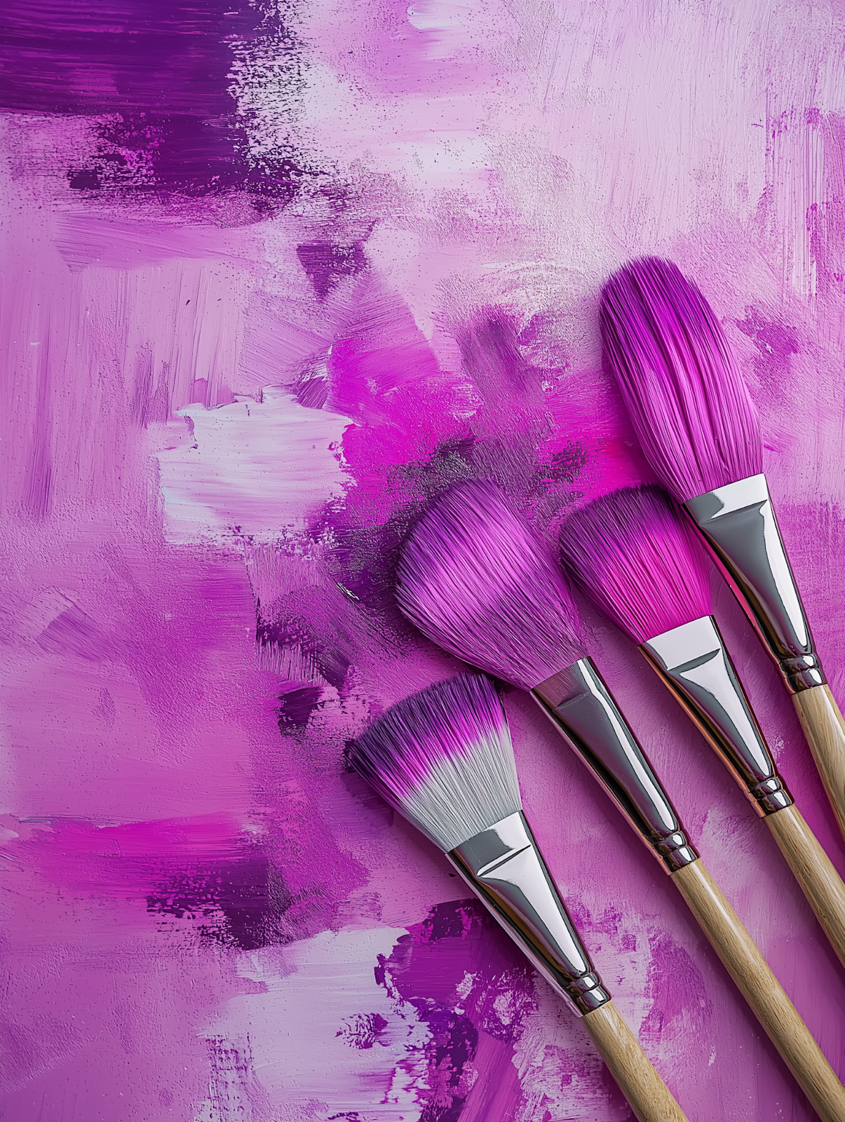
Bright and Bold
Adding a touch of complementary colours like orange or blue can deepen the vibrancy of pink. Bright pinks, like fuchsia or magenta, are often associated with creativity and bold statements in design.
Muted Tones
For a sophisticated look, muted pinks can be created by blending in green or grey. These shades are excellent for minimalist designs or adding depth to paintings.
Alternative Methods to Create Pink
While red and white are the traditional components of pink, experimenting with alternative methods can yield unique results.
Using Base Colours Beyond White
- Yellow as a Base: Mixing yellow with red can create salmon-like pinks. For example, pairing Naples yellow with crimson red results in a warm, lively tone.
- Creamy Bases: Adding ivory or off-white introduces a vintage, rustic feel to the shade.
Adding Complementary Colours
- Green for Subdued Tones: A touch of green mutes the intensity of pink, making it ideal for understated, elegant designs.
- Blue for Cool Undertones: Incorporating blue enhances the coolness of pink, making it suitable for icy, winter-themed artwork.
The Role of Mediums in Mixing Pink
Choosing the Right Medium
The medium you use impacts how the colours mix and appear. Popular options include:
- Acrylic Paints
Acrylic paints are versatile and allow for smooth blending. They are perfect for creating vibrant, long-lasting pinks. - Oil Paints
Oil paints offer richer pigments and a longer drying time, enabling intricate blending for complex shades. - Watercolours
Watercolours are ideal for soft, translucent pinks. However, the level of dilution with water can affect the final shade.
Tips for Perfectly Mixing Pink
Creating the ideal pink requires careful attention to detail. Follow these tips for the best results:
Test Your Colours First
Always test your mixture on a separate palette before applying it to your canvas. This ensures you achieve the desired shade without unexpected results.
Start Gradually
Begin with small amounts of red and white, gradually adjusting the ratio. Adding too much of either colour at once can make it challenging to correct.
Consider Undertones
The undertone of your red pigment matters. Warm reds lean towards orange, while cool reds shift towards purple. Keep this in mind when mixing for a specific mood.
Exploring Pink in Art and Design
Symbolism of Pink
The colour pink evokes a wide range of emotions and meanings:
- Soft Pink: Innocence, love, and femininity.
- Bright Pink: Energy, vibrancy, and creativity.
- Muted Pink: Sophistication and subtlety.
Practical Uses in Art
From painting to graphic design, pink serves various purposes:
- Backgrounds: Soft pinks create calming backgrounds for portraits and landscapes.
- Accents: Bright pinks are excellent for highlighting key elements.
- Textures: Experimenting with pink in textures can add depth and interest to abstract art.
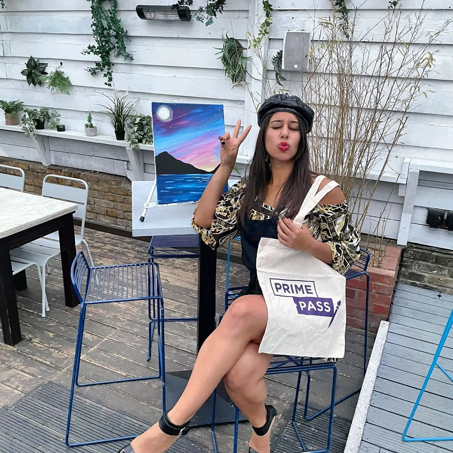
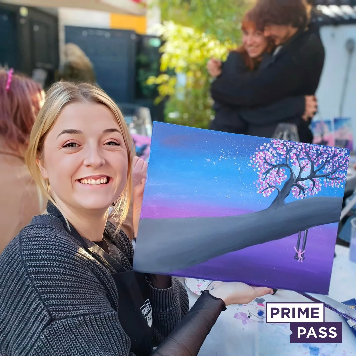
Prime Pass Painting Sessions
Unleash Creativity with Pink
Prime Pass offers paint-and-sip sessions where participants can explore the endless possibilities of pink. Whether you’re a beginner or a seasoned artist, our guided sessions provide the perfect environment to experiment with colour blending.
Social and Relaxing
These sessions are not just about painting; they’re a chance to unwind, connect with others, and create lasting memories. Enjoy a glass of wine or your favourite drink while bringing your artistic vision to life.
The Science Behind Colour Mixing
The Role of Light
Understanding how light interacts with pigments helps in achieving the perfect pink. White reflects light, diluting the intensity of red and resulting in lighter tones. The more white you add, the softer the pink.
Colour Psychology
Pink has a psychological impact, often associated with calmness, compassion, and creativity. Bright shades energise, while pastel tones soothe and relax.
Common Mistakes and How to Avoid Them
- Overpowering with Red
Adding too much red can make the pink too intense. Always start with small amounts. - Using Incompatible Whites
Different whites can alter the undertone of pink. Titanium white is best for vibrant shades, while zinc white works for softer tones. - Skipping Tests
Not testing your mix can lead to unexpected results. Always check your mixture on a separate surface before applying.
Exploring Pink’s Influence on Everyday Life
Fashion and Design
Pink’s role in fashion is timeless, representing a range of moods and styles. Its versatility allows it to be elegant, fun, or bold. From pastel pink dresses symbolizing grace and romance to hot pink accessories adding a pop of vibrant energy, this colour suits any occasion. Pink is a popular choice in haute couture, casual wear, and statement pieces alike. Designers often use pink to evoke femininity, modernity, or even rebellion, depending on its shade and pairing.
In art, pink is equally impactful. Artists use it to create depth, softness, or vibrancy in their work. Pastel pinks are often chosen to convey a sense of calm and serenity, while brighter tones like magenta bring a dynamic, youthful energy to paintings. Pink also works as a striking contrast against darker tones, drawing attention to focal points in compositions.
Home Décor
Muted pink tones have become a favourite in interior design, thanks to their ability to create warm and inviting spaces. Soft pink walls can transform a room into a serene retreat, blending seamlessly with neutral or earthy palettes. Pink accents like cushions, rugs, or artwork add a subtle charm without overpowering the overall aesthetic.
In painting and visual art, muted pinks are widely used to build soothing backgrounds or atmospheric settings. Artists often incorporate these tones to create a sense of nostalgia or romance in their work. A soft pink sky, for instance, can evoke the tranquil beauty of dawn or dusk in a landscape painting. Similarly, muted pink can be used to soften harsh elements in abstract or modern art, adding balance and warmth to the overall composition.
The Role of Pink in Painting
Pink offers an extensive range of applications in painting, making it a highly versatile colour for various styles and themes:
- Creating Mood and Atmosphere
Pink is often used to set the tone of a painting. Light, pastel pinks can create a dreamlike, whimsical atmosphere, while darker, more saturated pinks add passion and intensity. - Highlighting and Contrast
Bright pinks, such as fuchsia or neon pink, work excellently as highlights. They can make certain elements stand out, especially when paired with cooler tones like blues or greens. Artists often use pink to draw attention to specific areas of a painting. - Symbolism and Emotional Impact
Pink can convey a range of emotions, from the innocence of pastel tones to the boldness of magenta. Depending on its use, it can represent love, joy, hope, or even rebellion. Many modern artists use pink to challenge traditional notions of colour symbolism, pushing the boundaries of creative expression. - Blending and Transitioning
Pink acts as a beautiful transitional colour when blending other shades. For example, it can smoothly connect red and white or blend harmoniously with peach, purple, or even gold. This makes pink a vital component in creating gradient effects or layered textures in both abstract and realistic paintings. - Exploring Different Textures
Experimenting with different mediums—like acrylics, watercolours, or oil paints—allows artists to achieve diverse textures with pink. Watercolours produce delicate washes of pink that can evoke softness, while oils give a richer, more intense finish for dramatic effects.
Book Your Paint and Sip Session at Prime Pass
Looking for a fun, creative way to spend time with friends, family, or colleagues? Prime Pass offers unforgettable paint and sip sessions that combine artistic expression with a relaxed, social atmosphere. Whether you’re a seasoned artist or a complete beginner, our sessions are perfect for anyone looking to explore their creativity, unwind, and enjoy a drink.
Why Choose Prime Pass?
- Guided Instruction: Our expert instructors will guide you step by step, ensuring that you feel confident in your painting, no matter your experience level.
- Relaxing Environment: Enjoy a fun, laid-back setting while sipping on your favourite beverage. The ideal backdrop for creativity and relaxation.
- Perfect for Groups: Whether it’s a birthday, a team-building activity, or just a casual get-together, our paint and sip sessions are a fantastic way to bond with others.
- No Experience Necessary: No need to worry about your artistic abilities—we’ve designed these sessions for everyone!
Join Us at Prime Pass: At Prime Pass, we make painting fun and accessible to everyone. Enjoy creating your masterpiece, share laughs with friends, and discover the joy of artistic expression, all while sipping your favourite drink. Book your paint and sip session today, and let’s get creative together!
Frequently Asked Questions (FAQs)
1. What does the colour pink represent?
Pink symbolises love, compassion, and playfulness. Depending on its shade, it can evoke feelings of calmness, energy, or sophistication.
2. How is pink created?
Pink is made by blending red with white. The ratio of these colours determines the shade, with more red creating deeper tones and more white producing lighter ones.
3. What mistakes should I avoid when mixing pink?
Avoid adding too much red, neglecting to test colours, and using incompatible whites. Gradual mixing and testing can help achieve the perfect shade.
4. Can I use other colours to create pink?
Yes, you can experiment with colours like yellow or green for unique pink tones. Adding blue enhances cool undertones, while green mutes the intensity.
5. What mediums are best for mixing pink?
High-quality acrylic or oil paints work best. Titanium white is ideal for opaque pinks, while zinc white creates softer, more translucent shades.
6. What makes Prime Pass paint-and-sip sessions special?
Prime Pass offers a social, relaxing environment for exploring creativity. Guided instruction ensures comfort for all skill levels, making it perfect for friends, families, and team-building events.

