
The cream is a versatile and soothing colour that adds warmth to any palette. Whether you’re painting, decorating, or experimenting with colours, achieving the perfect creamy hue can transform your creative projects. Understanding the fundamentals of colour mixing and the nuances of cream colour can take your design skills to the next level.
In this comprehensive guide, we’ll explore how to mix the perfect cream shade, key colour combinations, and techniques for adjusting its warmth and depth. Plus, we’ll dive into the various applications of cream colour in design and share some common mistakes to avoid.
If you’re also interested in mastering other essential colour mixes, be sure to explore our guide on What Colours Make White for more insights into how different shades can elevate your palette.
Introduction to Cream colour
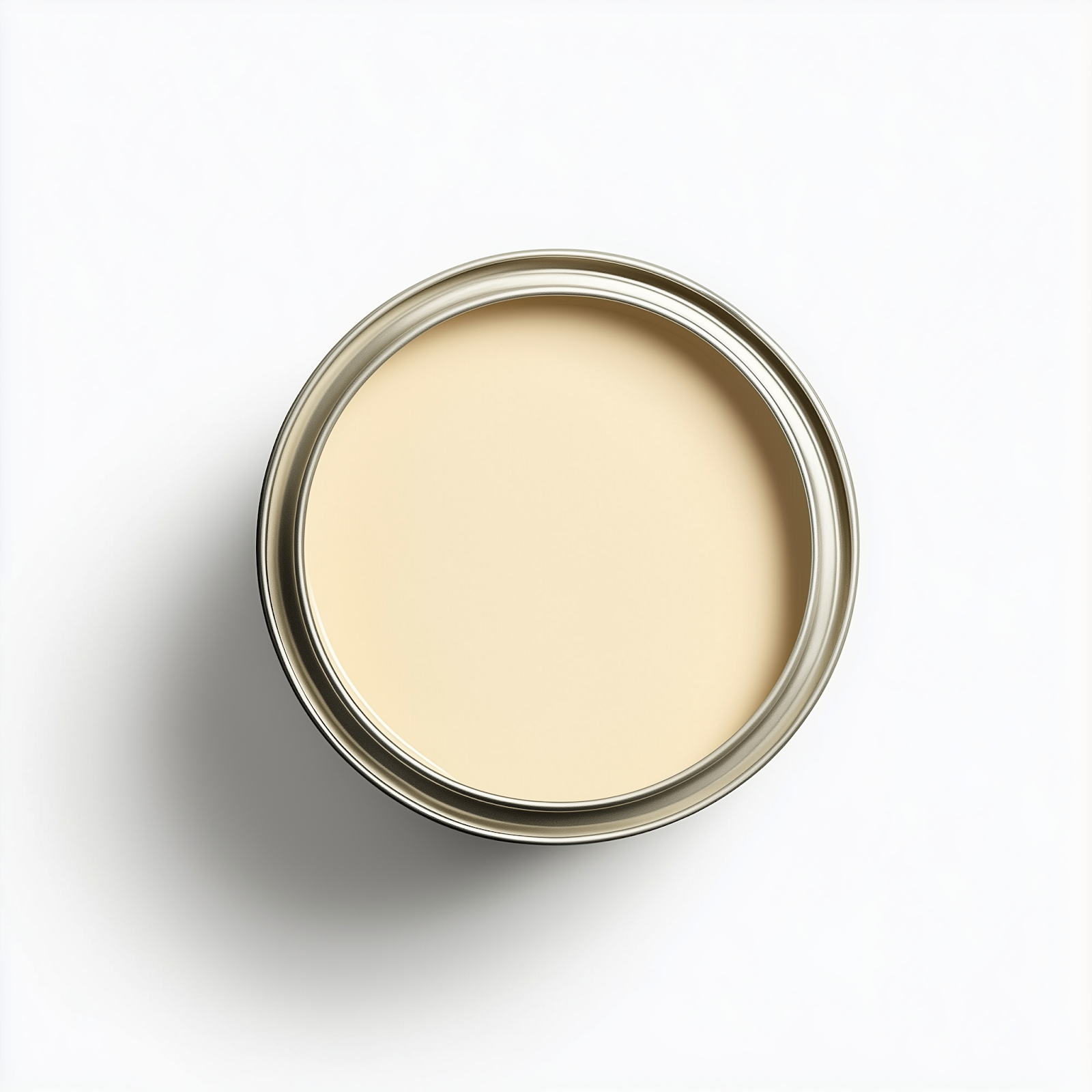
Cream is an off-white colour that leans toward a yellowish hue. Its name comes from the rich, buttery colour of cream produced from cow’s milk. Cream can also be darkened by mixing with black, which gives it a deeper tone. Some other names associated with off-white colours like cream are beige, ecru, and ivory.
Mixing the right blend of colours to get a perfect cream shade can be a challenge. Before attempting it, it’s important to know a bit of colour theory. Applying the tips here will help you mix it like the pros do.
What Makes Cream Colour Special?
Cream stands out as a warm, neutral colour with both soothing and inviting qualities. Its gentle nature allows it to blend seamlessly into any colour palette, making it a popular choice in home décor, art, and fashion. What makes cream so versatile is its ability to evoke a feeling of balance and comfort, making it an ideal foundation colour for more vibrant accents.
Understanding colour Theory for Mixing Cream
Before diving into mixing colours, it’s important to have a basic understanding of colour theory. The key points include:
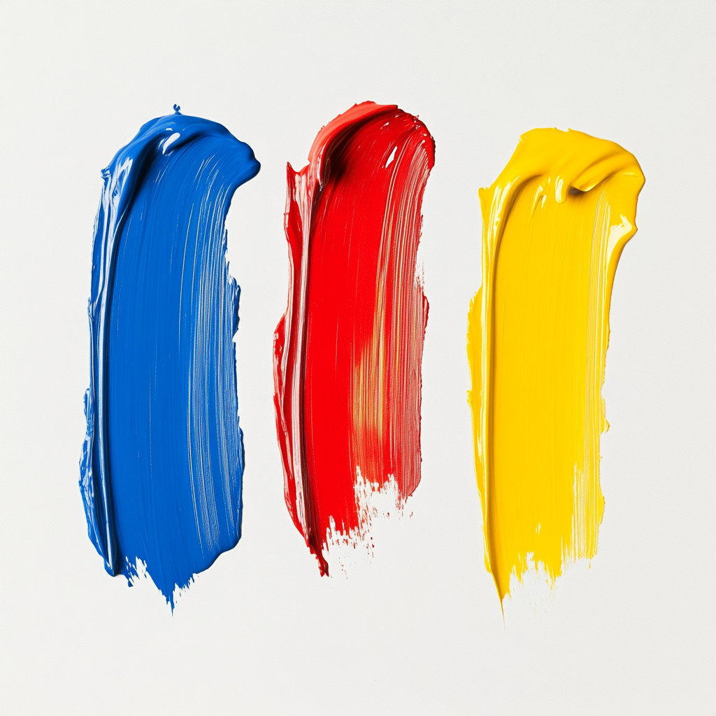
- Primary colours: You can create any colour from the three primary colours: red, yellow, and blue. The primary colours form the basis for colour mixing, which states that you can create a vast array of hues, as well as tertiary (third) colours, by using the primary colours in the correct proportions.
- Simultaneous Contrast: This refers to how the perception of a colour changes based on adjacent colours. Your cream shade will look different depending on the colours paired with it, so consider how colours interact before finalising your choice.
- Adding Dark to Light: It’s easier to darken a light colour by adding a small amount of a darker pigment. For instance, add blue to white to darken it, but avoid trying to lighten the blue with white. This concept is essential for mixing cream and other light tones.
- Single-Pigment Paints: When mixing colours to create cream, ensure that you’re using single-pigment paints to avoid muddy results. Overmixing can also dilute your cream colour, so it’s better to stop mixing just before they’re completely blended.
For more detailed tips on mixing colours, including how to create maroon, check out our guide: What Colours Make Maroon: Easy Guide to Perfect Colour Mixing.
The Basics of Cream colour Mixing
Creating cream typically involves mixing white with yellow. The proportion of these two colours will determine the tone of the cream. From soft pastel creams to richer, deeper shades, here’s how to get started:
- White and Yellow: The Foundation of Cream
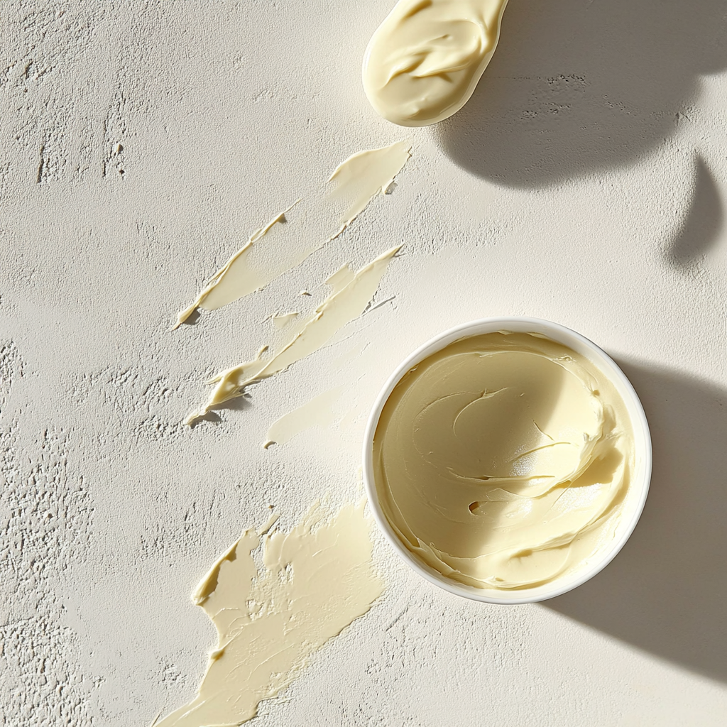
- Light Cream: Mix three parts white with one part yellow for a subtle, airy cream. This ratio is perfect for delicate designs.
- Rich Cream: For a warmer, deeper tone, use two parts white to one part yellow. This creates a fuller, more luxurious cream.
- Adding Red or Brown for Warmth
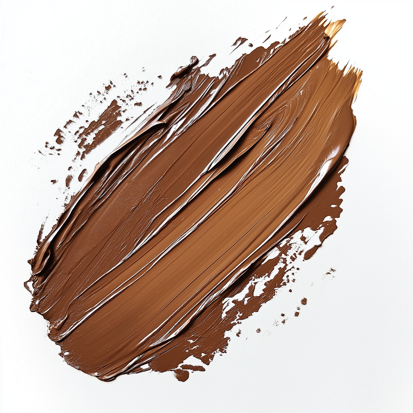
- Burnt Sienna: This reddish-brown colour adds warmth and depth to cream. By mixing it with white and yellow, you can create a more earthy tone.
- Raw Umber: If you want a sophisticated, muted cream, adding raw umber (a subtle brown tone) will deepen the colour, creating a more vintage look.
Advanced Techniques for Mixing Cream colour
Mastering colour mixing involves experimenting with different techniques and adjustments:
- Achieving the Perfect Shade:
- For a Pale Cream, use more white than yellow (a ratio of 3:1). This will create a soft, delicate cream.
- For a Deeper Cream, increase the yellow to create a richer tone. A 2:1 ratio of white to yellow will give you a fuller, more intense cream.
- Adjusting the Warmth of Cream:
- Burnt Sienna: Add a small amount of burnt sienna for a warm, golden hue.
- Orange: A hint of orange can brighten the cream, giving it a more energetic, vibrant quality.
- Brightening Cream:
- To brighten your cream without losing its richness, add more white pigment. But be cautious—too much white can make it too pale, losing the depth and warmth that makes cream so versatile.
Cream colour Recipes
Now that you understand the basics, here are some recipes to create your perfect cream shade:
- Mixing Brown and White:
- Start with raw sienna or burnt sienna and mix it with white. Add raw or burnt umber for depth. Use a small amount of brown to avoid darkening your cream too much. If needed, add a bit of yellow or red for warmth.
- Yellow Ocher or Naples Yellow:
- Combine these yellows with titanium white for a creamy, warm tone.
- Using Titanium Buff:
- Titanium buff (also called unbleached titanium) is a great base for making cream. Add extra white to lighten the mixture, giving you various shades of cream.
- Gray and colour Mixing:
- Mix gray with yellow ocher or raw sienna for a unique, nuanced cream. Ivory black (a warmer black) works well for creating a soft gray, which can be further modified with yellow tones to create a subtle cream.
- Skin-Tone colours:
- Use skin-tone paints, supplemented with titanium white, yellow ocher, or burnt sienna, to create various hues of cream.
Common Mistakes to Avoid When Mixing Cream
Mixing the perfect cream is not always straightforward. Here are some common pitfalls to avoid:
- Overloading Yellow: Too much yellow can result in a bright, almost neon shade instead of a soft cream. Always add yellow slowly and in small amounts.
- Incorrect Ratios: The balance of white and yellow is crucial. If you overdo one, your cream may end up too pale or too yellow. Stick to a 3:1 ratio for light cream and adjust as needed.
- Excessive Earth Tones: Adding too much raw sienna or burnt umber can overpower the cream colour, making it too dark or muddy.
- Inadequate Mixing: Ensure all pigments are thoroughly blended. Streaks or uneven colours will detract from the smooth, creamy appearance you’re aiming for.
Applications of Cream colour in Design
Cream’s neutral warmth makes it an ideal choice for various artistic and design applications. It pairs well with other colours, acting as both a backdrop and a highlight.
- Interior Design and Décor:
- Living Rooms & Bedrooms: Cream walls create a calming atmosphere, perfect for creating relaxing spaces. It pairs well with pastels, earthy tones, and metallic accents.
- Kitchens & Dining Rooms: Cream can add sophistication to kitchen designs. Combine it with bold accents or wooden textures for a welcoming feel.
- Art and Painting:
- Portraiture & Landscapes: Cream is often used in skin tones and for blending to soften bright colours or add depth.
- Abstract Art: As a subtle background, cream enhances other vibrant colours, balancing the overall composition.
- Fashion and Textiles:
- Bridal Wear: Cream offers a soft, elegant alternative to pure white, flattering a wide range of skin tones.
- Home Textiles: Cream-coloured fabrics like cushions, curtains, and bedding create a luxurious and cosy ambiance in any room.
Colour mixing and Creative Exploration at Prime Pass
At Prime Pass’s paint and sip sessions, understanding how to mix cream colour and explore its applications is key to enhancing the artistic experience. These sessions provide a fun and interactive environment where participants can experiment with colour mixing under expert guidance.
colour Mixing in Prime Pass’s Paint and Sip Sessions: Prime Pass offers a unique opportunity to explore the nuances of colour mixing, including creating the perfect cream tone. Whether you’re a beginner or an experienced artist, these sessions allow you to learn and practice mixing colours like cream, enabling you to incorporate them into your personal projects with confidence.
The interactive nature of Prime Pass’s paint and sip events encourages creativity and collaboration, making them a great choice for group gatherings or team-building activities.
Book Your Painting Session with Prime Pass

Ready to unleash your creativity? Whether you’re a beginner or a seasoned artist, Prime Pass painting sessions offer the perfect opportunity to explore the world of colours, techniques, and artistic expression. Join us for a fun and interactive paint and sip experience where you’ll not only learn how to mix colours like the pros but also enjoy a relaxed and inspiring atmosphere.
Why Book a Session with Prime Pass?
- Guided by Experts: Our talented instructors will guide you through the painting process, helping you refine your skills and create something beautiful.
- Fun and Relaxing Environment: Enjoy a laid-back setting where you can sip your favourite beverage while you paint and socialise with friends or colleagues.
- Customisable Experience: Whether you’re working on a specific project or want to try something new, our sessions cater to your unique artistic interests.
- Group & Team Building Options: Perfect for a fun outing with friends or a team-building event with colleagues.
Don’t wait—book your session today and discover the joy of painting at Prime Pass!
Click here to book your session now!
Frequently Asked Questions
What is the colour cream?
Cream is an off-white hue with a subtle yellow undertone. It’s a versatile and warm colour commonly used in various design palettes to add sophistication and balance. By mixing white with a small amount of yellow, cream achieves its characteristic softness and warmth, making it suitable for both artistic and interior design applications.
How is cream colour created?
Cream colour is created by mixing white and yellow pigments. The proportion of yellow determines the cream’s intensity and depth. Typically, a ratio of three parts white to one part yellow yields a light cream, while two parts white to one part yellow produces a richer tone. Adjustments can be made by adding red or brown hues to enhance warmth and nuance.
What is the ideal ratio for mixing cream colour?
A common ratio for mixing cream is three parts white to one part yellow for a light cream shade. For a richer and deeper cream tone, use two parts white to one part yellow. Starting with more white allows better control over the shade’s intensity, ensuring a balanced and consistent cream colour suitable for various creative projects.
Can you adjust the warmth of cream?
Yes, the warmth of cream can be adjusted by adding small amounts of orange or burnt sienna. Incorporating these hues enhances the cream’s warmth and adds depth. However, it’s important to add these colours gradually to avoid overpowering the mixture, maintaining a balanced and sophisticated cream tone.
What are common mistakes when mixing cream colour?
Common mistakes include adding too much yellow, using incorrect ratios, and incorporating excessive earth tones like brown, which can overwhelm the mixture. Maintaining colour balance and thorough mixing are essential to achieve a consistent cream hue. Overloading yellow or dark colours can distort the desired softness and warmth of cream.
How can I achieve a brighter cream tone?
To achieve a brighter cream tone, add more white to the mixture. Increasing the white pigment lightens the cream, enhancing its brightness without compromising its warmth. Carefully adjust the white-to-yellow ratio to maintain the desired softness while making the cream tone more vibrant and luminous.
What are the applications of cream colour in design?
Cream is widely used as a versatile base in both artistic and interior design settings. It adds warmth and sophistication to artworks, complements other colours in design palettes, and serves as a neutral backdrop that enhances visual appeal. Its adaptability makes it suitable for various projects, from paintings to home decor.
How do Prime Pass’s paint and sip sessions help with mixing cream?
Prime Pass’s paint and sip sessions provide hands-on experience in mixing cream colours. Participants learn to adjust the yellow-to-white ratio and incorporate other hues under expert guidance. These sessions enhance understanding of colour mixing techniques, helping artists achieve flawless cream tones and boosting their confidence in creative projects.
Why is understanding colour mixing important for achieving cream tones?
Understanding colour mixing is crucial for achieving the perfect cream tone because it ensures the right balance of white and yellow pigments. Knowledge of ratios and how different hues affect the shade allows for precise control over the cream’s intensity and warmth, resulting in a consistent and aesthetically pleasing colour in various design applications.
What techniques enhance the depth of cream colour?
To enhance the depth of cream colour, incorporate additional hues such as burnt sienna or umber. These colours add warmth and nuance, giving the cream a richer and more sophisticated appearance. Adjusting the ratios carefully and mixing thoroughly ensures the depth is achieved without overpowering the base cream tone.

